1
100+
Golden Kitty award
30
Intreviews
Countries
1M+
Active Users
Project overview
What is Zenia?
Project Duration
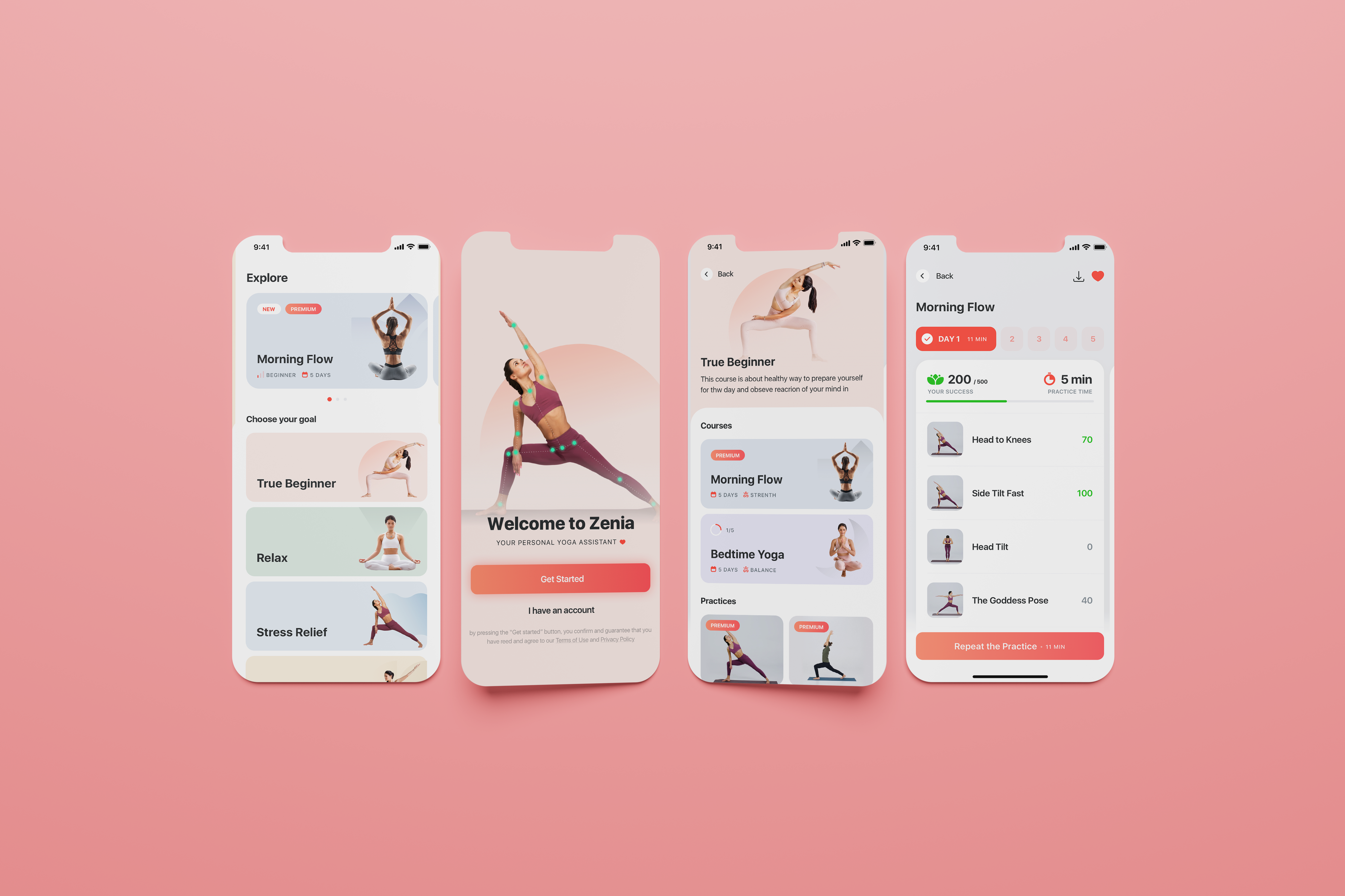
Zenia is the world’s first AI-powered Yoga Assistant, powered by machine learning and movement recognition technology to safely guide your home yoga practice. Offering real-time feedback and voice guidance, Zenia provides a seamless and safe yoga experience across iOS, Android, and web platforms. In 2020, Zenia was honored as the "Product of the Year" in the Health & Fitness category on Product Hunt.
November 2018 -
December 2020
My Responsibilities
As the Senior UX Designer, I was responsible for steering the product design and user research aspects of the project. My role included reimagining the existing user interface, leading research initiatives, and introducing new functionalities to better serve our users. I collaborated closely with CEO, UI designer, and development team, to ensure the design met both business and user needs.
My Role
Lead UX Designer
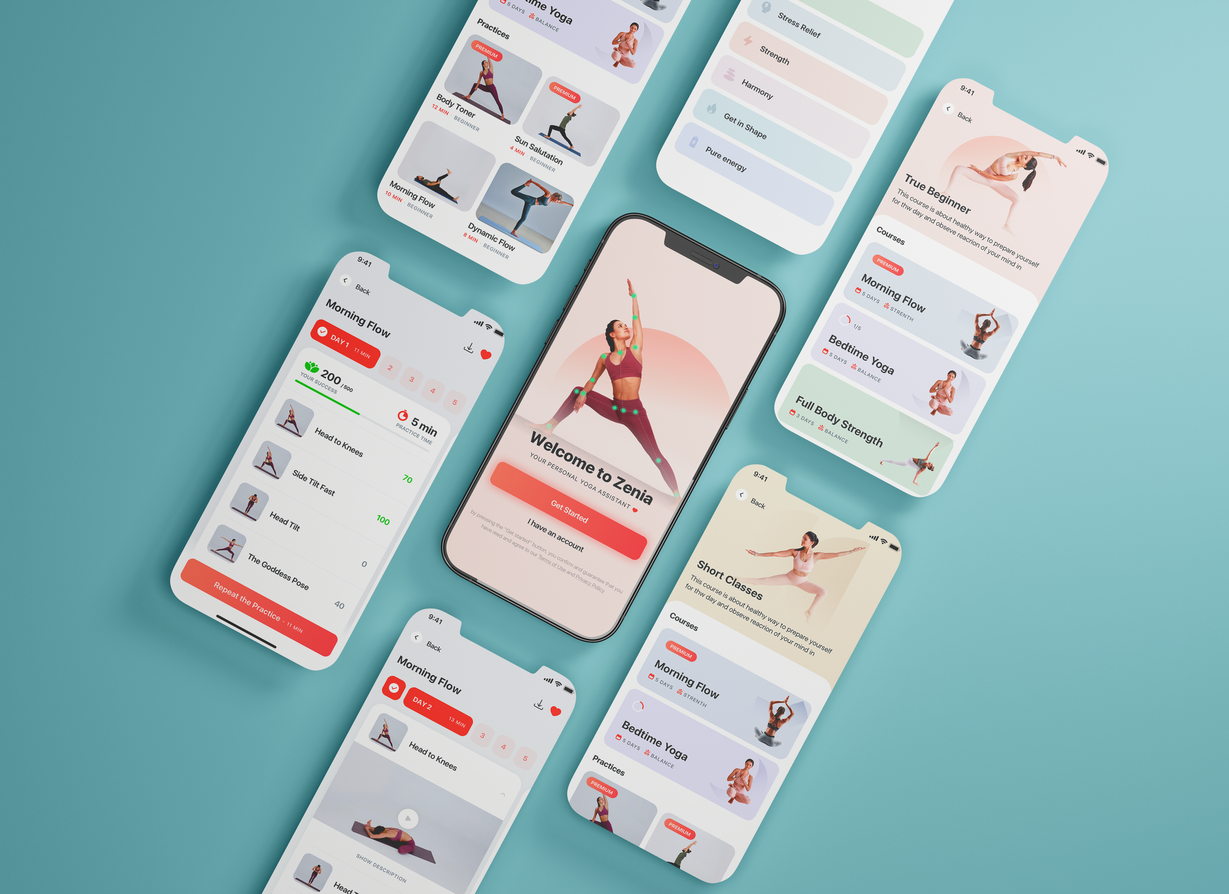
Project Overview
Challenges / The problems
The pandemic severely limited people's ability to visit gyms and yoga studios, driving a surge in at-home fitness activities. While many turned to YouTube videos for guided yoga sessions, these videos lacked the personalized, real-time feedback necessary for effective and safe practice. This created a significant gap for users who needed more than just pre-recorded instructions to stay engaged, track their progress, and ensure they were practicing yoga correctly. Zenia was designed to directly address this issue by offering real-time, personalized guidance and feedback, making at-home yoga more accessible, effective, and safe.
Business Goals & KPI
Zenia's main metric was the number of trainings per user and our business goal was to elevate this metric alongside improving user retention rates.
Business Goals
Increase the average number of user sessions per day and motivate users to train more
Enhance retention metrics and the percentage of users who successfully complete their training sessions
Raise the percentage of users who authorize camera access for real-time feedback
KPI
Amount of training per user per day
Retention Rates
Number of users who passed onboarding
Number of users who give permission to the camera
KPI
Amount of training per user per day
Retention Rates
% of users who passed onboarding
% of users who give permission to the camera

"How can we design a yoga guide that provides users the studio-like experience at home?"
Design Challenge
phase 1: UNDERSTANDING THE USER
User Research Methods
I began by analyzing the existing data sets, utilizing Mobile Analytics through Amplitude and Github for insights. My next step involved a systematic review of customer support requests, which I grouped by issue type. Finally, I performed a usability audit and conducted market research to inform the design strategy.
- Data & Mobile Analytics
- Usability Audit
- Customer Interviews
- User Observation
- Customer Support
- Market Reserach
User Interviews
The most engaging aspect of the project was User Observations and Customer Interviews. Through user observations, I gained insights into how users interact with Zenia, identifying challenges and obstacles they encountered. During the customer interviews phase, we invited 10 individuals to provide their feedback. Subsequently, we categorized the issues raised to form a clearer picture of user pain points.
User research: pain points
"My schedule is too busy and I don’t have time to commute to yoga class"
"I’m novice yoga learner and I dont know how to start. I am to shy to go to the yoga class"
"Rigid Covid restrictions for gym and yoga during pandemia"
"Rigid Covid restrictions for gym and yoga during pandemia"
"It’s such a pain to watch yoga youtube videos and stopped it everytime time to adjust your pose"
3. Develop
Personas
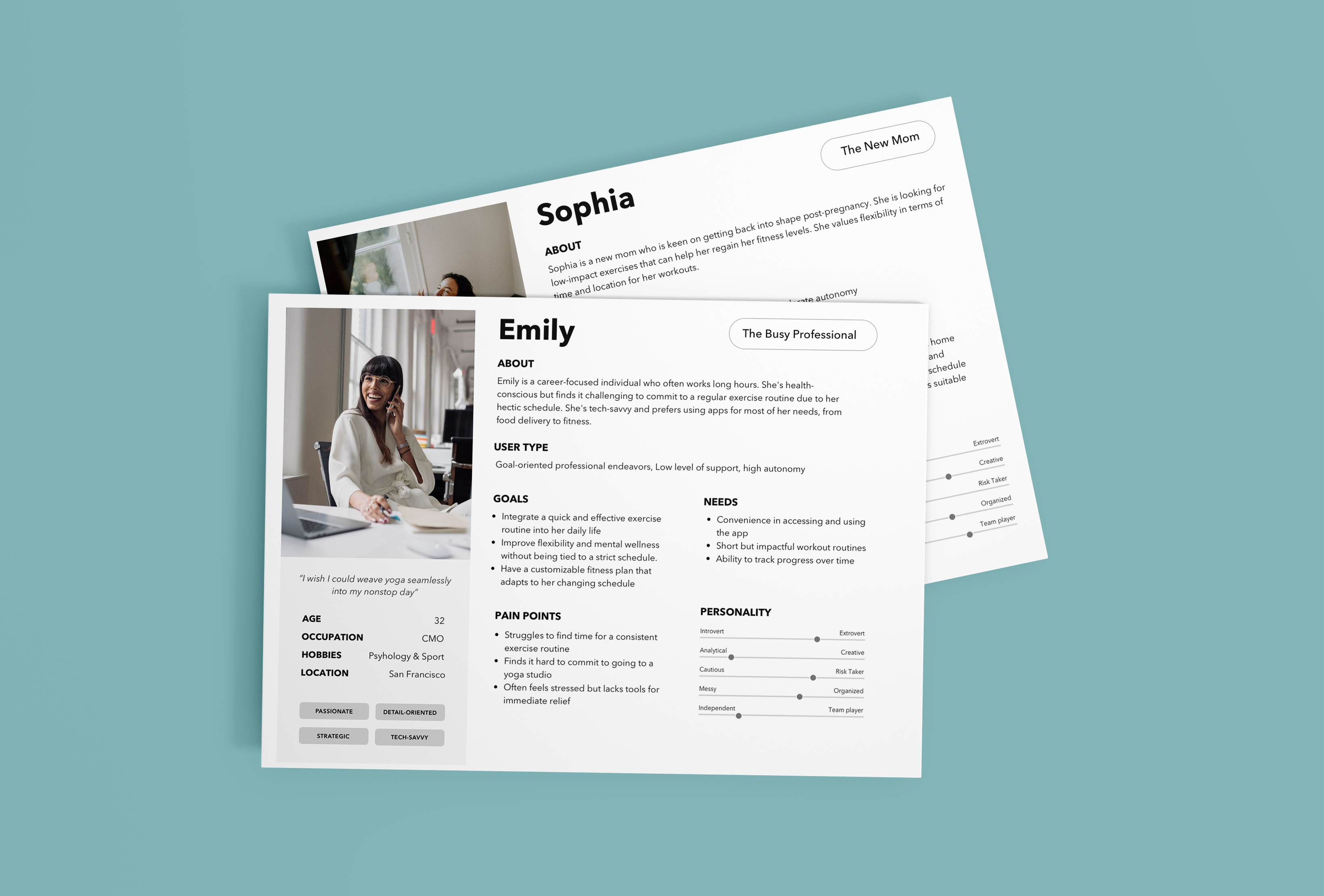
We carefully analyzed the data obtained during the Define Phase, with a focus on insights from User Interviews. After collating and categorizing these key findings—especially those related to user challenges—we developed two key personas. These personas represented two distinct user categories: novice yoga learners "The New Mom," and advanced yoga practitioners "The Busy Professional."
Competitive Analysis
Next, we carried out a comprehensive competitor analysis to better understand our market positioning. Our primary competitors consisted of well-known yoga applications, while our secondary competitors included offline yoga studios, YouTube channels, and the growing number of Skype / Zoom classes.
The service experience is made up of the customer’s interactions with many touchpoints, and service quality can be defined by how well the touchpoints work together for the customer.

Starting the design
Low-Fidelity Wireframes
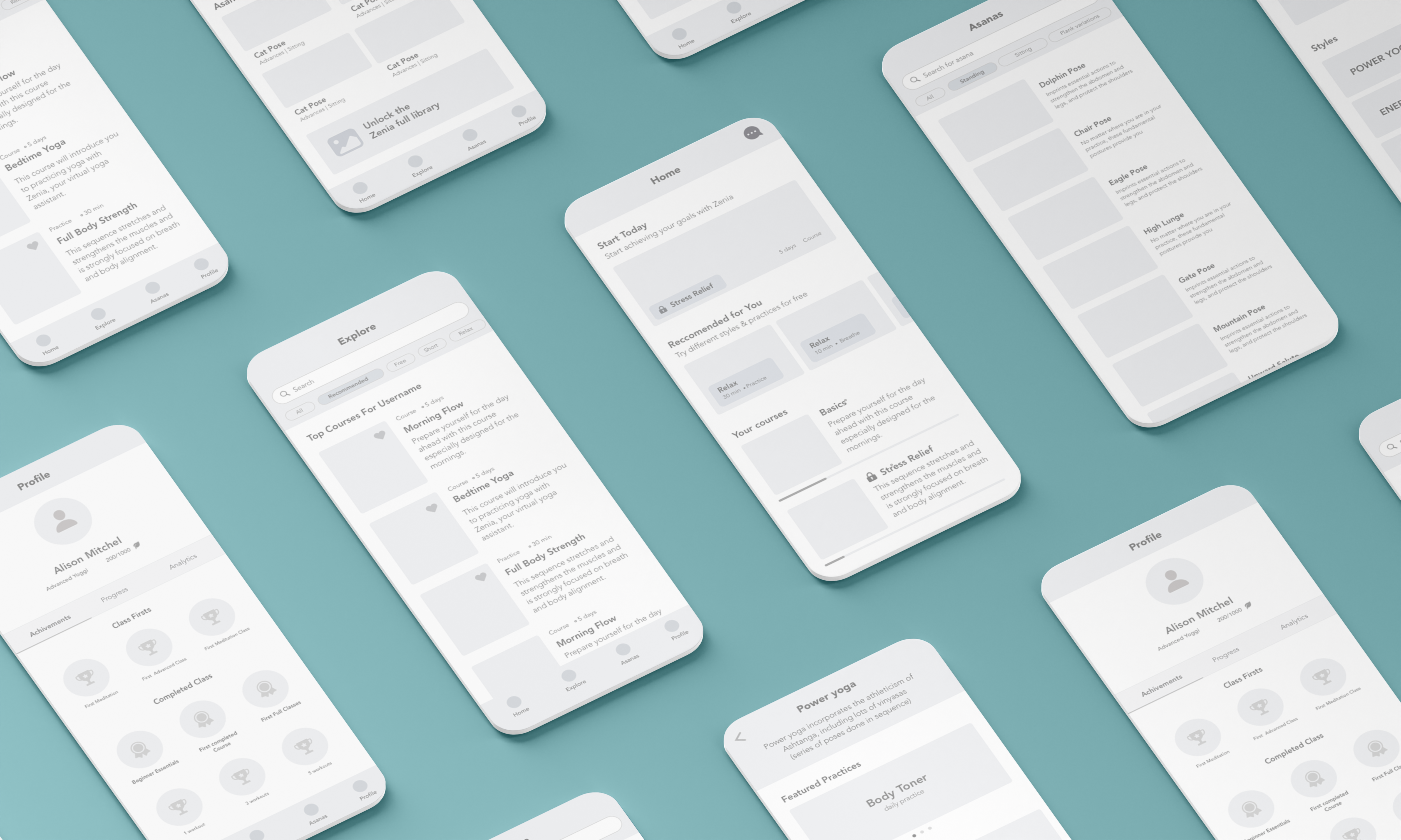
Leveraging key insights from our user research and customer feedback, we crafted a set of foundational design principles. With these in place, I turned my focus to shaping the Information Architecture and developing initial low-fidelity wireframes.
Usability study: findings
After creating a prototype from low-fidelity wireframes, we conducted a remote, moderated usability study for the Zenia app. We asked 10 different participants to run through various scenarios in our prototypes and complete three prompts. We then used affinity diagramming to gather observations during the usability study and synthesize the data. This approach provided us with sufficient feedback to inform our future design iterations.
4 out of 10 participants skipped the onboarding tutorial. This means that the onboarding process might not be engaging enough and should be revisited.
7 out of 10 participants expressed concern when prompted to give the app camera permissions. This means that the app may need to better communicate why camera access is necessary.
8 out of 10 participants were impressed with the new training view. This means that the new training view is generally well-received and can be utilizied.
2 out of 10 participants used the social sharing feature, but those who attempted to share on Instagram reported issues. This means that the poor integration with Instagram could be a barrier for people who do want to share their yoga experiences with others.
Challenge 1
Eliminating barriers
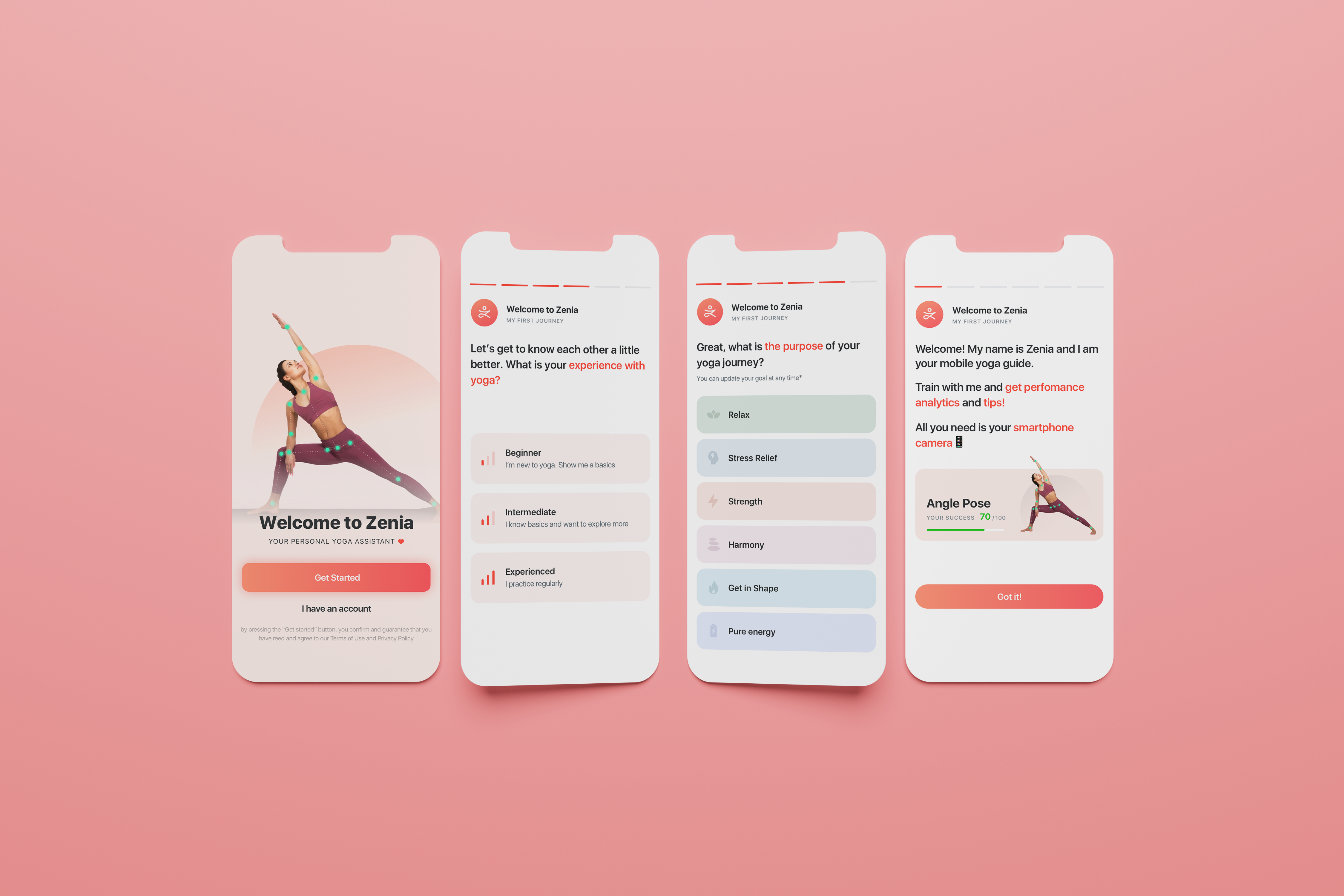
We revamped the Zenia App's onboarding flow to improve user engagement. We removed the initial sign-up screen and cut out unrelated questions, keeping only those that matter for the yoga practice. At the end of this streamlined process, users can either start their first Zenia training session immediately or schedule one for later. This update increased our registration rate by 20%.
Challenge 2
% of users who give permission to the camera
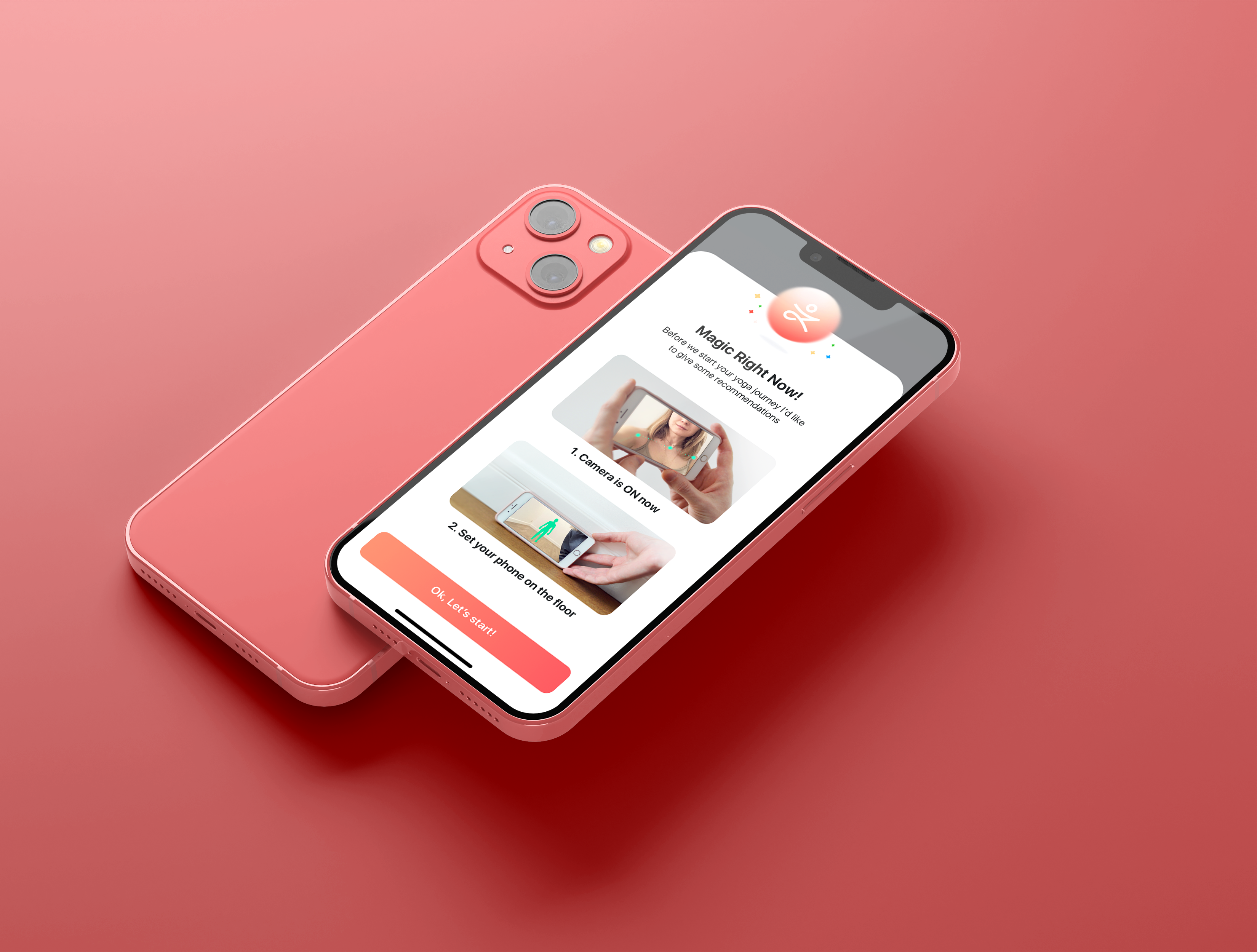
The next challenge was getting users to enable camera permissions, essential for Zenia's movement analysis. We solved this by showing users a video tutorial upfront and providing an instruction page. This approach dramatically improved our performance, boosting our camera permission rates by an impressive 80%.
Challenge 3
Yoga levels + Measuring systems
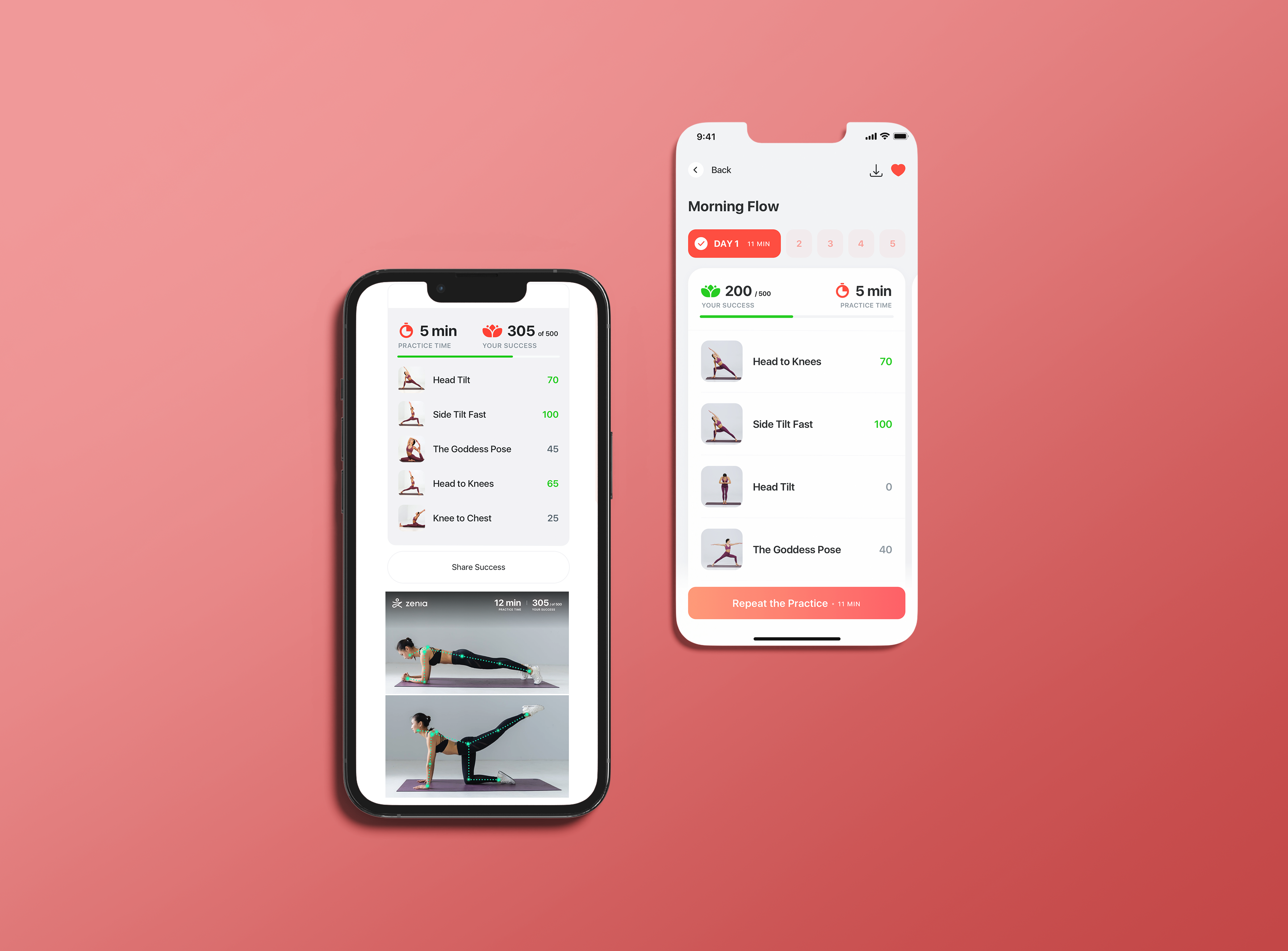
Users receive comprehensive performance statistics and an overall score for their entire practice. Our analytics revealed that this decision motivates users to stay more focused and achieve better results. As a result, after each training session, users receive a score indicating their yoga level. The introduction of performance metrics and the development of a leveling system for users led to a remarkable 30% increase in user activity.
Challenge 4
Best moments + Social Sharing
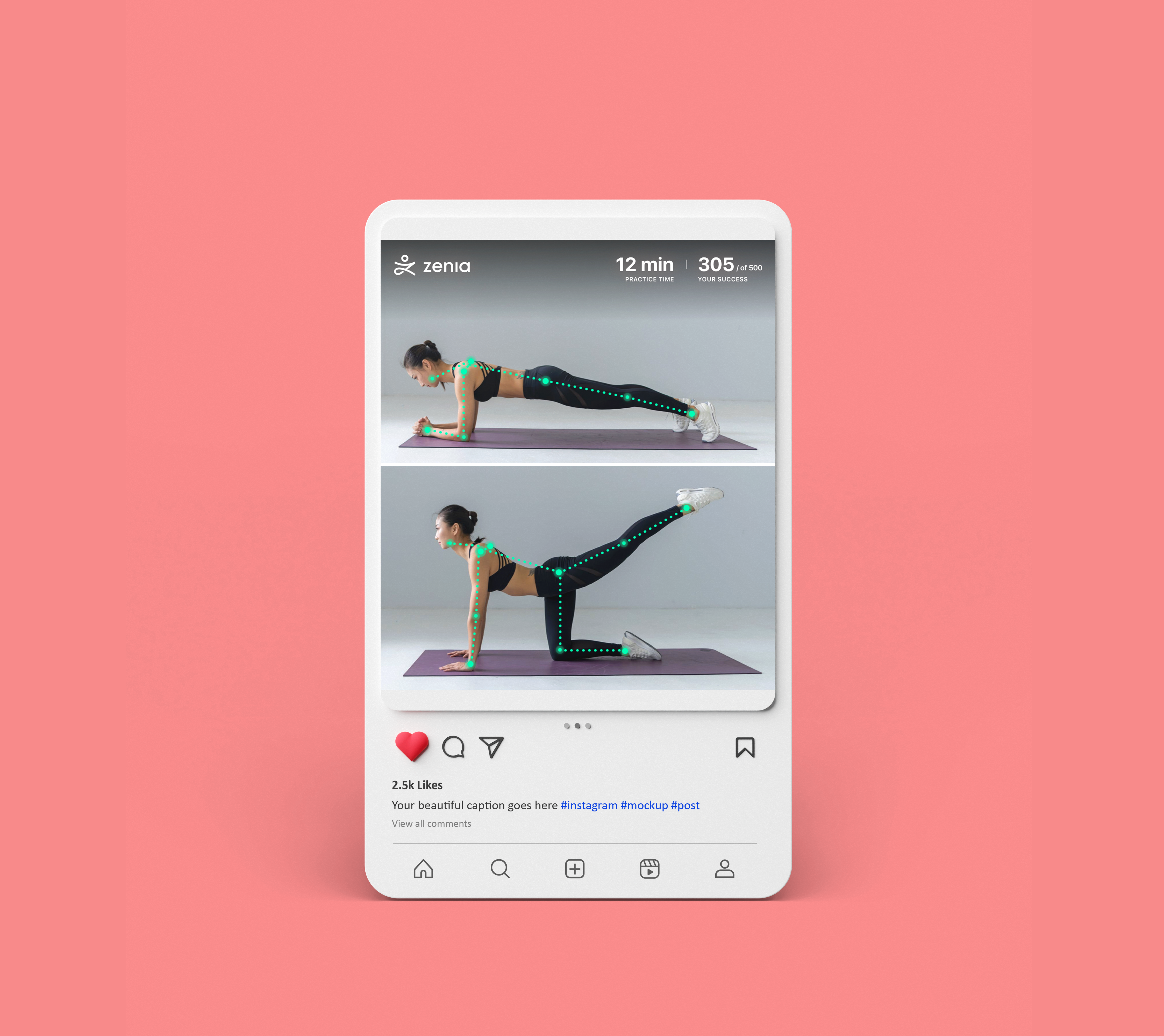
The next design solution, aimed at motivating users to train more, involved giving them the ability to share their best moments with social networks. To begin, we asked users for permission to capture photos during their practice. Once users granted this permission, they could easily share their achievements with social networks or messaging platforms.
Refining the design
Accessibility considerations
Accessibility considerations
High Contrast Mode
Offer a high-contrast mode for users with low vision or color blindness to improve readability.
Screen Reader Compatibility
Ensure that the app is compatible with screen readers like VoiceOver and TalkBack to provide audio feedback for users with visual impairments.
WCAG Compliance
Strive for compliance with Web Content Accessibility Guidelines (WCAG) to meet international accessibility standards.
Resizable Text and Elements
Allow users to resize text and interface elements to meet their specific readability requirements.
Going forward
The outcomes and results
Our user experience redesign was meticulously crafted with the aim to boost user engagement and provide an enriching training experience. The enhancements were strategically targeted to address specific business goals, fostering an environment where users felt more motivated and supported throughout their fitness journeys. The results post-launch were remarkable, reflecting the success of our UX strategies:
+24%
amount of training per user per day
+20%
of users who passed onboarding
+80%
% of users who give permission to the
And to top it off, we got an unexpected nod for the Golden Kitty Award from Product Hunt, which led us to win 'Product of the Year' in Health and Fitness. What a journey!

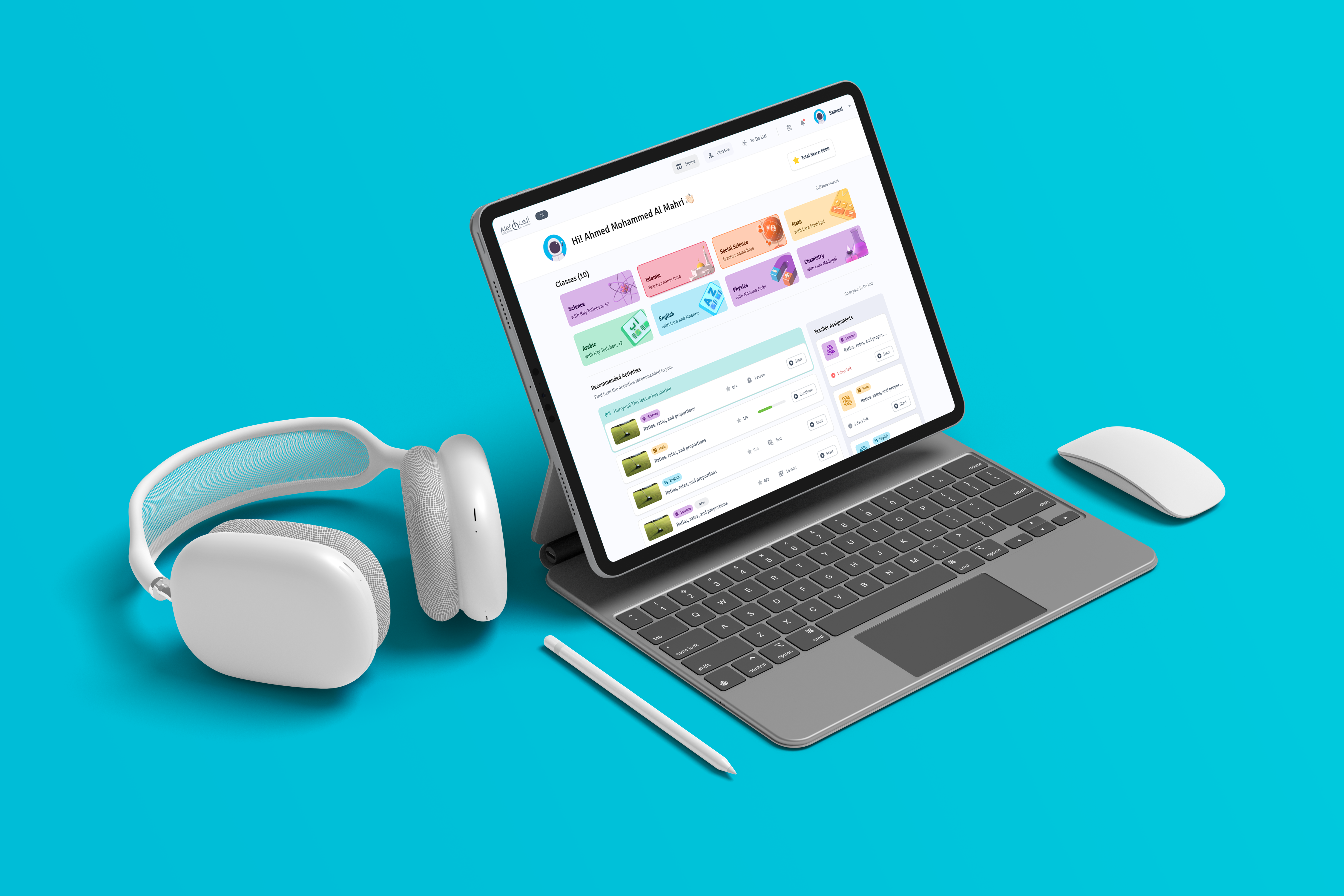
Alef EducationProduct Design | UX Research
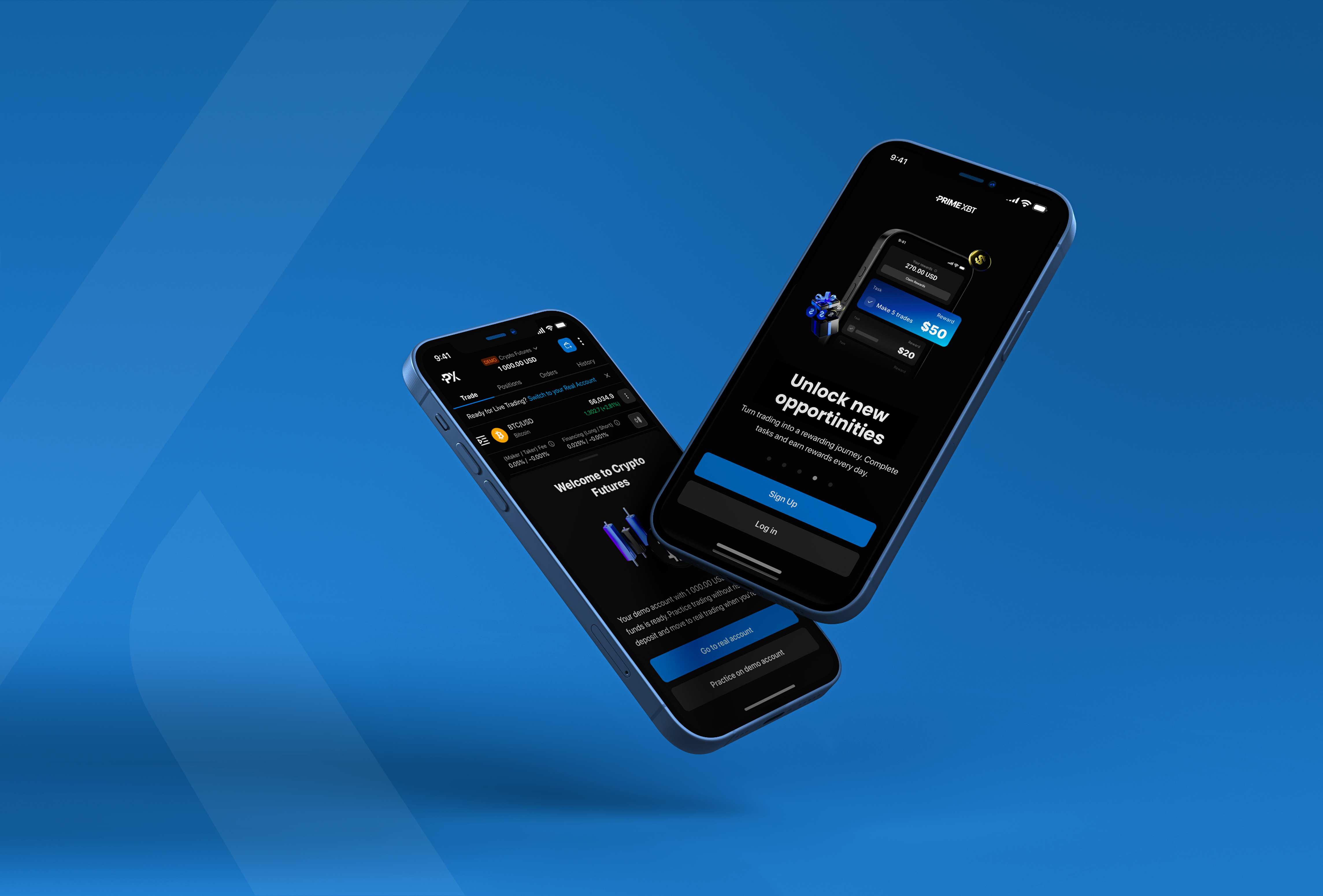
Prime XBTProduct Design | UX Strategy
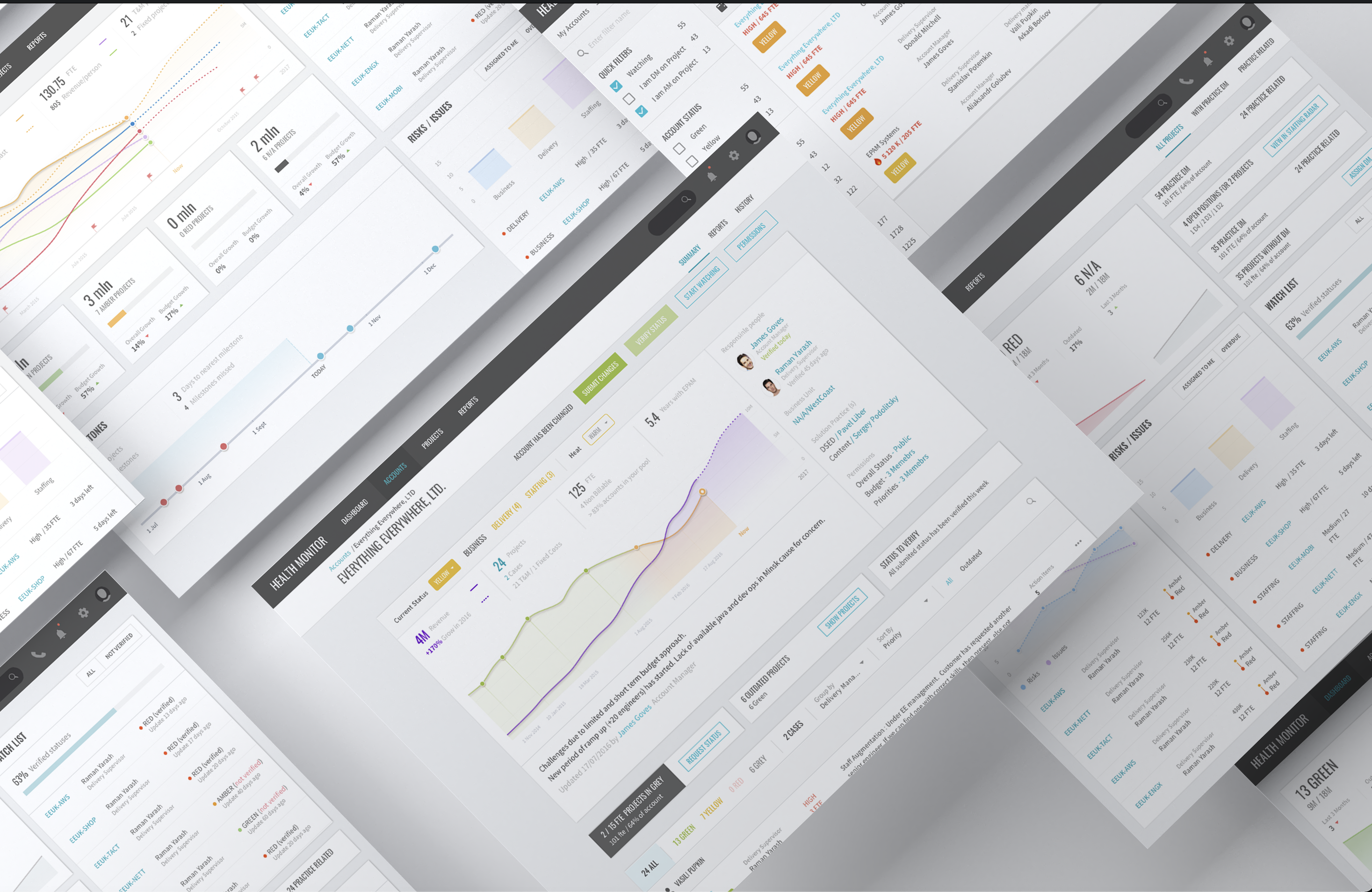
Delivery Health MonitorUX Research | Product Design
WARGAMING CARDUX Research | Product Design