100+
100+
Interviews
3
Countries
Countries
100.000+
Active Users
Project overview
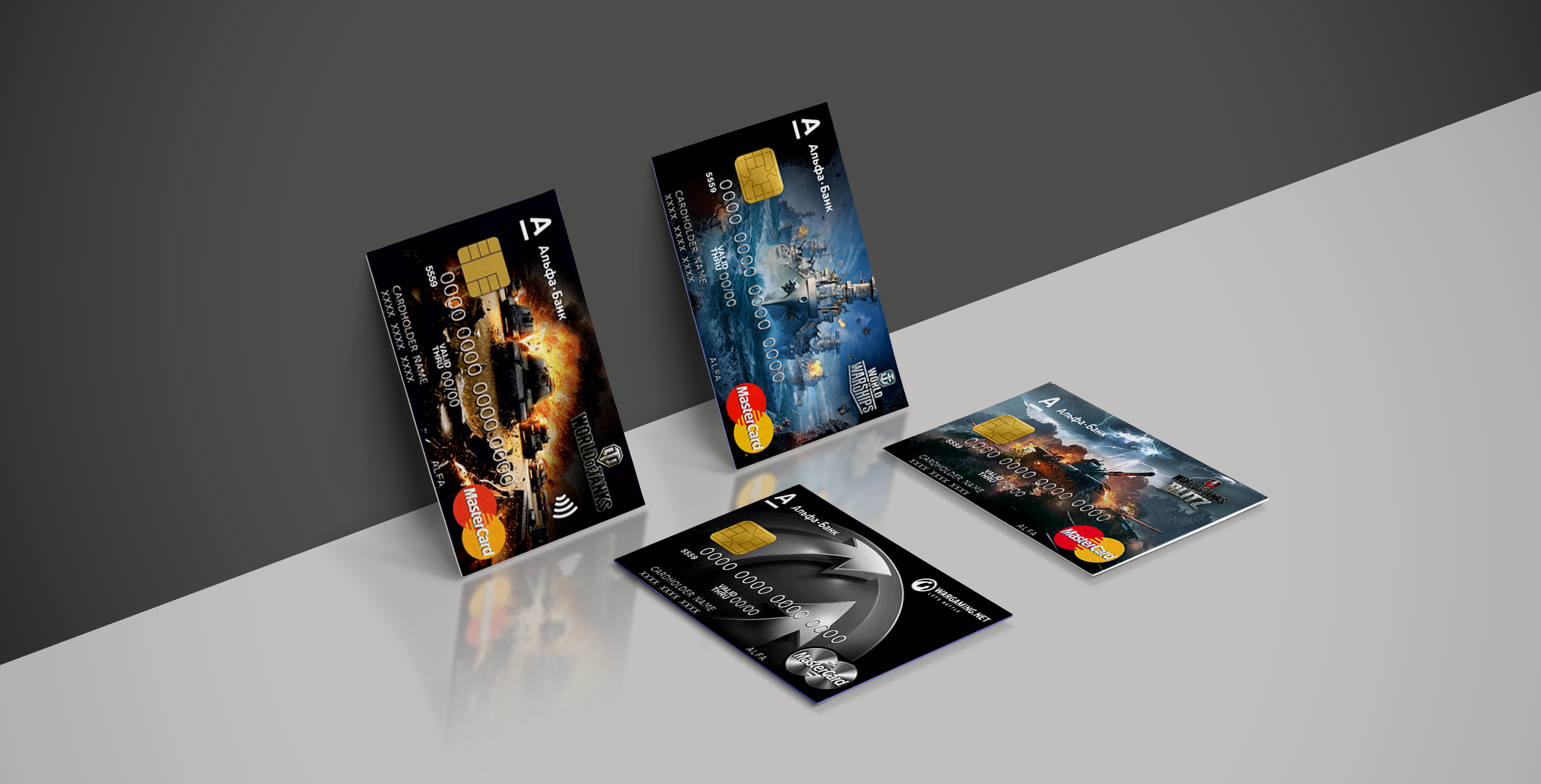
What is Wargaming Card?
Wargaming Card is a cashback card issued by a international bank. This card allows users to get back a percentage of the amount spent in rubles in a gold tokens. During working on this project I had the unique experience of conducting user research in 3 different countries, which inteiled over 100+ hours of customer interviews. As a result, we fully redesigned the existing service, launched an extremely new functional program, and increased main metrics by 20%.
My Role & Responsibilities
I was Lead UX Designer on this project. My responsibilities were to be responsible for international research, and lead customer development and product development processes. I worked closely with the Product Manager, UI designer, Business analysts, and development team.
Problem Statement
- We don't know why our players don't use our cards;
- We don’t know why cardholders stop using their cards (partly in the first months, partly afterwards);
- We don’t know what barriers the cardholders face when using Wargaming cards and so aren’t able to overcome them;
- We are not aware of the key motives of cardholders who want to use Wargaming cards.

How can we create a service that users are delighted to use?
Design Challenge
Project Goals
We have outlined the goals and objectives from multiple perspectives, to build an entire understanding of the challenges we’re facing. This provides a summary of the goals and objectives:
Research Goals
- Get qualitative background information about Wargaming Card users, their behaviors, problems, and needs;
- Systemize and map all knowledge about users to support product decisions;
- Identification and systematize Wargaming card users’ problems
Business Goals
- Increase the number of active users and LTV score;
- Reduce the outflow of users;
- Motivate users to spend more on the Wargaming Card;
- Build brand new functionality and provide the best digital experience possible.
Design Process
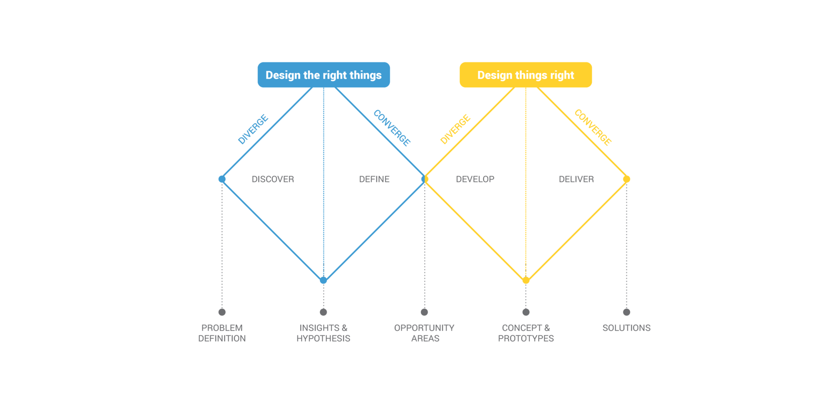
The human centred design process starts with a good understanding of people and the needs that the design is intended to meet. We were using the Double Diamond process, originally released by the British Design Council. I like this framework for its structure, clarity and dynamics. The two diamonds represent a process of exploring an issue more widely or deeply (convergent thinking) and then taking focused action (convergent thinking).
Phase 1. DISCOVER
Research Methods
- UX Audit
- Market Research Analysis
- Customer Journey Mapping
- Customer Interviews
- Quantitative Surveys
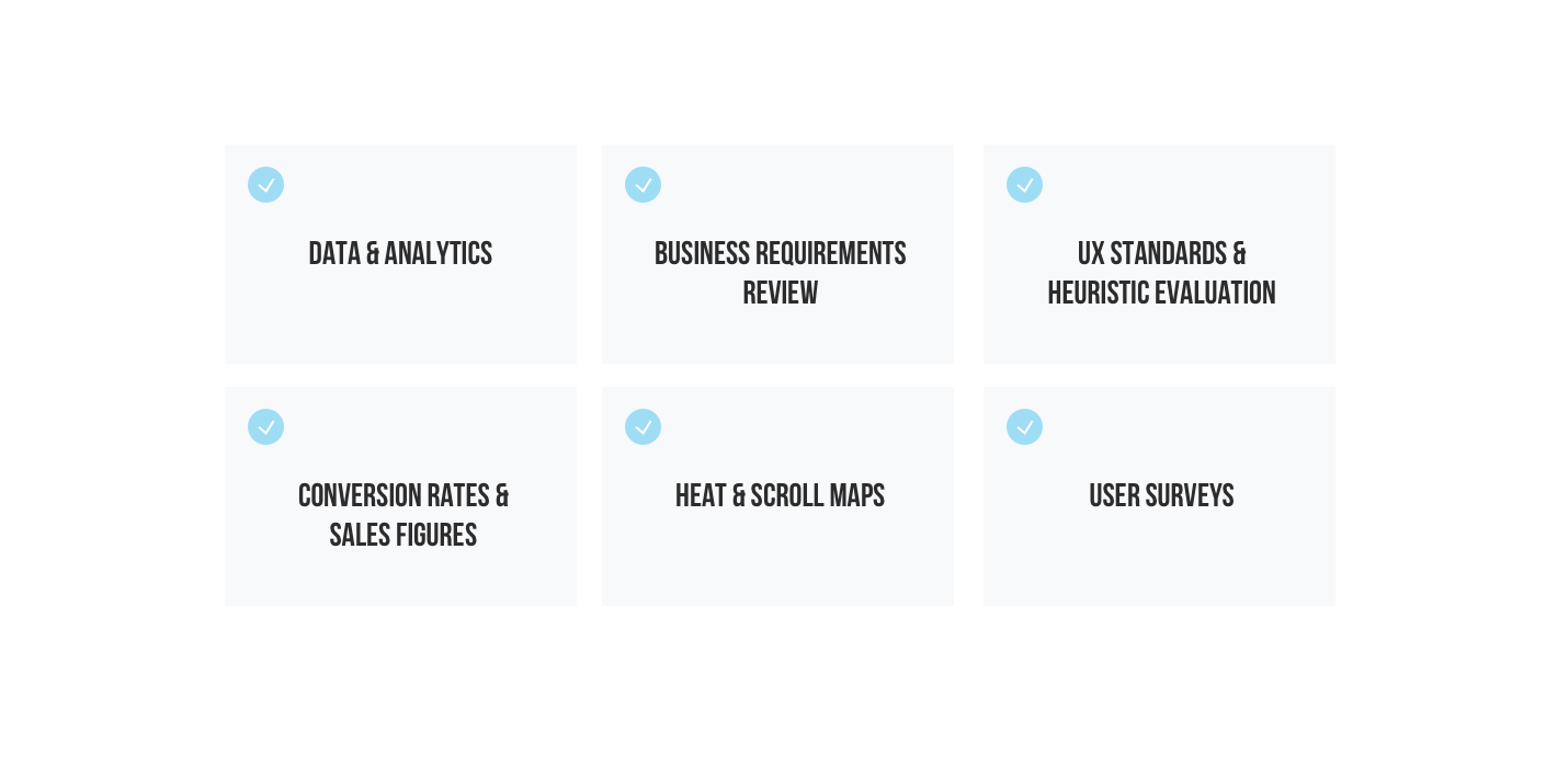
UX Audit / Usability Testing
What Happens During a UX Audit? First, the big questions. During our UX audit, we used a variety of methods, tools and metrics to analyse where a product is going wrong (or right):
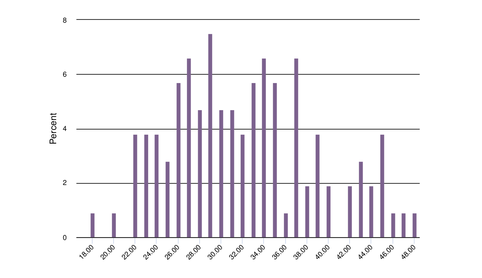
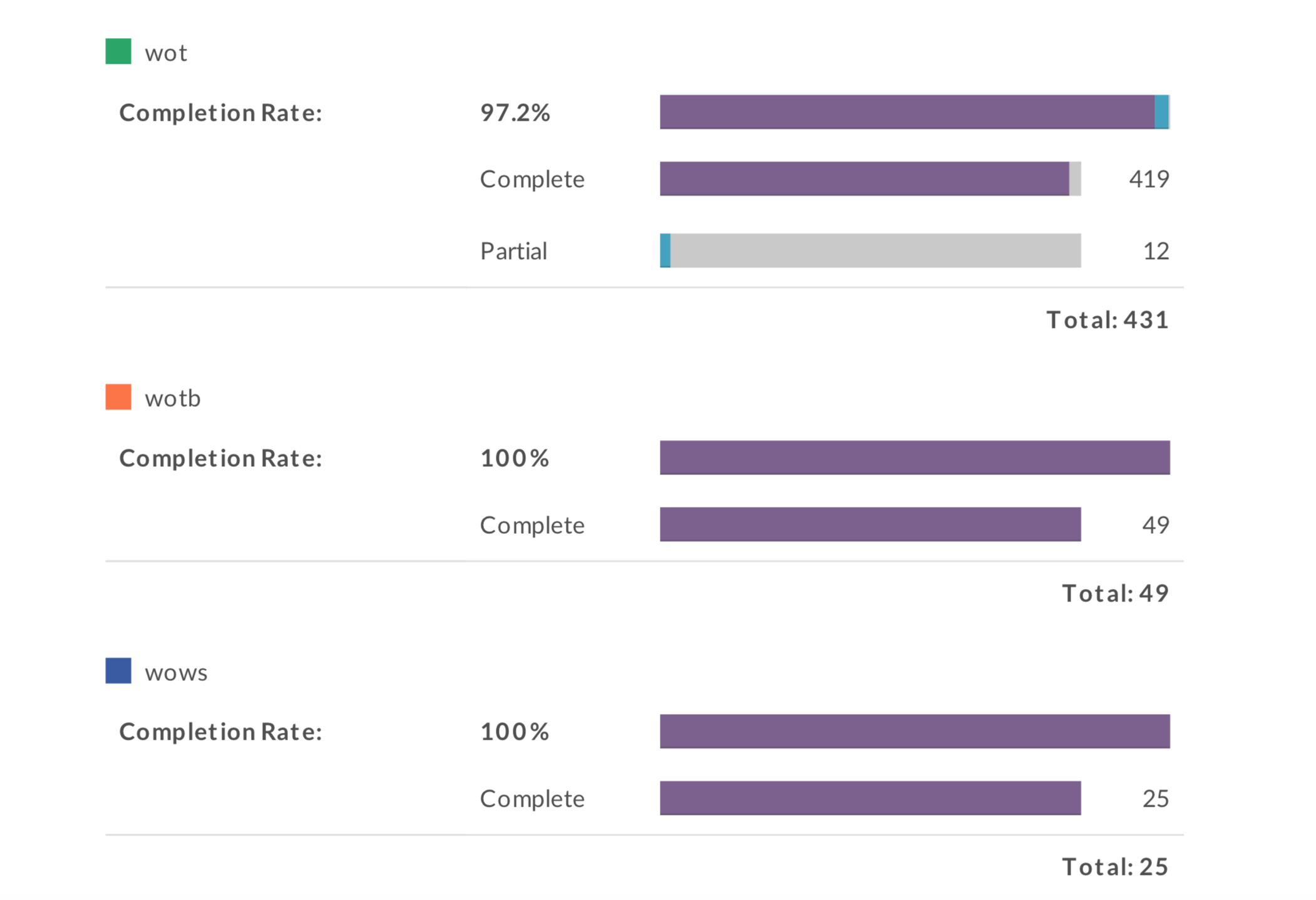
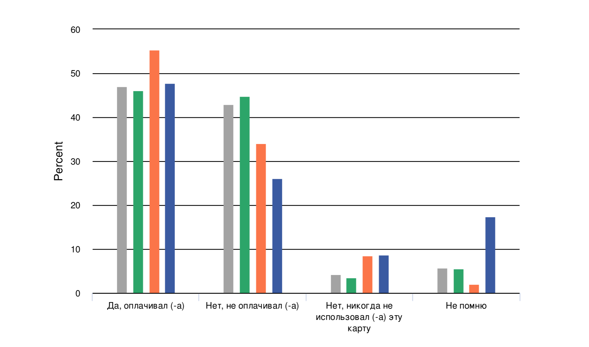
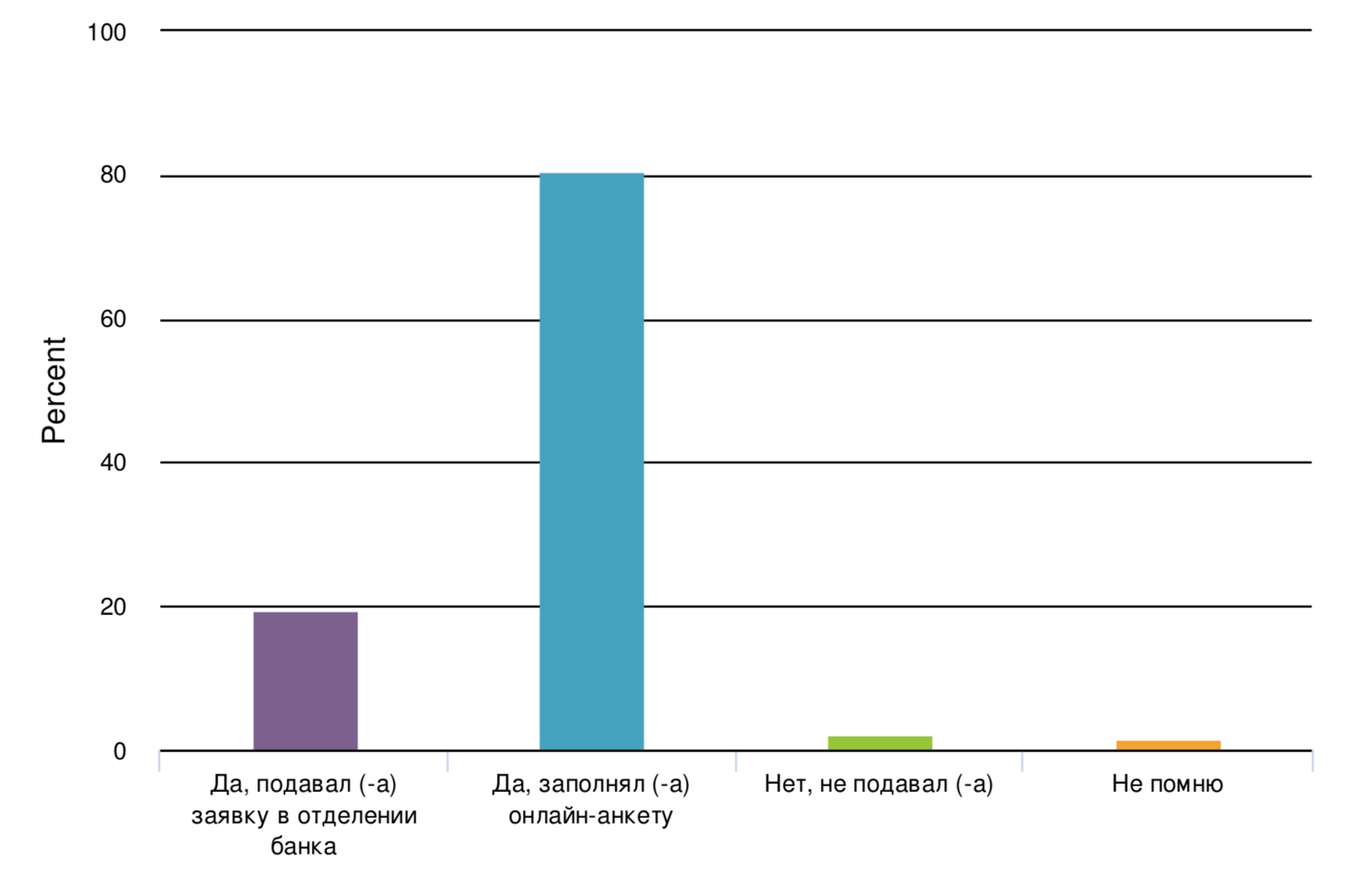
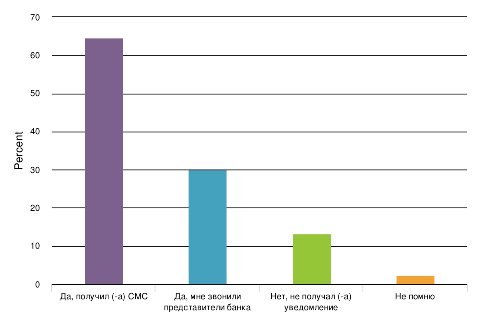
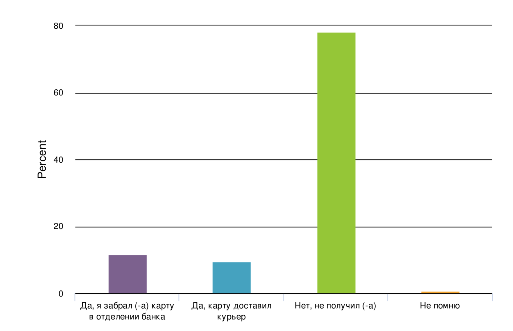
Quantitative surveys
Quantitative data is designed to collect cold, hard facts. Numbers. What is this data useful for? Understanding the bigger picture and providing statistics that can help to inform the direction of your project.
Being your users
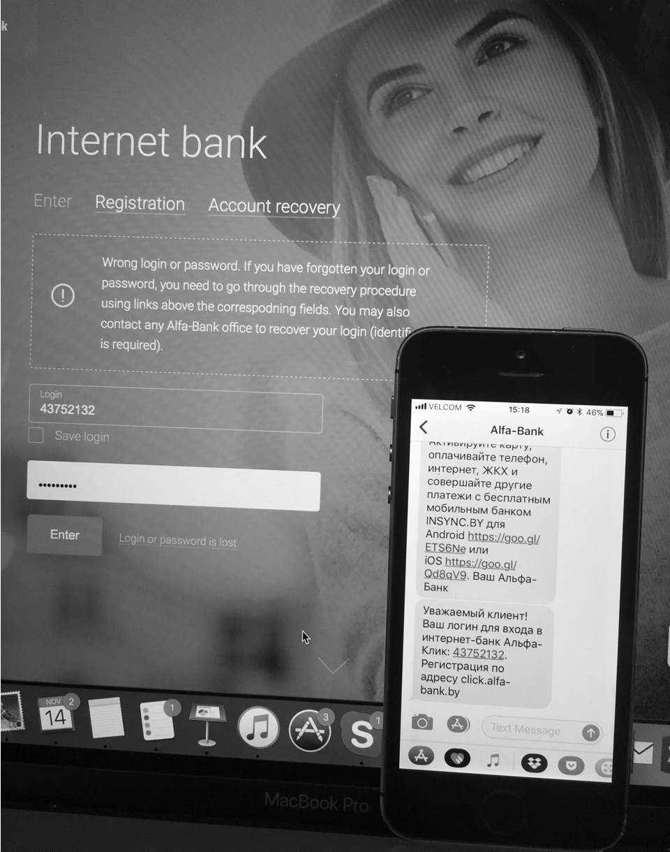
We stepped into customers’ shoes and tried to complete all the steps by ourselves. We carried out the tasks that they would do, in the environments where they would do them. The photo below shows how we were trying to complete the registration process on the site =)
2. DEFINE
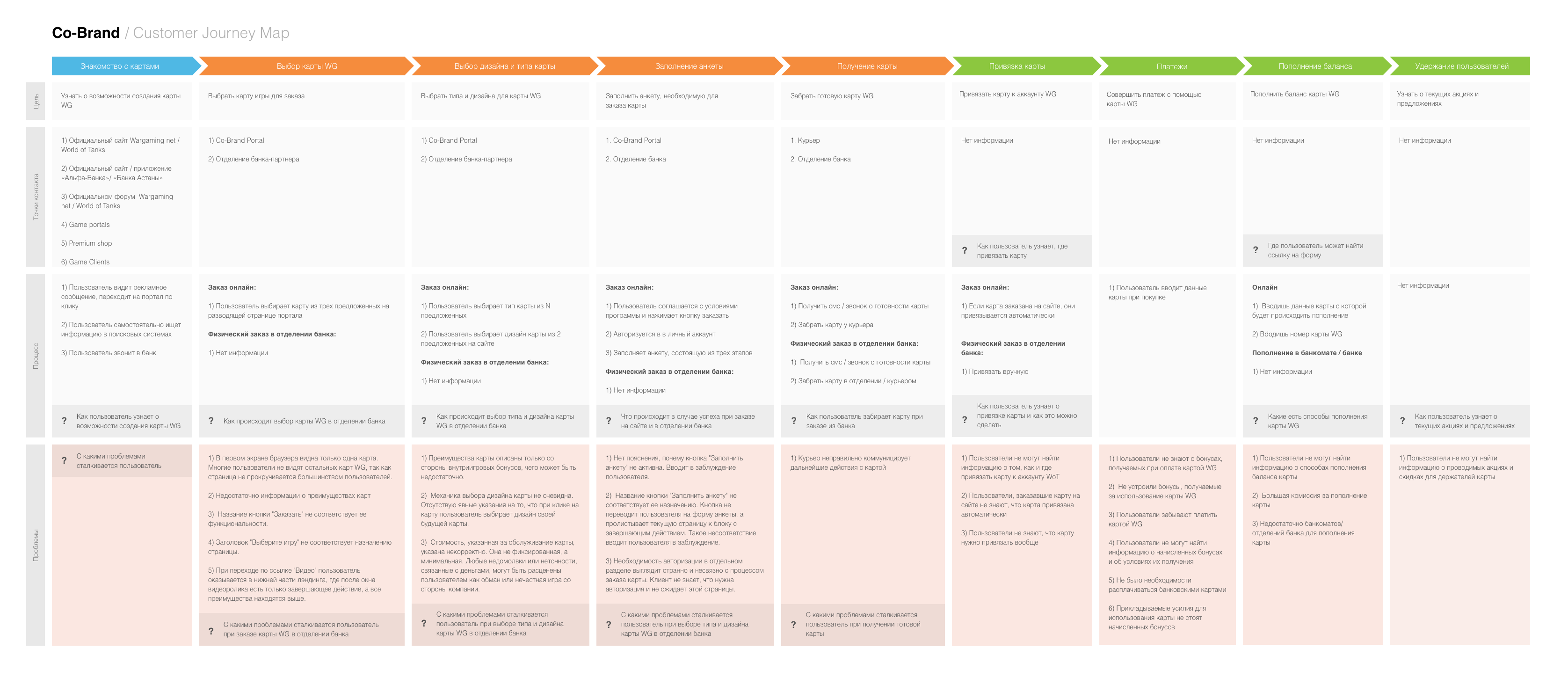
Customer Journey Mapping
Mapping is one of the best ways to identify the changing contexts of a customer’s interactions with the company over time. It brings us an understanding of what customers are feeling, thinking, and doing at any given point in time when they are interacting with a service, and recognition of how that changes.
Workshop with our stakeholders
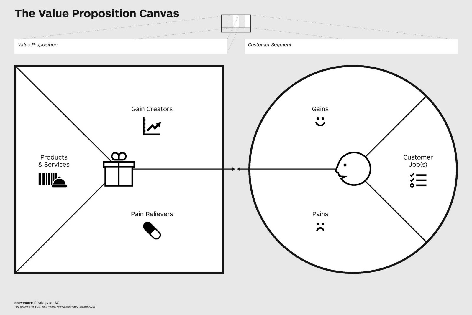
We organised a workshop with moderated, mixed groups of different stakeholders. During this workshop, we were working on customer profiles (first part of The Value Proposition Canvas). This kind of research involves clients in the design process early on, which should make it easier to explain your design solutions later in the project.
User Interviews
User interviews are a key activity for understanding the pain points, mindset, tasks, and motivations of the user group. Interviews are the fastest, cheapest way to learn more about what your customers are doing and which problems they’re facing.
Key focus areas
- It is not clear, at which stages users quit the process of getting and activating the card and why they do it;
- We do not know why our clients discontinue using the card. Some of them quit during the first months of use, while others quit later;
- We are not aware of barriers (that we can eliminate) the clients face when using the card;
- We do not know what mainly encourages clients to use co-brand payment cards;
- We do not understand the specifics of using and maintaining the services in different regions of the country.
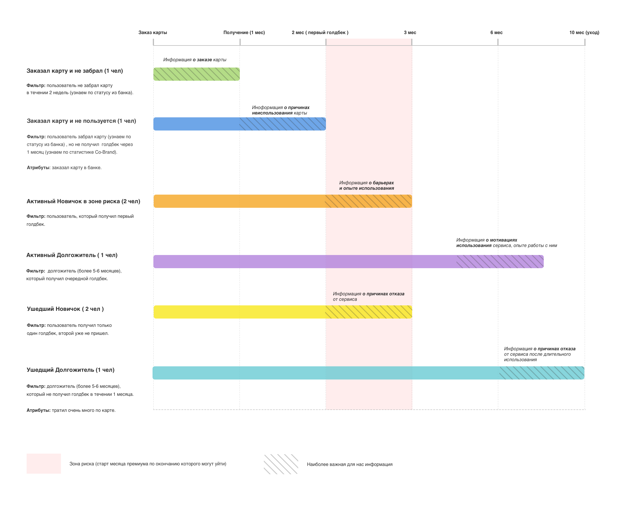
Participants
We defined a target audience based on our goals and problem areas. This is the most important part because the wrong target will definitely lead to failure.
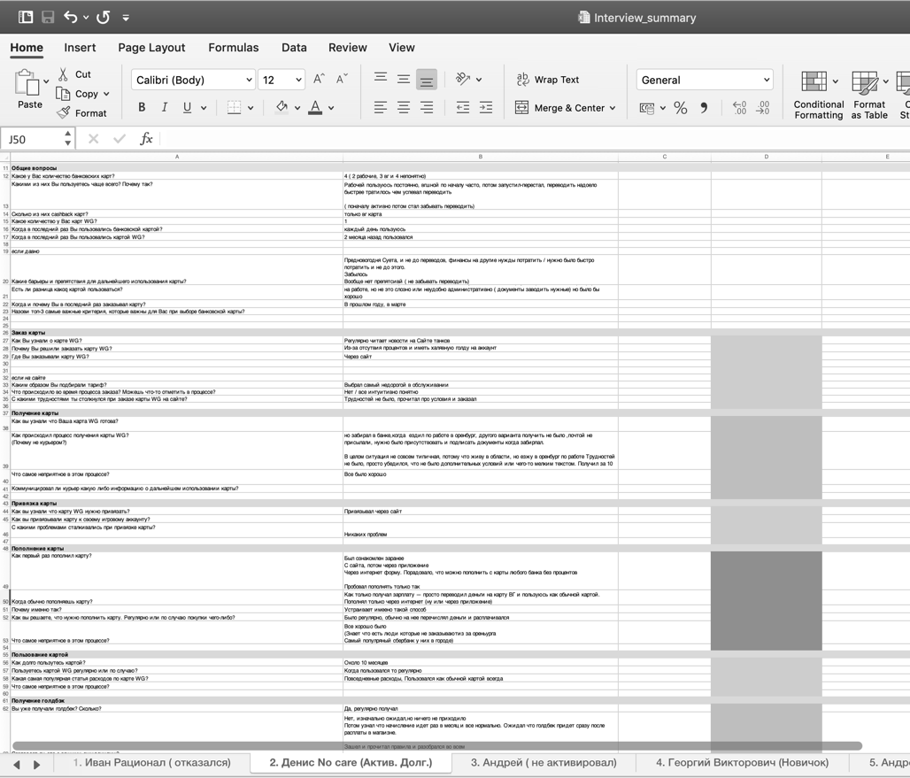
Interview script
The next step was designing questions for the interview and creating a script.During this stage of the research, I conducted over 100+ interviews with users from Russia, Ukraine, and Belarus.
3. Develop
Personas
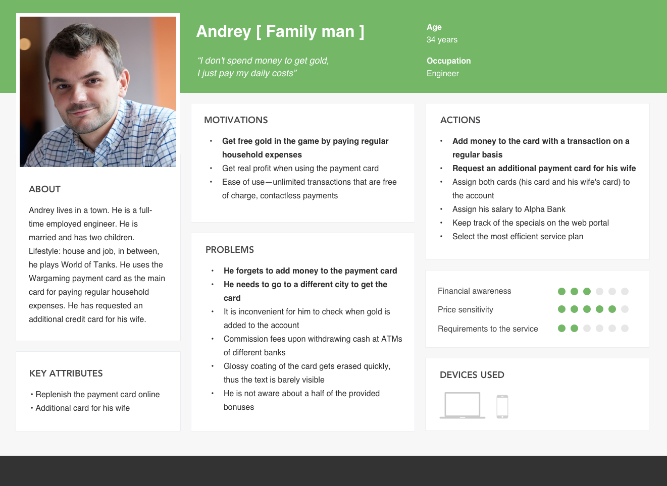
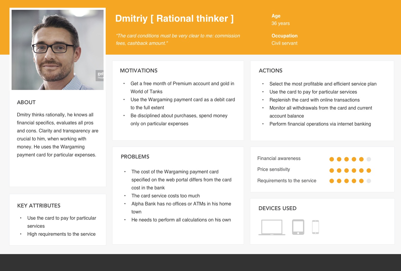
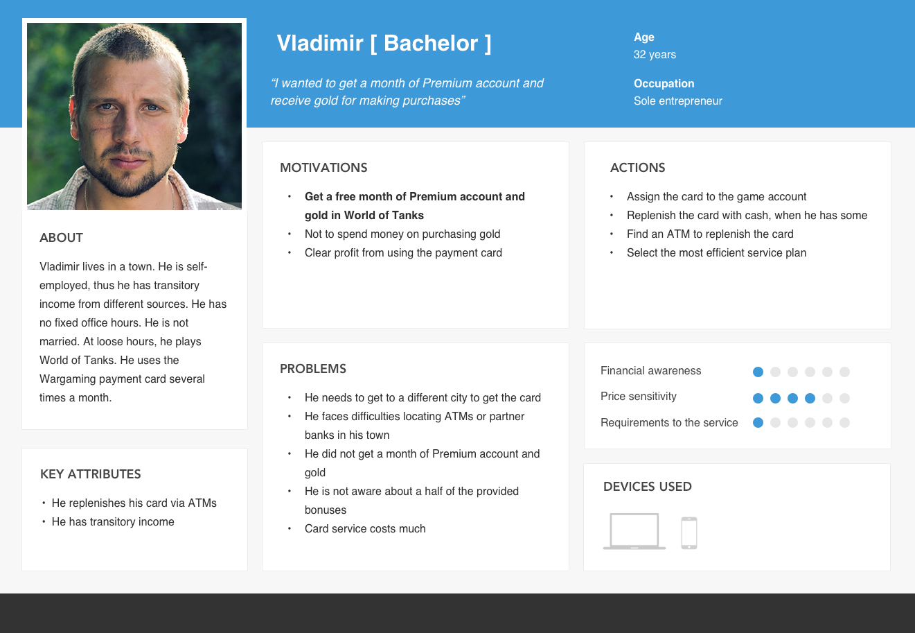
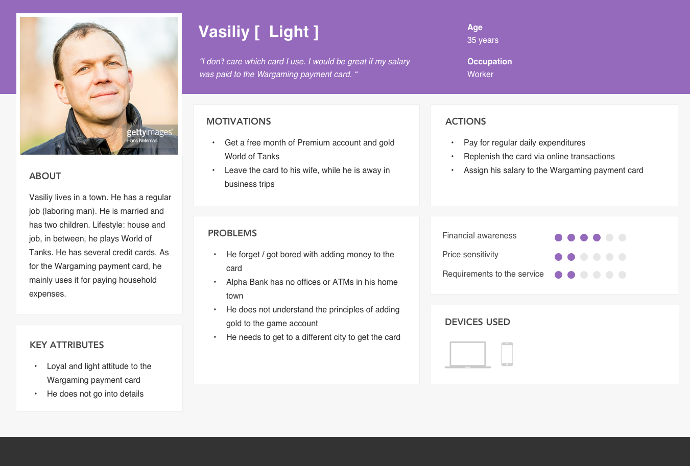
We took a closer look at our data gathered in Define Phase, especially User Interviews. Synthesising our customer research and tagging our most important insights, mainly problems, we defined 4 key personas. Those personas were rather different from the customer profiles made by our stakeholders at the workshop session.
Customer Insights
“I don't spend money to get gold, I just pay my daily costs”
“The card conditions must be very clear to me: commission fees, cashback amount."
“I wanted to get a month of Premium account and receive gold for making purchases”
“I don't care which card I use. It would be great if my salary was paid to the Wargaming payment card.”
Service Experience
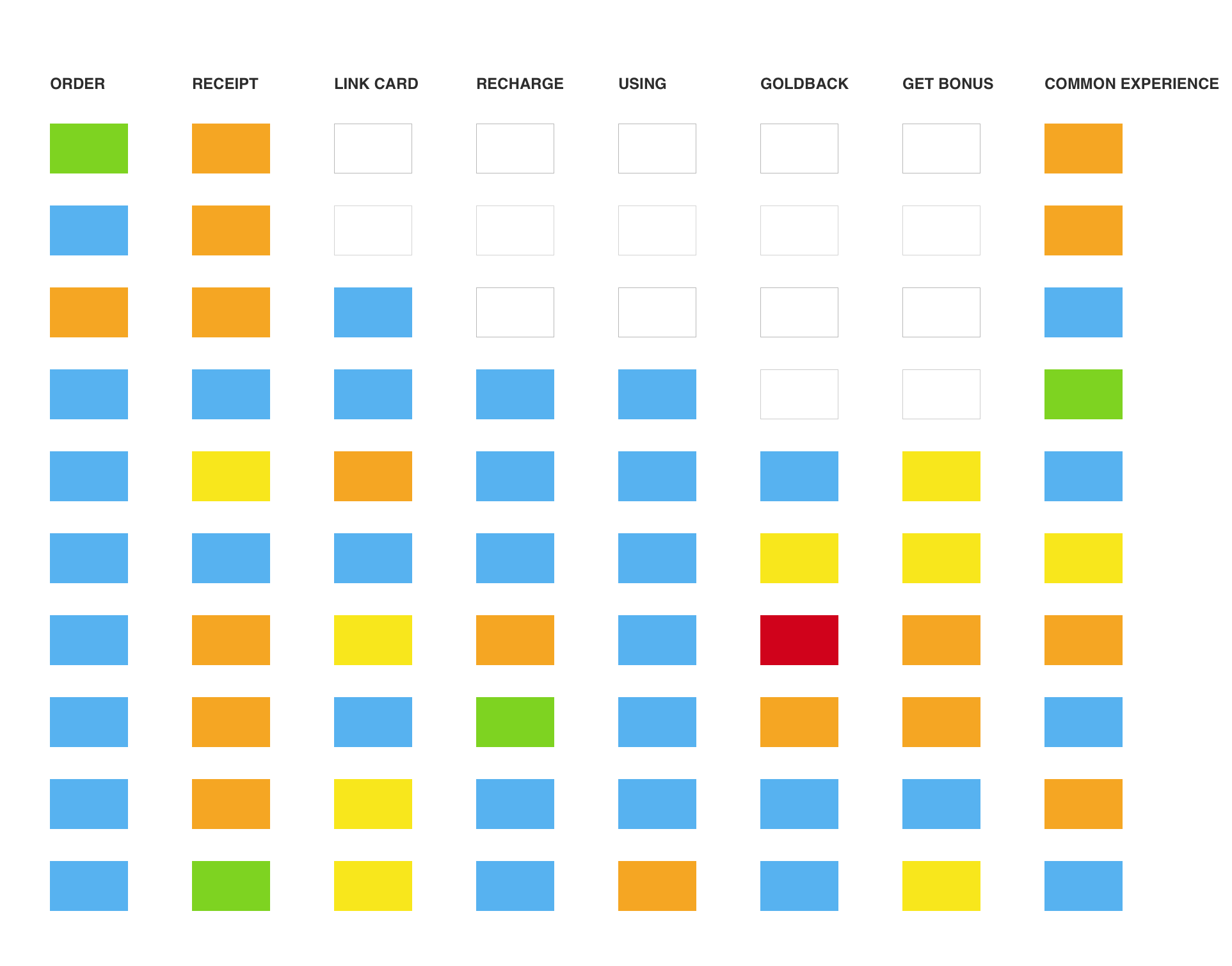
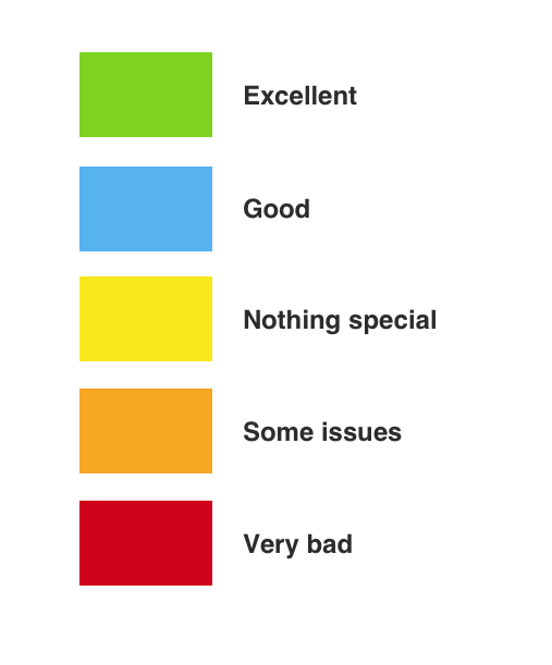
The service experience is made up of the customer’s interactions with many touchpoints, and service quality can be defined by how well the touchpoints work together for the customer.
The service experience is made up of the customer’s interactions with many touchpoints, and service quality can be defined by how well the touchpoints work together for the customer.
Information Architecture
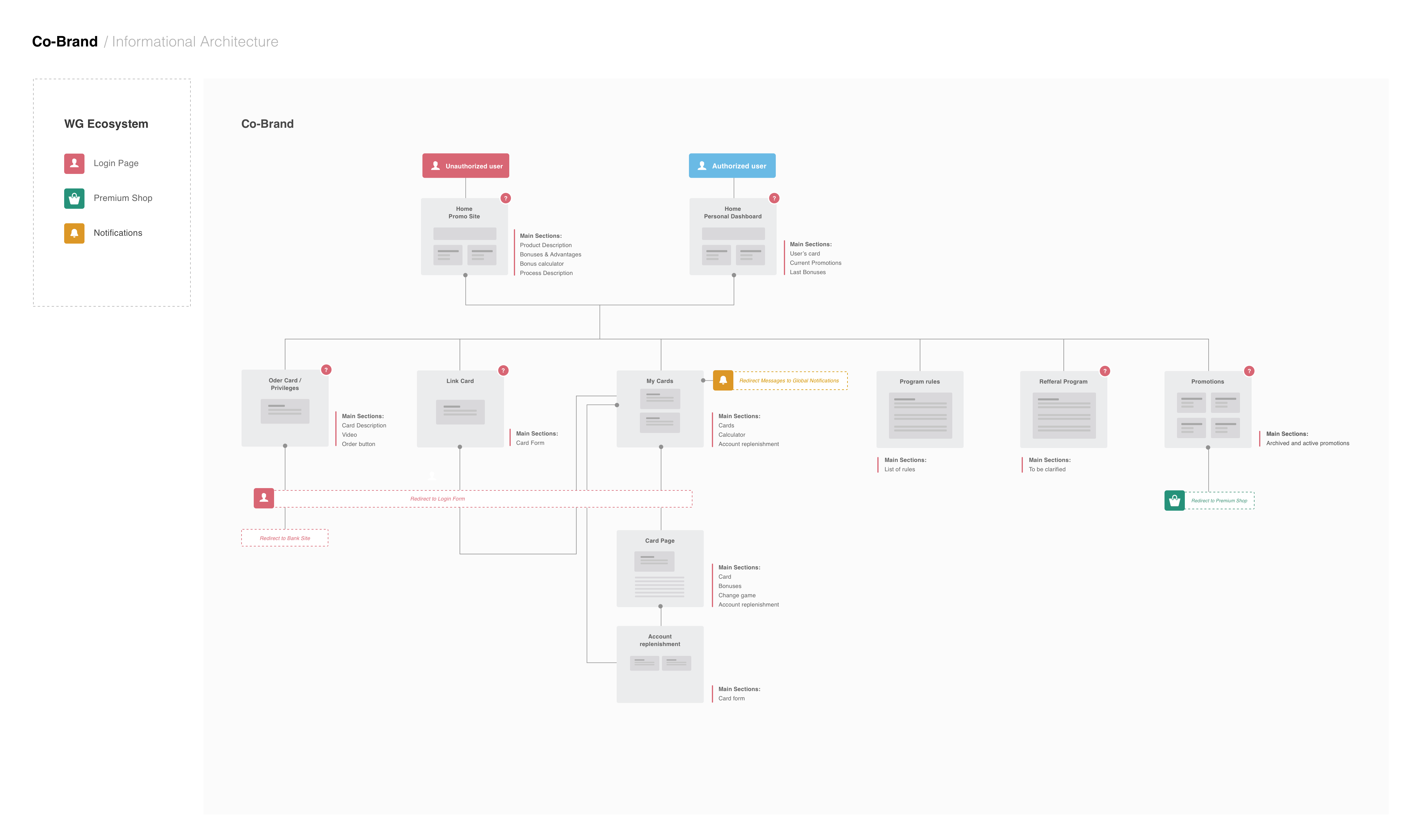
At the next step, we started working on the information architecture of our future portal. IA provides product development and engineering teams a bird’s-eye view of the entire product. Having a single document that delivers a simple and understandable representation of how the application or website works is vital for developing new features, updating existing ones, and for seeing what is possible considering the existing product.
Prototyping + Visual Design
PROTOTYPING / VISUAL DESIGN
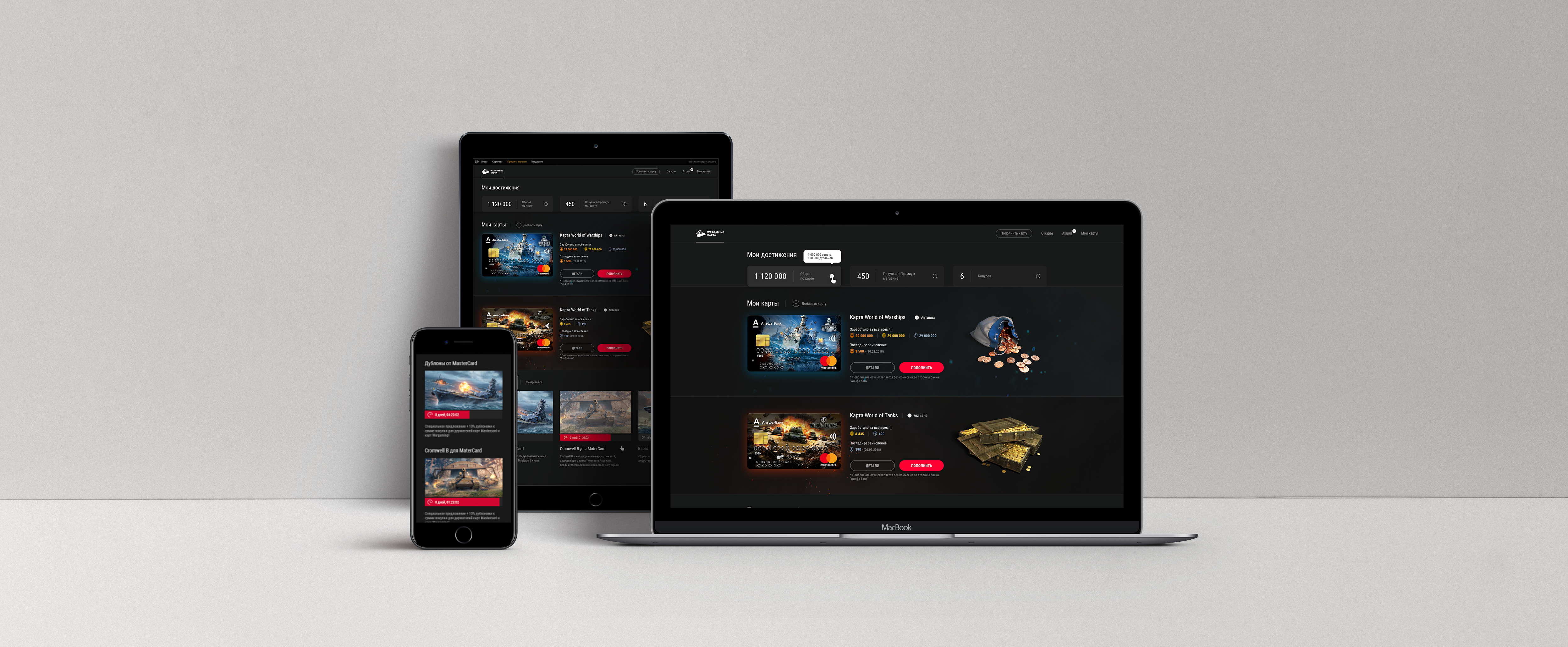
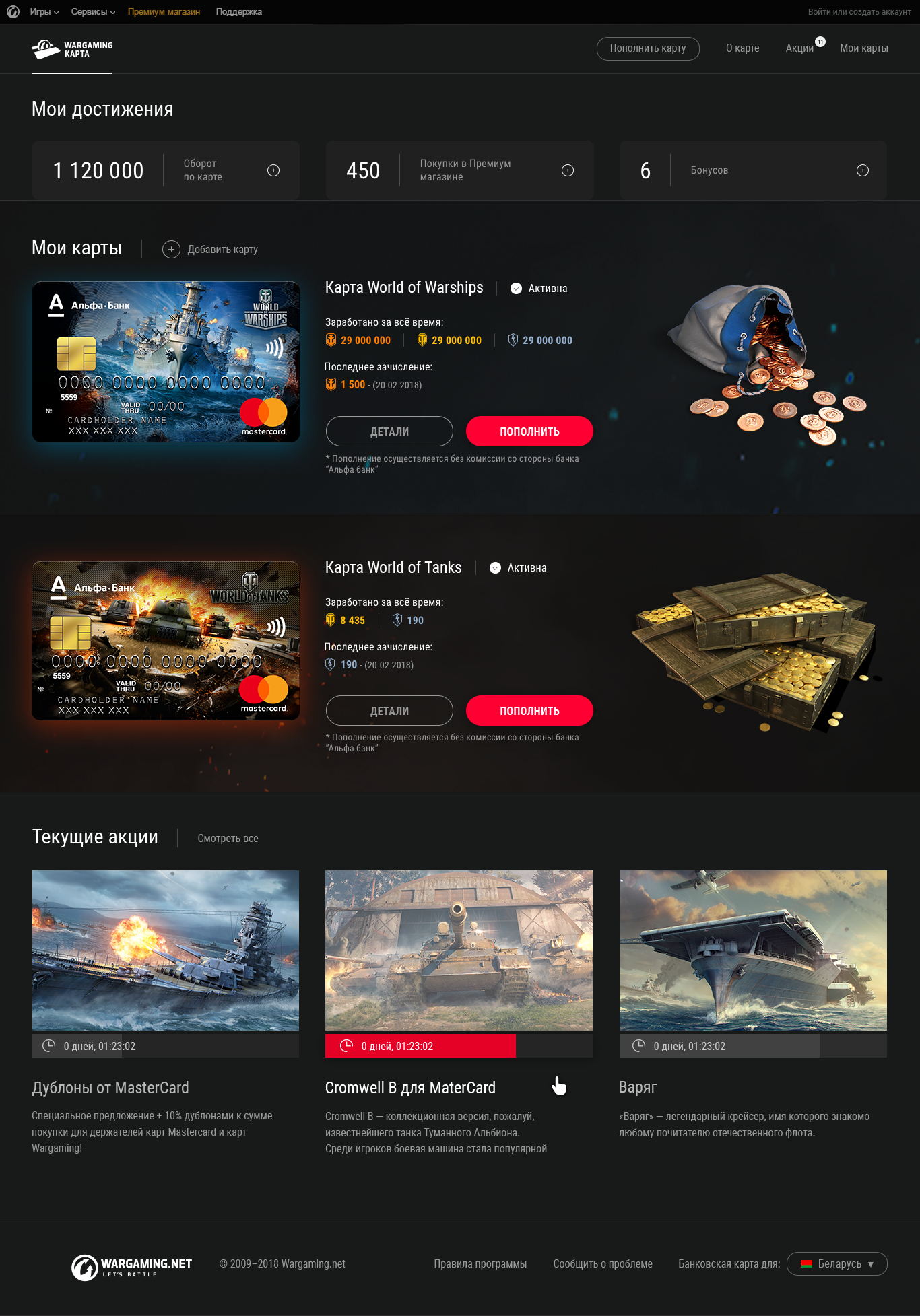
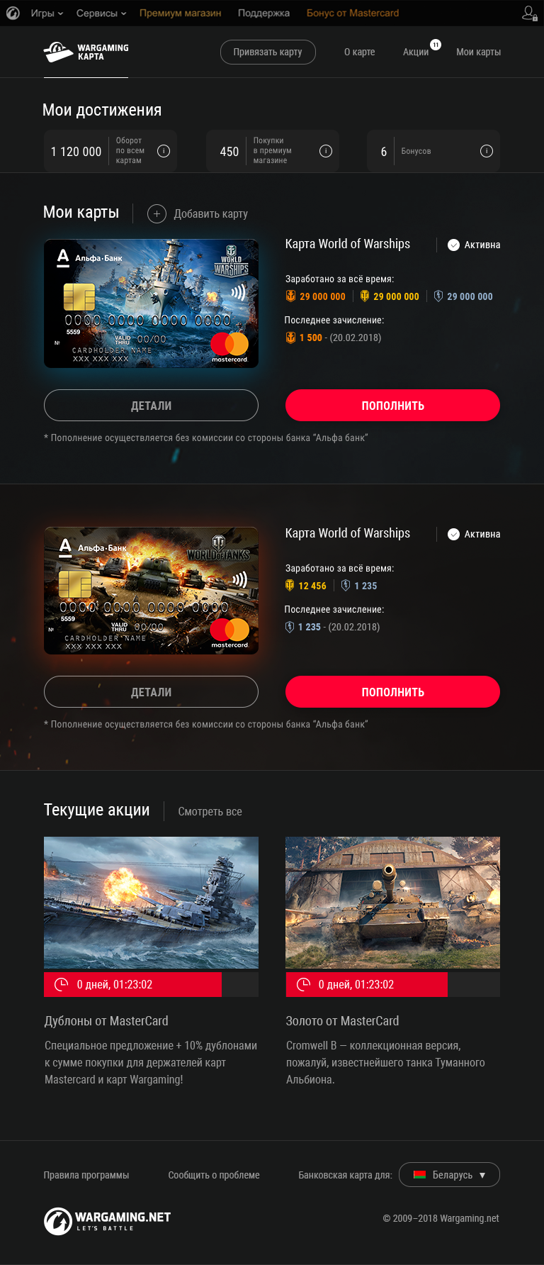
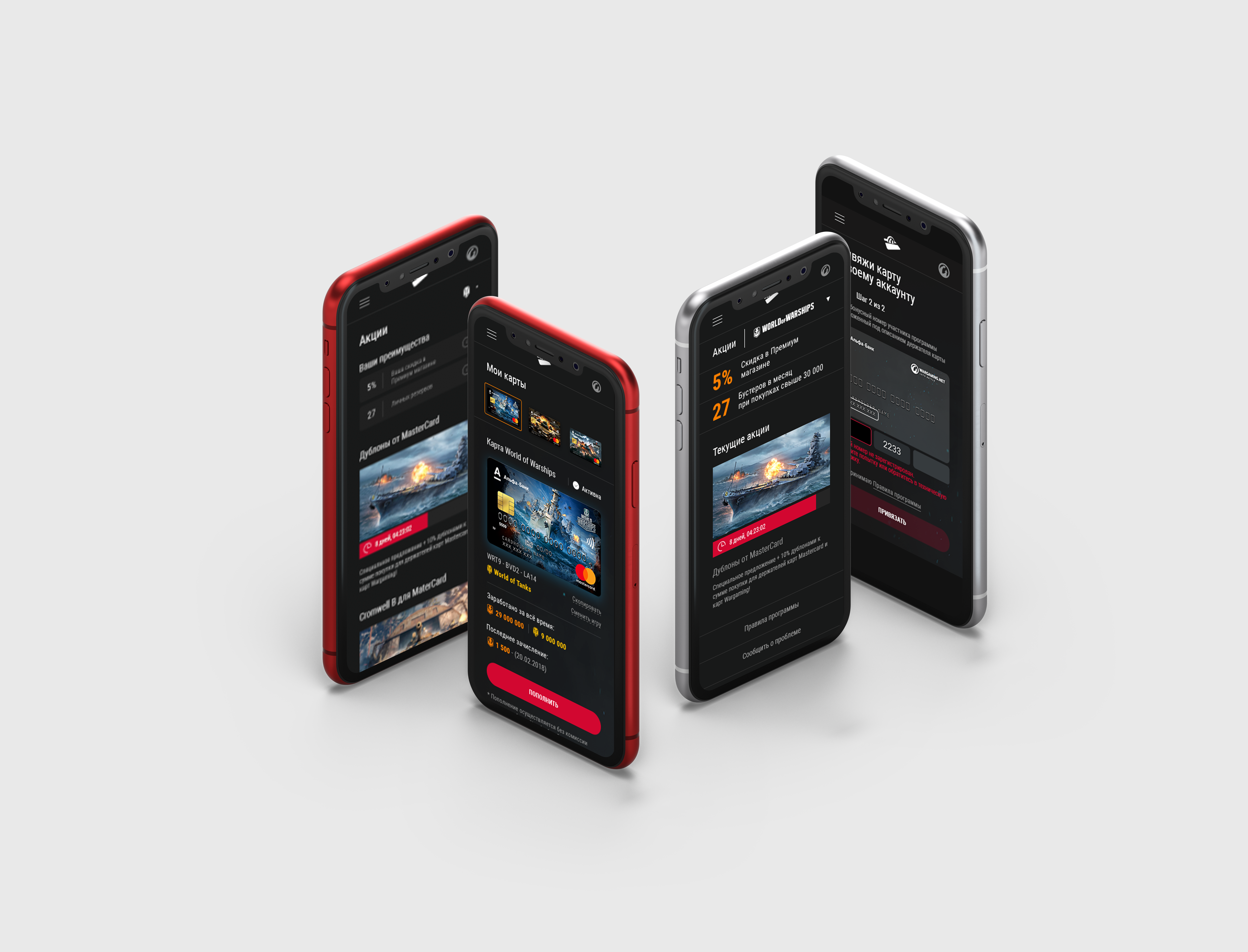
Based on the main research findings and key customer insights, we developed a list of design principles. I started working on wireframes and interactive prototypes for web, tablet, and mobile.
Desktop
Tablet
Mobile

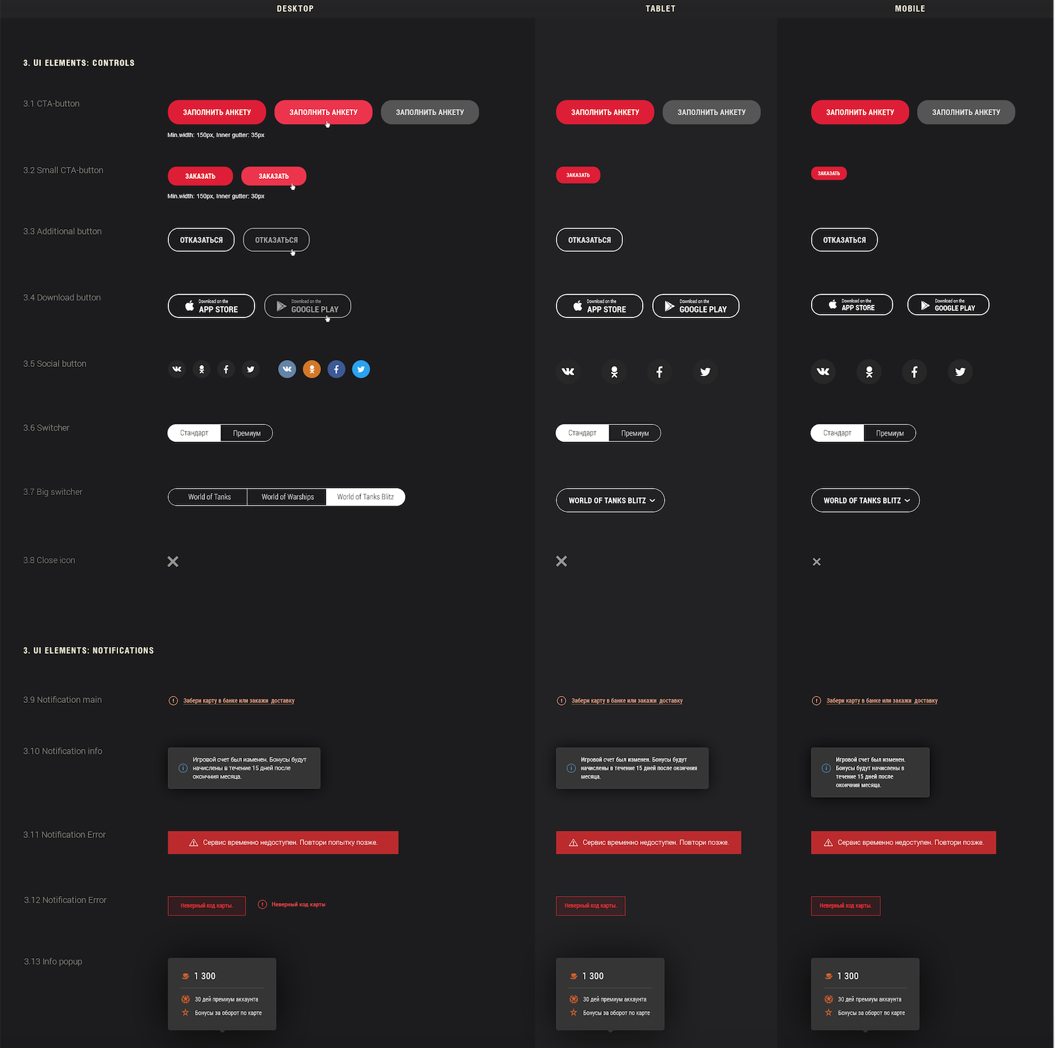
Design Guidlines / Atomic consistency
Alongside the finished interface designs, we produced a unified design system documenting all the elements, collections of rules, constraints, and principles to keep the designs as consistent and re-usable as possible. This was an important tool for the development team to use and build an understanding of.
4. Deliver
Post Analysis
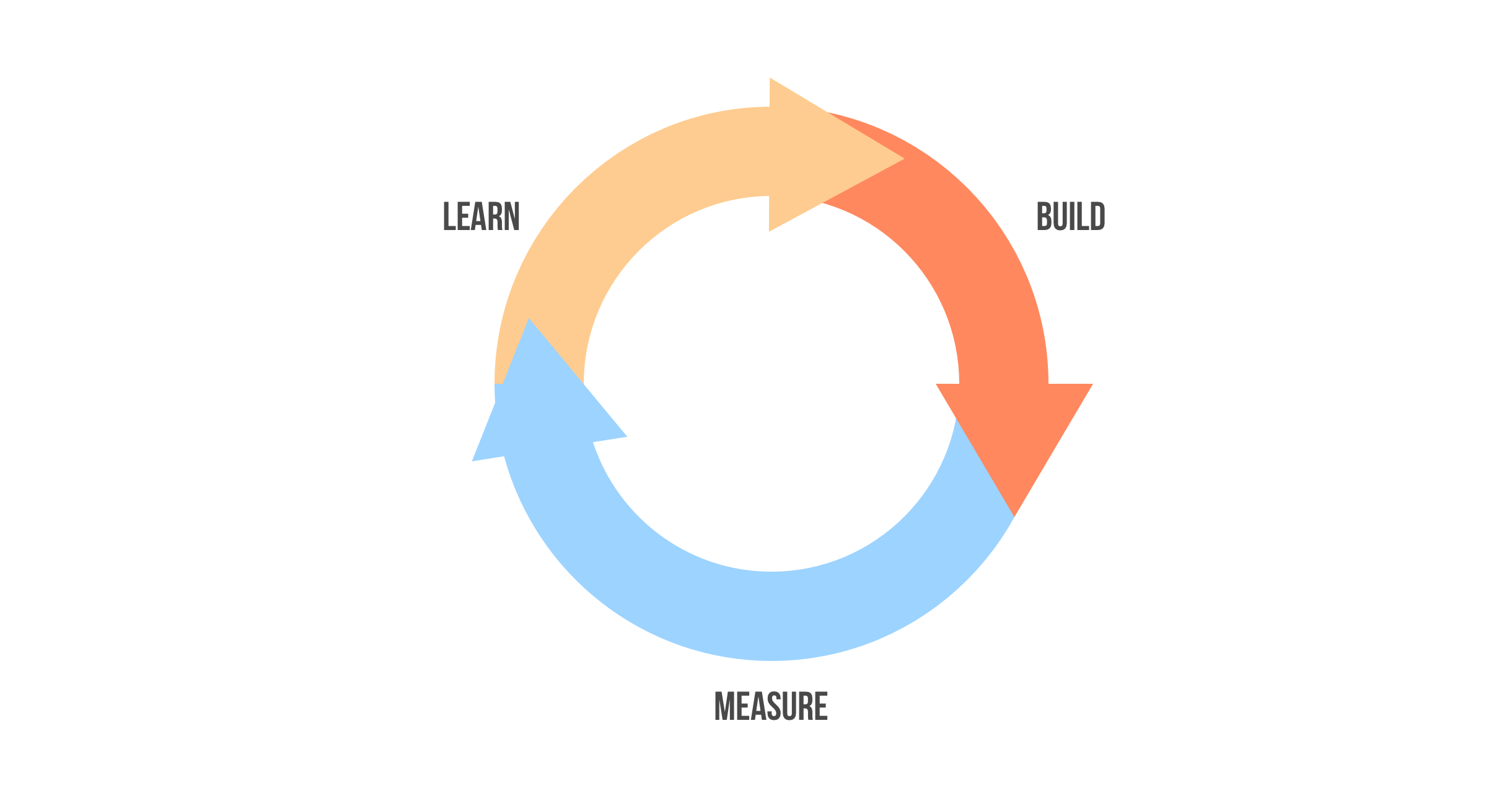
The best part about designing interfaces is that we get access to feedback. We can study how users interact with our design and, using this data, we can improve the efficiency of the product. Post-production, we integrated a tracking analytic system to our site to understand how a user uses our products, we get educated and go through the iterations again.
A / B Tests
Before launching our new website to a wider audience, we conducted a couple of A/B tests. A/B testing allows individuals, teams, and companies to make careful changes to their user experiences while collecting data on the results. We proved that the new website provides the best experience for a given goal.
The outcomes and results
- We learned that our customers were so different, but they had one problem in common. It was expensive to transfer money to the Wargaming card because of fees. So we concentrated on building new features that can help cardholders to manage their payments and transfer money to the card without any fees.
- Also, stakeholders started a new partnership with different banks to expand ATM-networks in smaller cities.
- As a result, we could increase the LTV score by 20% and raise sales by 10%.
Without customers willing to buy, it doesn’t matter how good or innovative or beautiful or reasonably priced a product is: it will fail. We should invest time in understanding our customers, their needs and pain points, and how to deliver solutions to them that works for them. So, get outside the building and start talking to your customers!
Alef EducationProduct Design | UX Research
Prime XBTProduct Design | UX Strategy
Zenia AIProduct Design | UX Research
Delivery Health MonitorUX Research | Product Design
