850.000
100+
Students
11.000
Schools
Countries
40.000
Teachers and Leaders
Project overview
What is Alef Education?
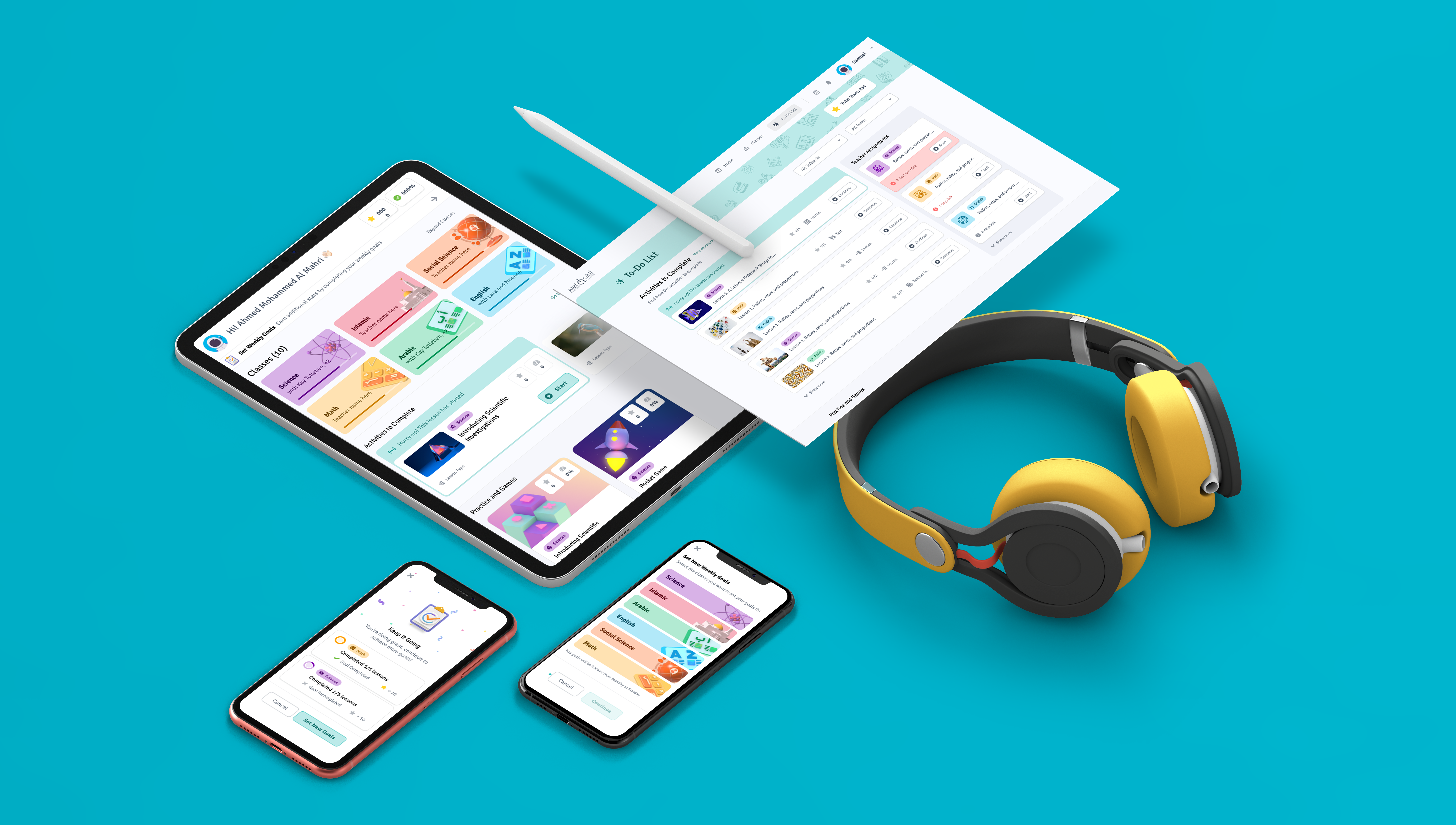
Alef Education is a global leader in education technology, at the forefront of using artificial intelligence (AI) and machine learning (ML) to create personalized learning experiences that transform how the world is educated. Being an award-winning digital and learning platform Alef provides personalized education to support students’ learning. While working on this project, we successfully redesigned the main product — the Alef Platform — and launched it in Indonesia, increasing the student base to up to 1 million students.
Project Duration
December 2020 -
January 2022
Responsibilities
As the Senior UX Designer, I spearheaded the product design and user research for Alef's flagship product — the Student Platform. My responsibilities included revamping the existing solution, leading research initiatives, and integrating innovative features. Throughout this process, I worked in close collaboration with the Product Manager, UX researchers, a UI designer, and the development team."
Role
Senior UX Designer
Project overview
Problem Statement
The Goal
1. Outdated Design. The existing student journey design is outdated and fails to address the diverse needs of a modern student demographic.
2. Lack of Mobile-Friendly Platform. With the increasing number of students and new market expansions, we need to make the platform mobile-friendly to ensure a seamless learning experience on smartphones and tablets, which are essential for our users.
1. Redesign the Student Journey. To revamp the student journey design to be more aligned with the current and diverse needs of modern students, ensuring it is intuitive, accessible, and engaging for our user base.
2. Cross-Device Platform Optimization. Optimize the scalability of Alef Education's platform for seamless learning across diverse devices and global audiences.
Metrcis & KPI
To evaluate the effectiveness of our redesign efforts, we have established three essential KPIs that together offer a comprehensive view of our platform's user experience and educational impact:
Students who use the Alef have a positive experience and are inclined to return.
The number of lessons per user is increasing.
Time spent on the platform is increasing.

How can we create a learning platform that students are delighted to use?
Design Challenge
Design Process
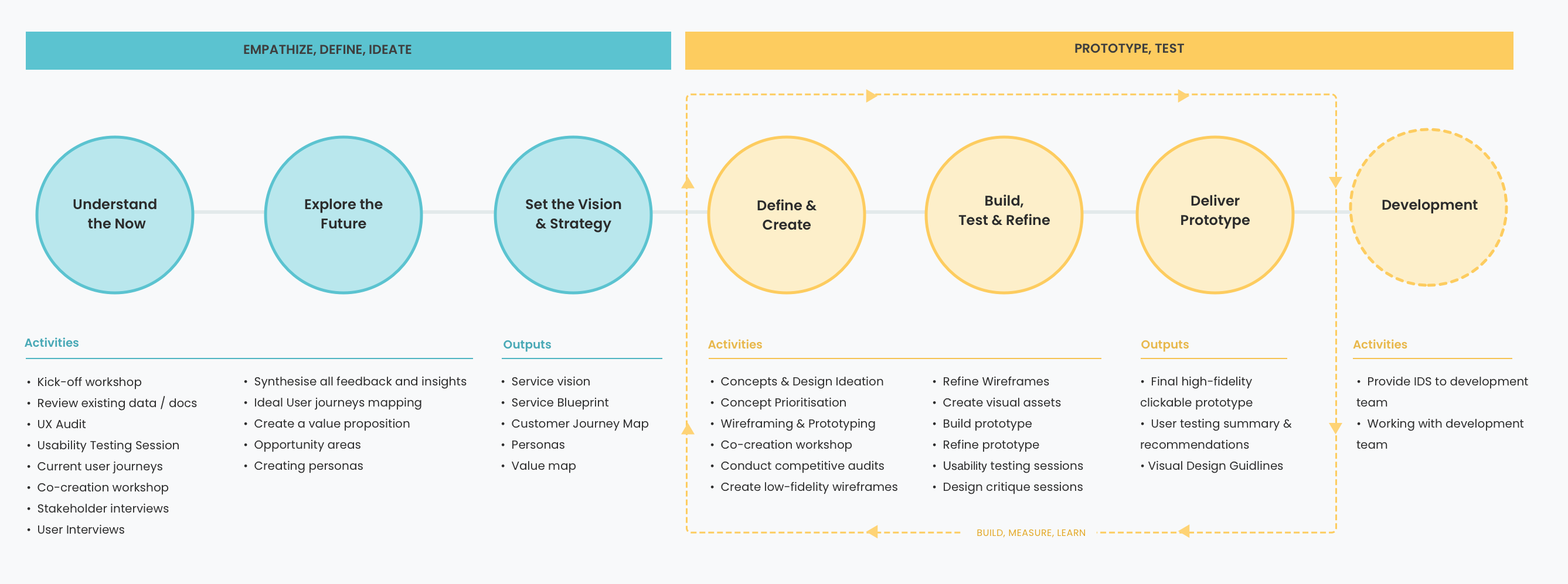
The human-centered design process began with a thorough understanding of people and the needs that the design intended to meet. We used the Design Thinking approach, which comprised phases of Empathize, Define, Ideate, Prototype, and Test. In each phase, we engaged in specific activities and produced key outputs, ensuring a smooth transition from comprehending user needs to refining our prototypes. I favored this framework for its structure, clarity, and dynamic approach.
Phase 1. Empathize with users
User Research
We began our user research with an internal kick-off workshop involving our stakeholders. Following this, we embarked on a comprehensive analysis of the current information and data, which included analytics tools like Smartlook.com and heatmaps, and proceeded with a UX audit. We then ran a series of usability tests with our students, conducted interviews with teachers, and meticulously reviewed all support requests from our school leaders. In the final phase, we organized and categorized the insights we collected, aligning them with the problems we had identified.
Research Methods
- Data & Analytics
- Teacher Interviews
- Usability Audit
- Student Usability Testing
- Customer Support Requests
- Market Research
Research Goals
Gather qualitative insights into Alef Education users, their behaviors, needs, and challenges.
Systemize user knowledge to inform product decisions effectively.
Identify and categorize user problems to prioritize improvements.
Evaluate product usage and pinpoint usability issues for enhancement.
User Interviews
The most insightful phase of our research involved user observations and customer interviews. Through user observations, we gained a deep understanding of how our students and teachers interacted with the Alef platform, identified challenges they encountered, and noted the obstacles they faced. Subsequently, during customer interviews with 14 participants, we collected valuable feedback that enabled us to categorize and prioritize the identified user problems.
User research: pain points
"Sometimes, I don't know where to click or what to do next in the app. It's confusing"
"When I get the answers wrong, it doesn't tell me why, so I keep making the same mistakes."
"The app takes a long time to start, and sometimes it just stops working in the middle of my lesson"
"I can't use the tool very well because the text is too small and it doesn't read to me"
Phase 2. Define
Personas & Customer Journey Maps
We took a closer look at the data gathered in the previous phase, particularly the User Interviews. By synthesizing our customer research and tagging our most important insights—primarily the problems—we crafted user stories and defined two key personas. For each persona, we designed detailed user journey maps.
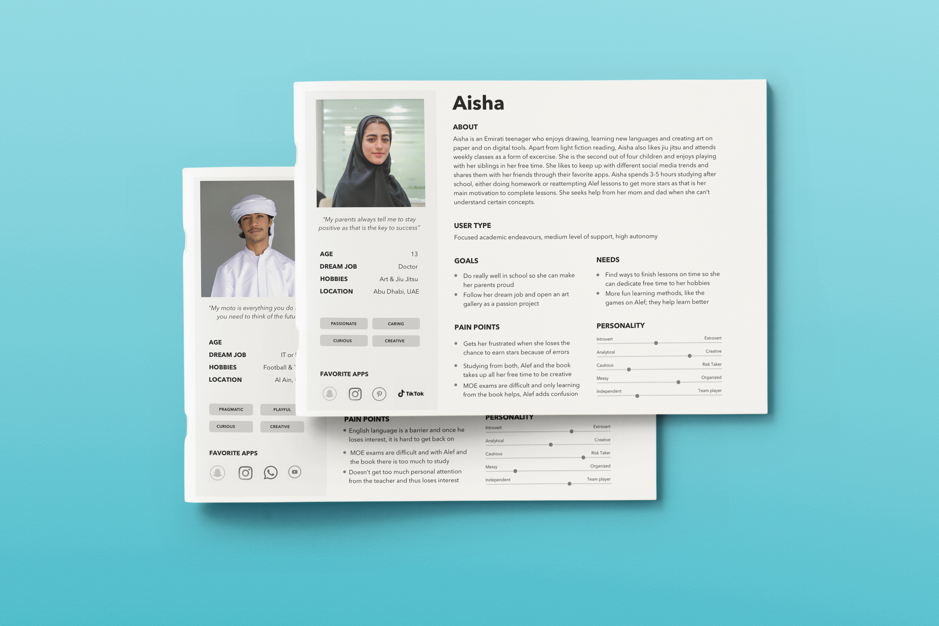
* Due to privacy considerations, we are unable to display these journey maps publicly; they are available upon request.
Phase 3. Ideate
Workshop with our stakeholders
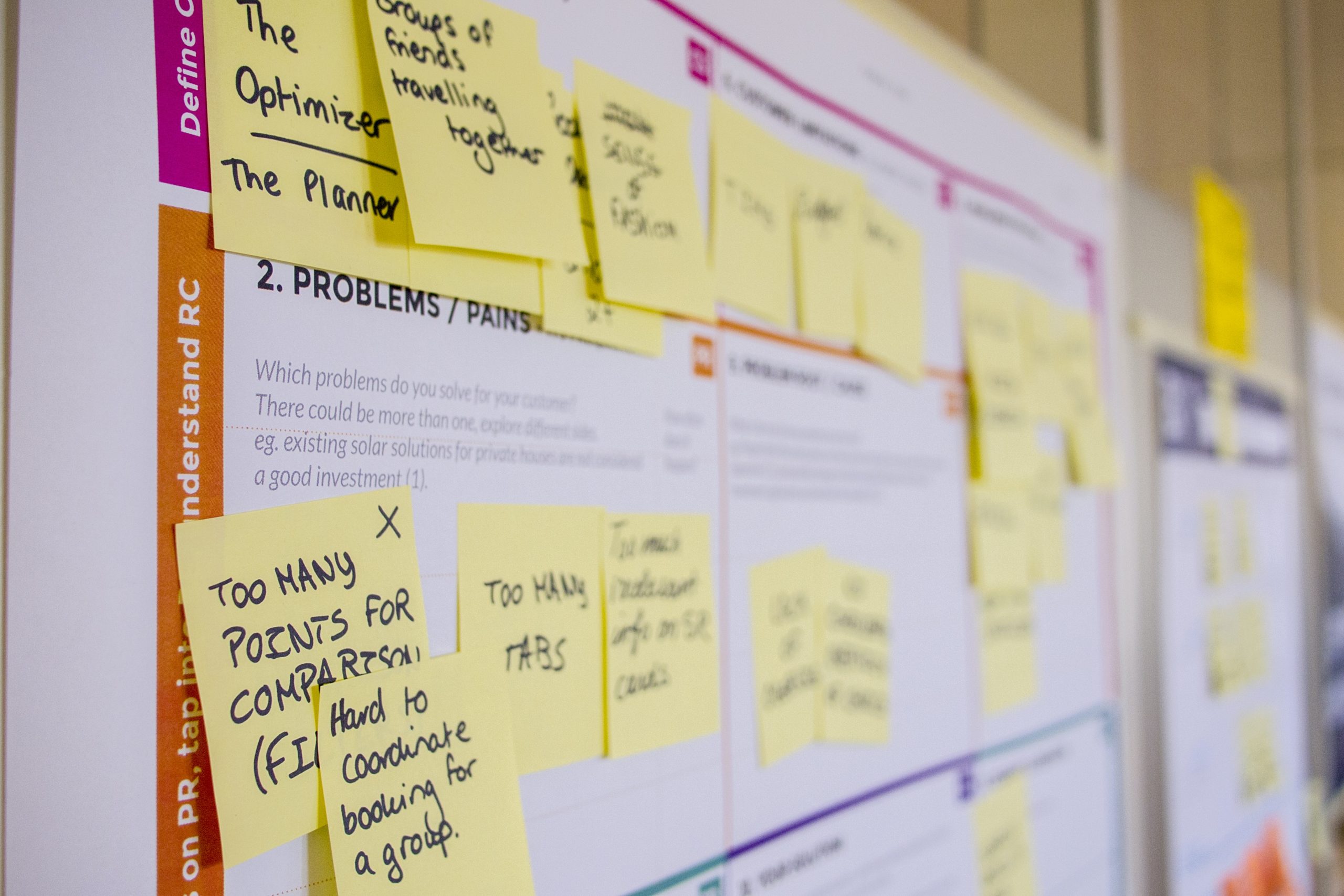
We organized a workshop that brought together moderated, mixed groups of various stakeholders, using MIRO as our collaborative platform. During this session, we dedicated our efforts to developing customer profiles — the first segment of the Value Proposition Canvas — and crafting a compelling value proposition. This cross-functional collaboration from the early stages of the design process ensures that all teams contribute to a unified strategy, simplifying the process of explaining and adopting design solutions as the project advances.
Competitive audit
We conducted a competitive audit to identify where Alef stands out and where it might lag behind or have the potential to expand. The main competitors of our platform are McGraw-Hill Education, Imagine Edgenuity, Catapult Learning, and Aperture Education. We evaluated all the companies using four criteria: Product Offerings, User Experience, Innovation, and Market Position. This analysis can inform strategic decisions, from product development to marketing and sales approaches.

Phase 3. Prototype
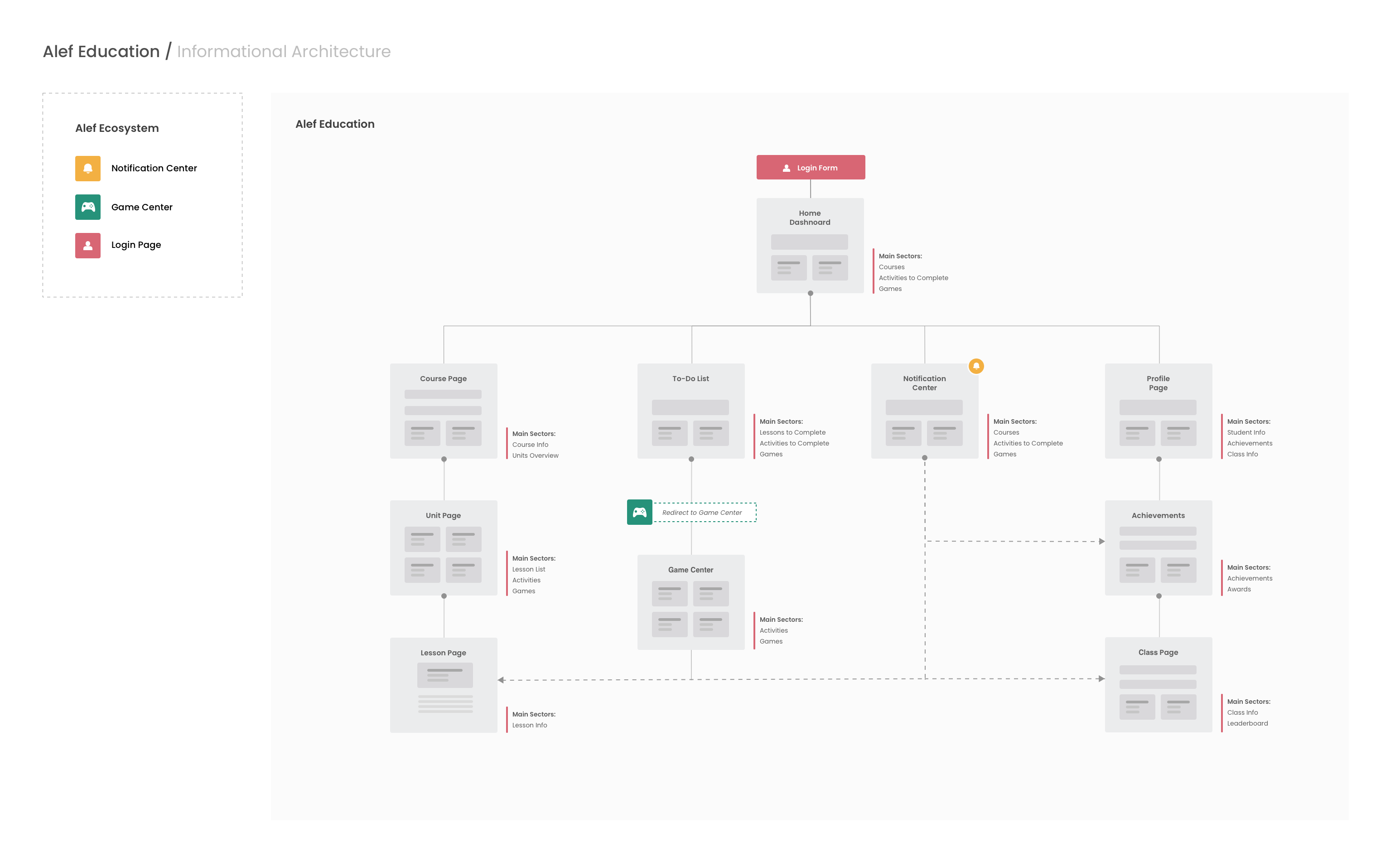
Information Architecture
At the next step, we outlined user flows, created storyboards, and started working on the new information architecture of our platform. Information architecture (IA) provides product development and engineering teams with a bird’s-eye view of the entire product. Having a single document that delivers a simple and understandable representation of how the website works is vital for developing new features, updating existing ones, and for seeing what is possible considering the existing product.
Low wireframes and prototypes
PROTOTYPING / VISUAL DESIGN
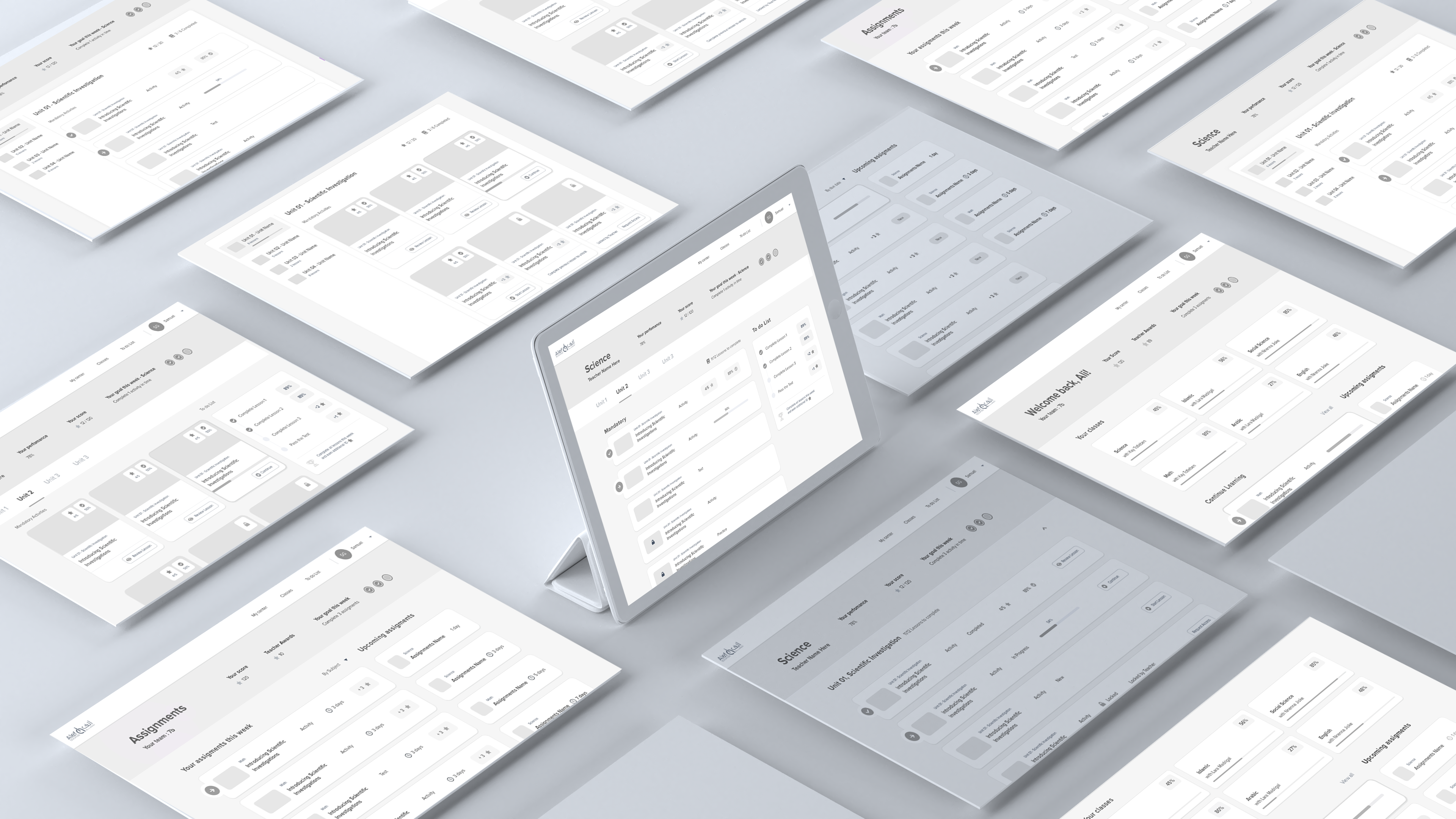
After creating the IA, we developed a list of design principles that we wanted to support, based on the main research findings and key customer insights. Then we proceed working on the first version of wireframes and built low-fidelity prototypes.
Phase 5. Test
Usability study: findings
After creating a prototype from the low-fidelity wireframes, we conducted a remote moderated usability study for Alef. We invited 16 participants to navigate through various scenarios in our prototype and complete three prompts. Subsequently, we employed affinity diagramming to collate observations from the usability study and synthesized the data. Using Miro boards, we organized the findings into clusters, identifying themes and patterns. We received sufficient feedback to inform our future design iterations.
Visibility of Completed Tasks
It was observed that 7 out of 10 participants had difficulty identifying completed tasks on the To-Do list.
Priority Sorting
It was observed that 6 out of 10 participants were unsure how to prioritize tasks on the list.
Task Editing
It was observed that 7 out of 10 participants struggled to edit existing tasks.
Accessibility
It was observed that 7 out of 10 participants with visual impairments encountered difficulties using the To-Do list due to limited accessibility features.
High-fidelity prototype
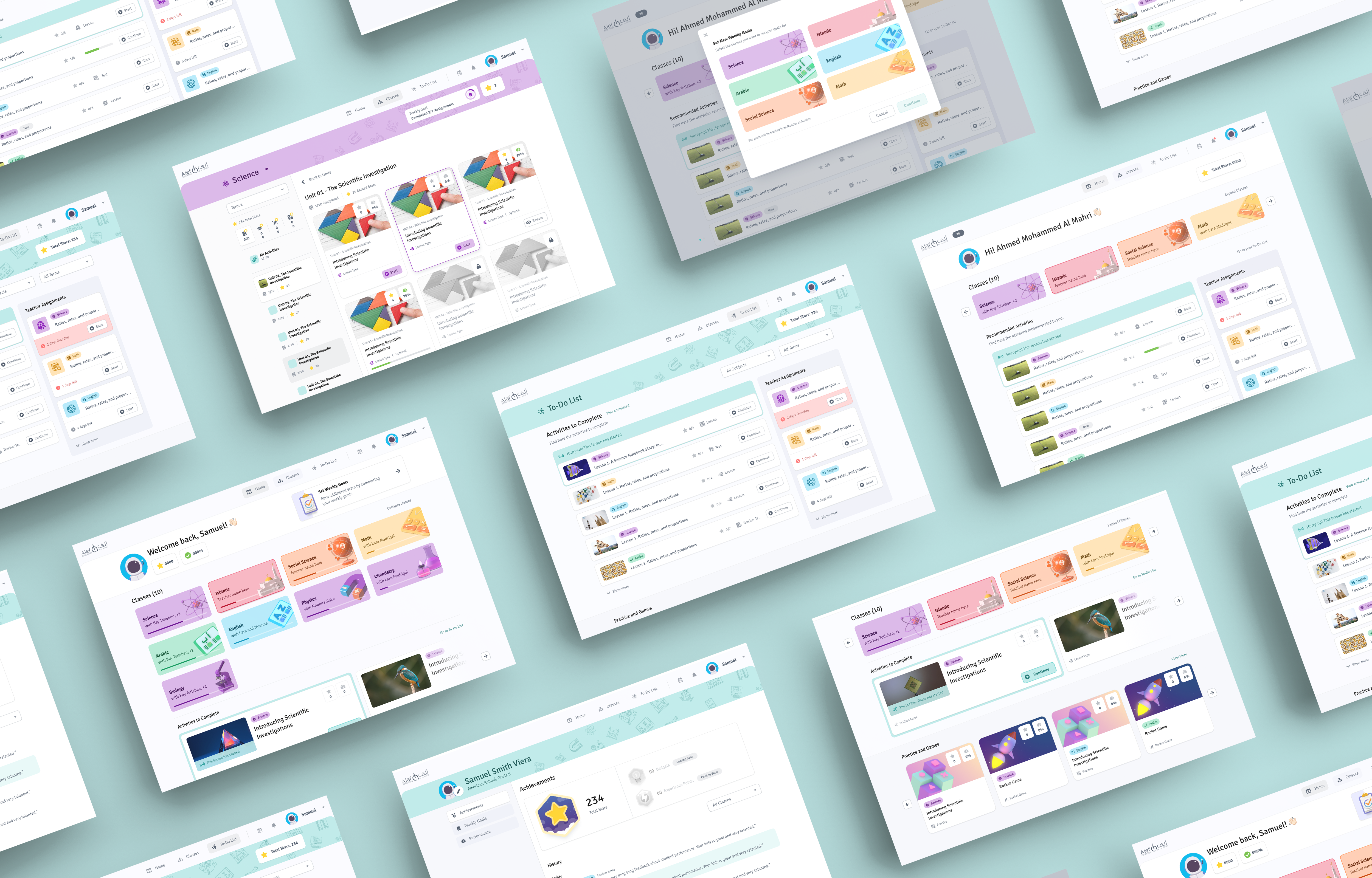
After the first round of the usability study, we updated the designs based on our insights and began working on high-fidelity designs. We did not need to create a new visual style for our platform because Alef already had a design system in place. Upon completing the high-fidelity designs, we ran design critique sessions to receive feedback from the teams. Then, we iterated on the mockups once again based on the feedback from these critique sessions.
Final Designs
The best part of designing interfaces is the access to user feedback. After launching the new version of the Alef Platform, we obtained our first proven results. We integrated a tracking analytics system into our platform to gain insights into user interactions with Alef. This helps us understand how users interact with our designs, informing our continuous iterative design process.
Challenge 1
Dashboard
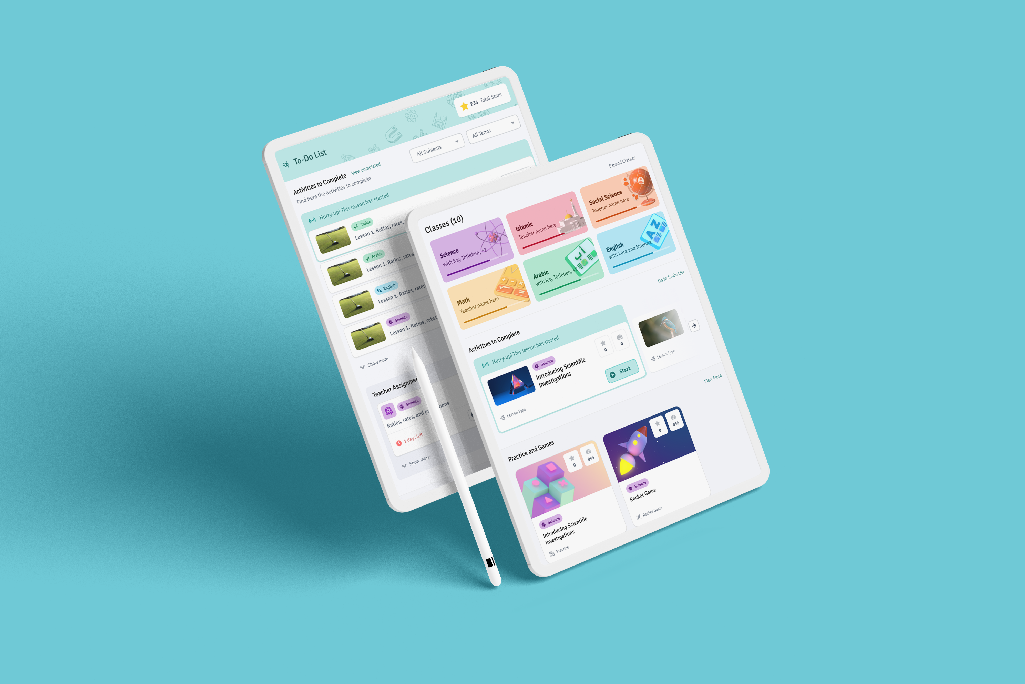
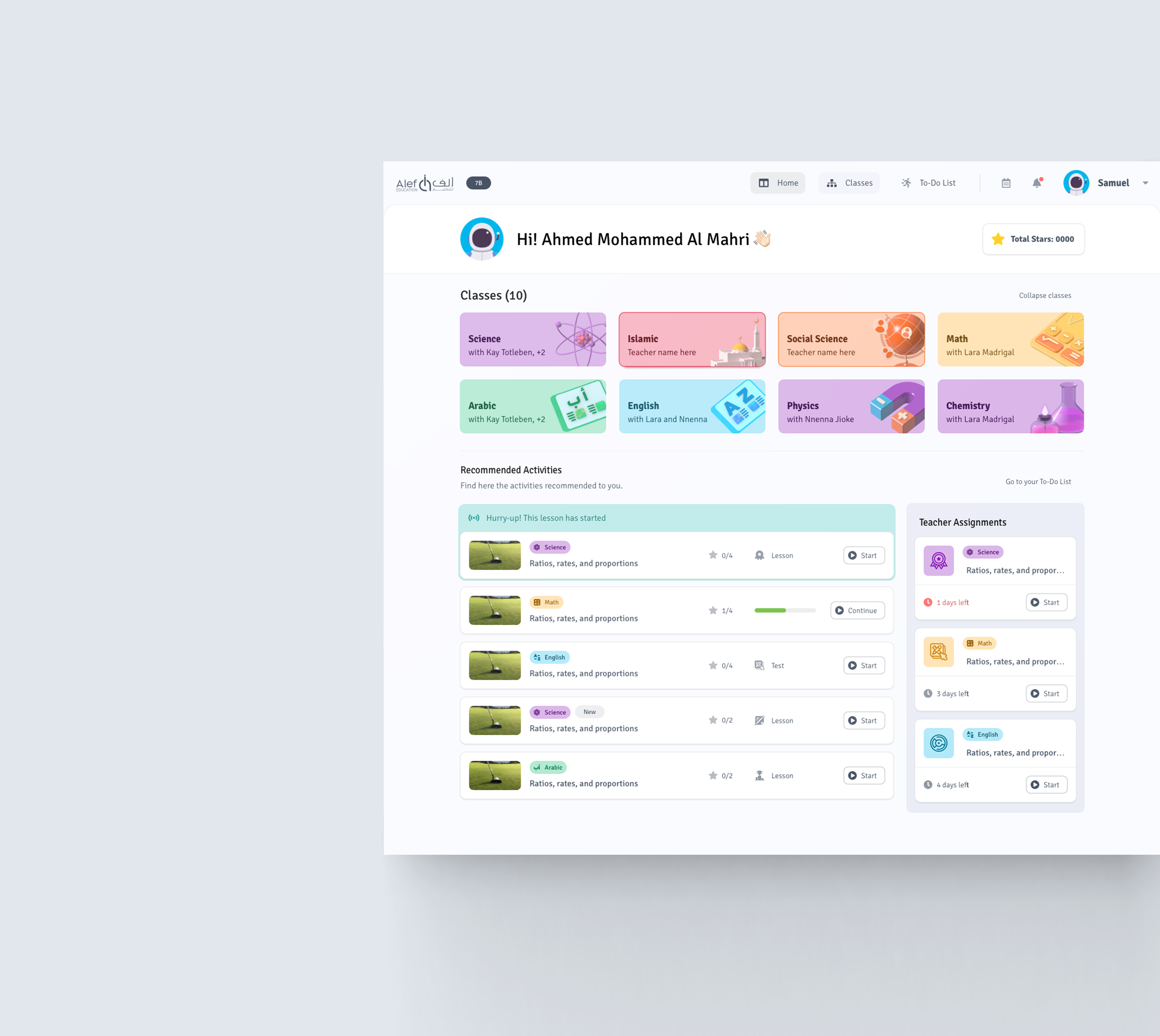
As part of the main update, we've redesigned the homepage. Now, users logging into their accounts are met with a dashboard displaying all their classes and pending activities. Additionally, students have direct access to practice and gaming pages from the main page. As a result, our data indicates a significant increase in user engagement, complemented by positive feedback from our students.
Challenge 2
Lessons page
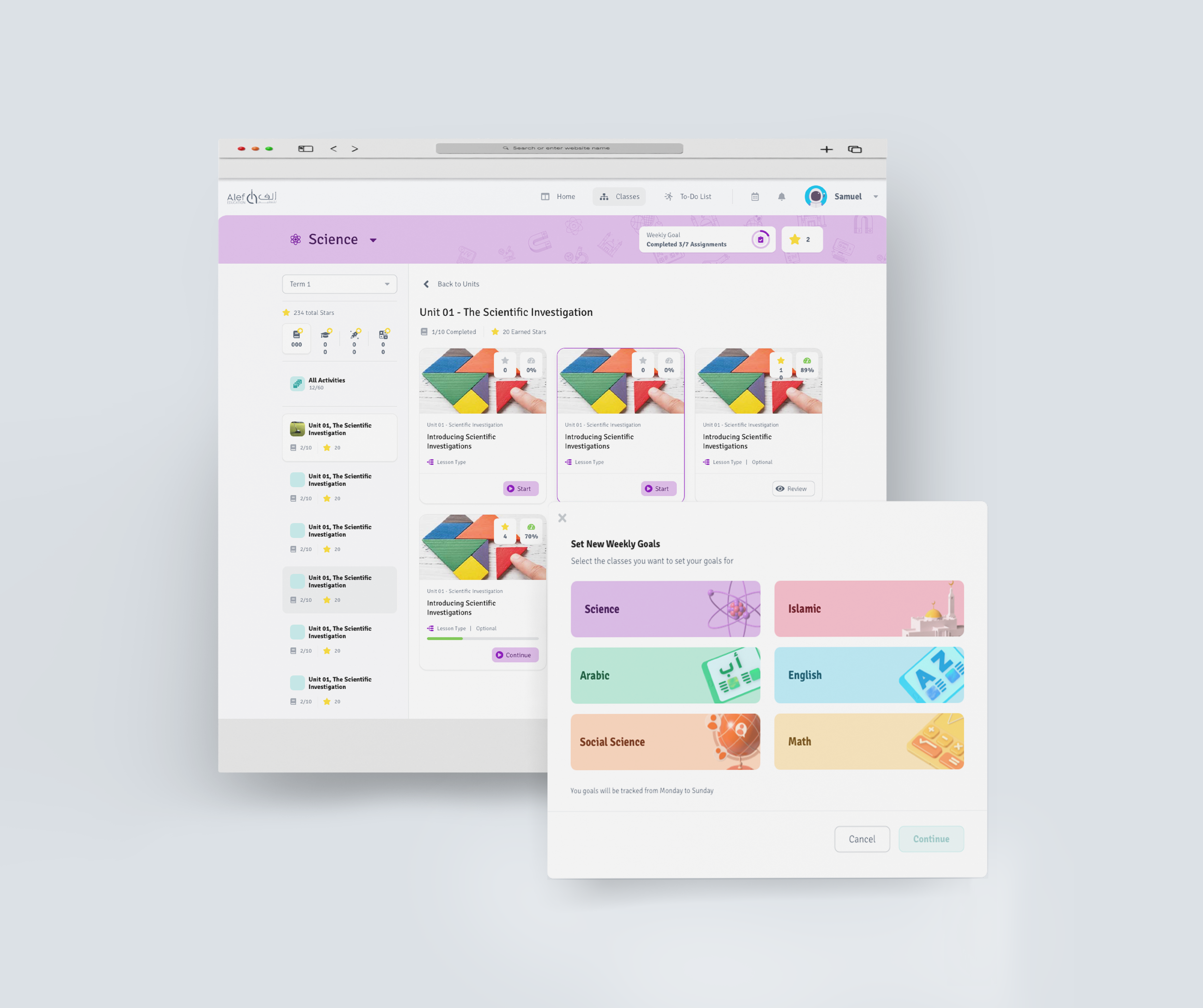
The next major change was the redesign of the unit page. In the new version, students can see a clear learning path and track the number of completed/incomplete activities. Now, they also have the ability to set learning goals and view their progress directly on the page.
Challenge 3
To-Do List
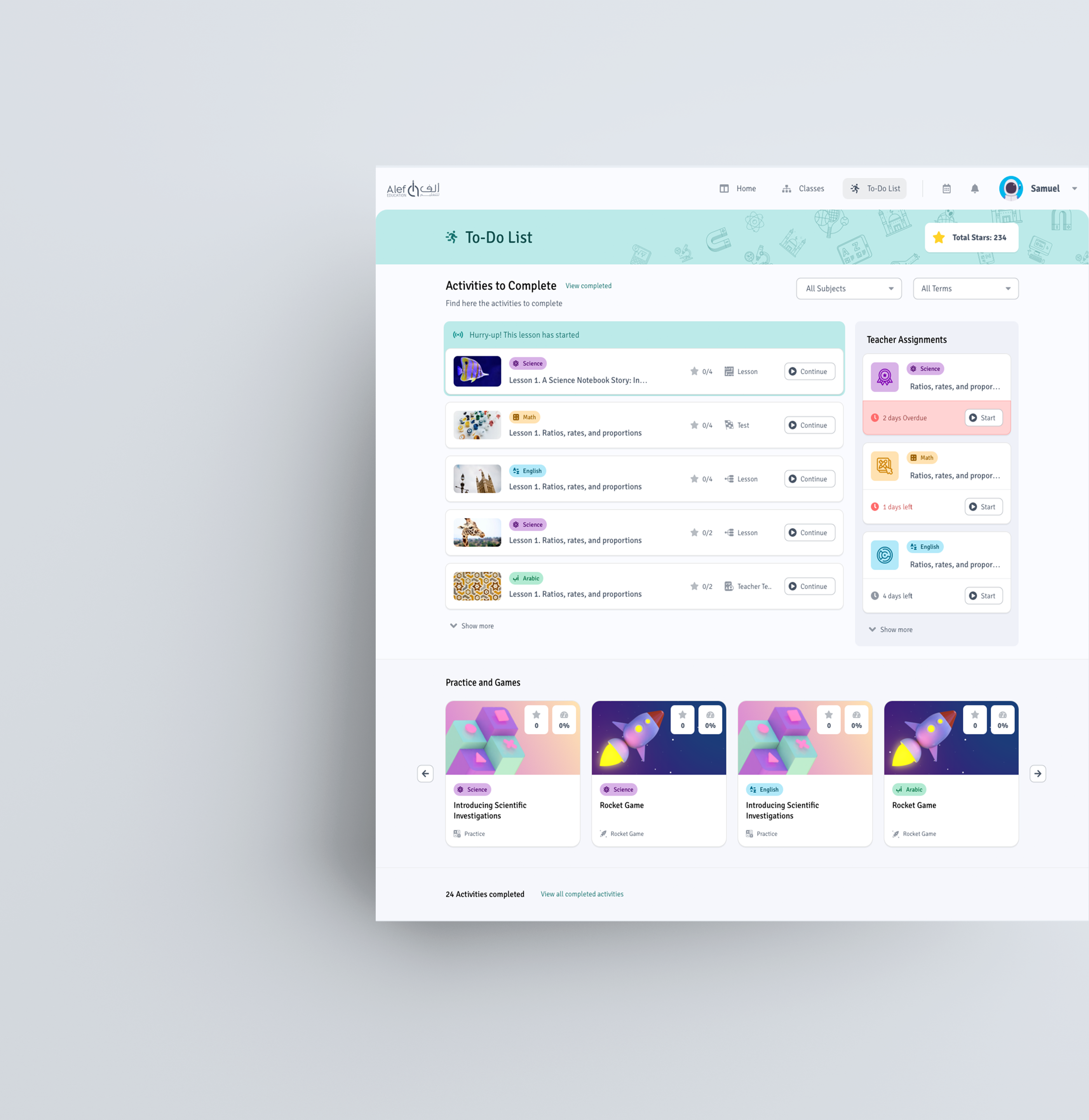
A major update in the new version is the launch of the To-Do list, where students can view all activities to complete, including teacher assignments organized by due date. Additionally, students have access to extra learning resources through practice exercises and games. This new functionality has received impressively positive feedback from students.
Accessibility considerations
In the next iterations of our design process, we focused on enhancing the accessibility of our platform to ensure that every student on any device can use it with ease.
Screen Reader Compatibility
Ensure that the platform is compatible with popular screen reader software, allowing visually impaired users to navigate and interact with content effectively.
Keyboard Navigation
Implement keyboard navigation features to enable users to navigate the platform without relying on a mouse, catering to individuals with mobility impairments.
WCAG Compliance
Strive for compliance with Web Content Accessibility Guidelines (WCAG) to meet international accessibility standards.
Resizable Text and Elements
Allow users to resize text and interface elements to meet their specific readability requirements.
Going forward
The outcomes and results
Our UX team embarked on a mission with two primary goals: to reimagine the student journey within Alef Education's platform and to enhance cross-device functionality for a global audience. The redesigned journey was met with enthusiastic approval Analytics post-launch showed a marked improvement in user engagement metrics:
+20%
time spent on the platform
+32%
number of lessons per user
1
Global ESG Awards
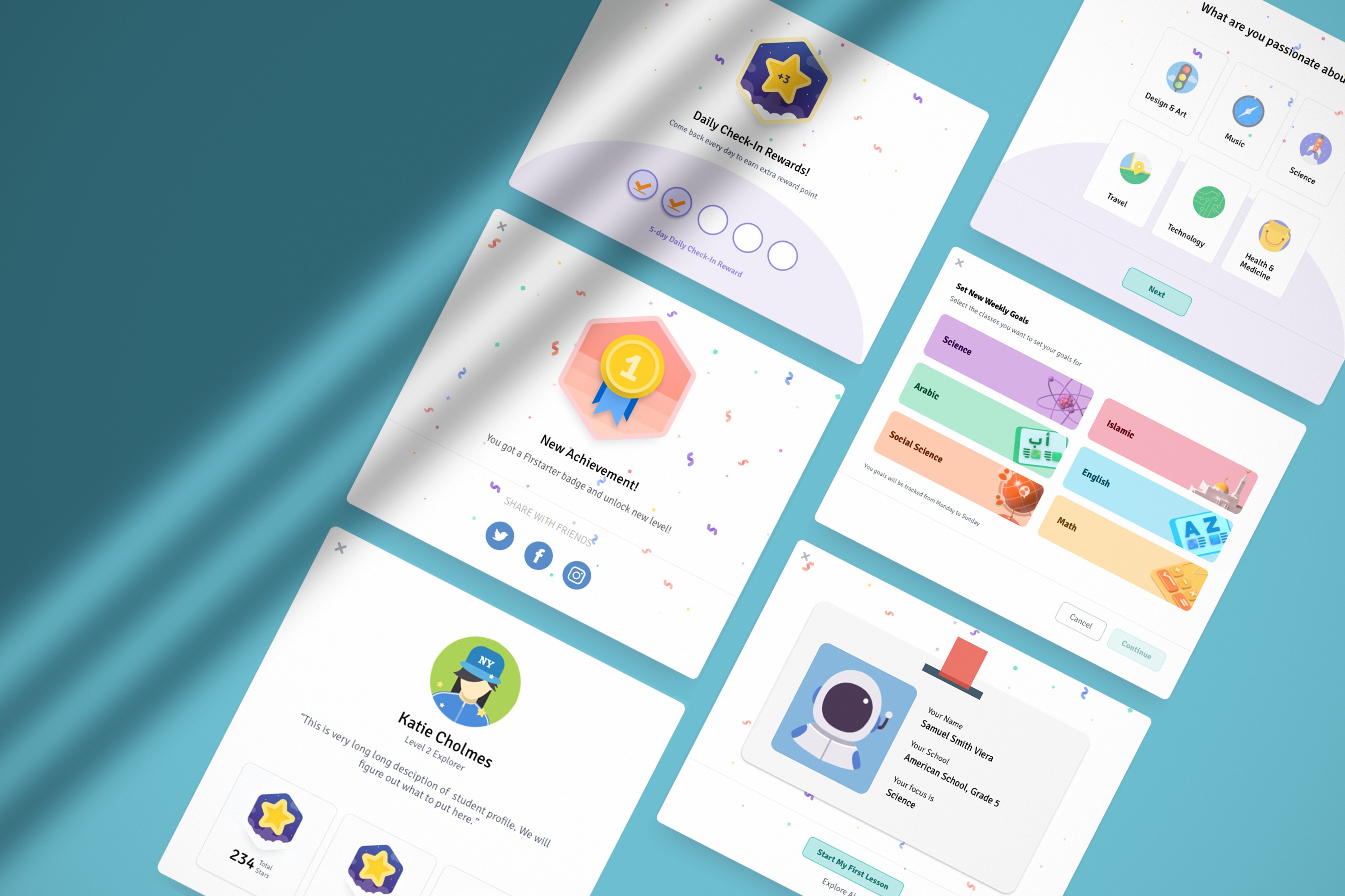
The launch of the mobile version heralded a new chapter for Alef Education. Students from Indonesia were among the first to benefit from this expansion, experiencing extended learning periods and a higher degree of satisfaction due to the platform's mobile responsiveness, which offered them the flexibility to learn across various devices.
Prime XBTProduct Design | UX Strategy
Zenia AIProduct Design | UX Research
Delivery Health MonitorUX Research | Product Design

WARGAMING CARDUX Research | Product Design