30+
Interviews
5
Personas
3
Workshops
Project overview
What is DHM?
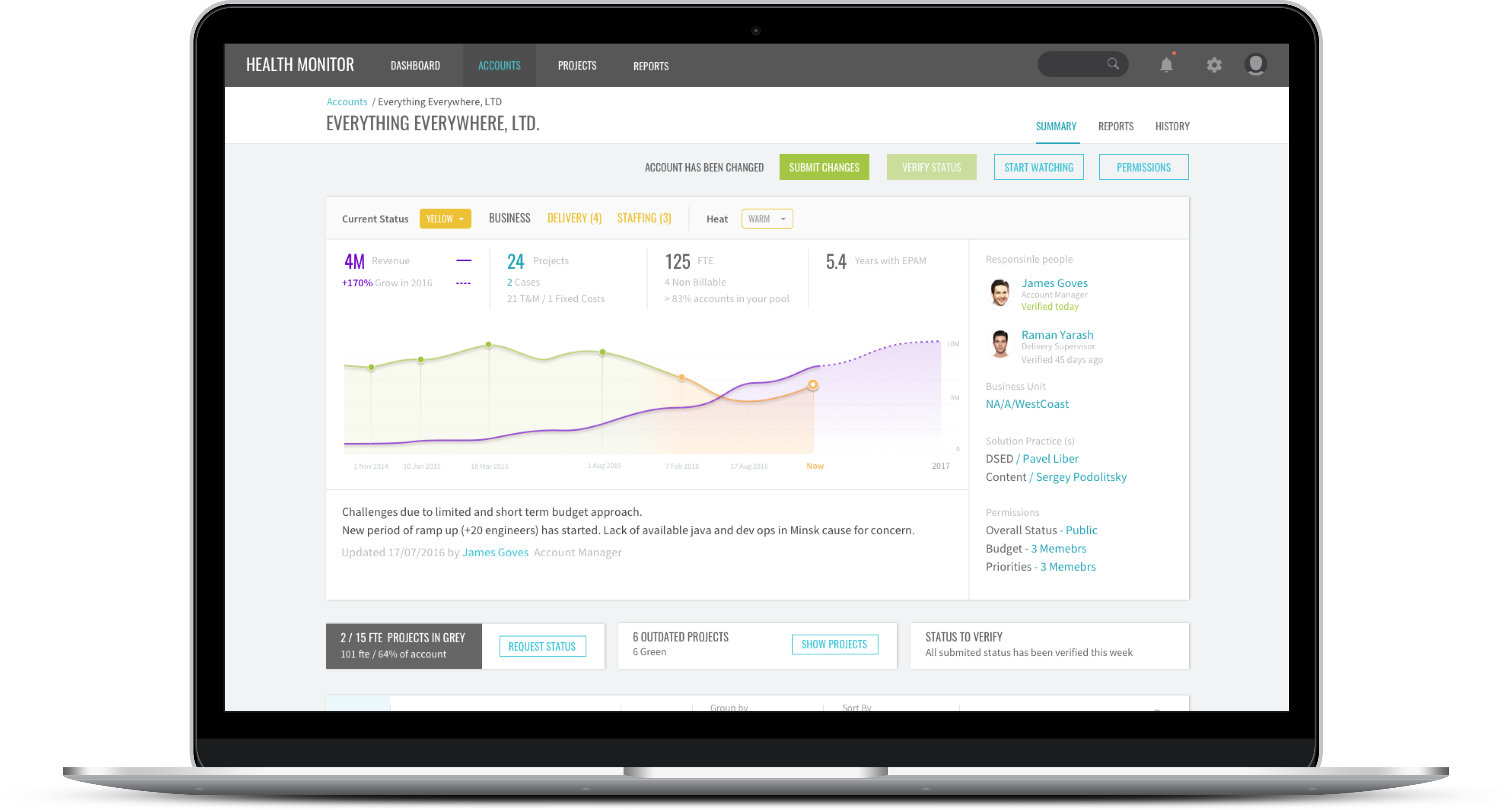
EPAM is evolving its delivery processes and introducing a Delivery Health Monitor with an intelligent user interface that allows users to get objective information about the current delivery status of ongoing projects. While working on this project, we conducted 3 workshops, over 30+ interviews, 5 CJM, and created over 15 concepts to improve the current experience of DHM.
My Role
I worked at Delivery Health Monitor as a Senior UX Designer. My responsibilities were to redesign the existing solution, own the user research, and conduct usability testing. Also, I was responsible for the final design. I worked closely with the UX Lead and Product Manager.
Problem Statement
Historically, getting the status of the account and project was managed by internal calls with responsible people and self organized dashboards, which was good for the small organization.
1
Today there is no way for EPAM stakeholders, accounts managers and delivery supervisors to get objective information about the current status of their projects in the same timeframe, to prevent critical risks and continue business growth.
2
Most of the Project Managers and Delivery Managers create internal reports for their direct supervisors to provide weekly status updates. These processes could be standardised and shared with all levels of organization to give overall visibility of delivery.
This creates challenges for EPAM, ranging from easy-to-use global instruments for tracking projects status, visibility of delivery at any organisational level, fast problem identification and focus on business priorities.

"How can we raise awareness about delivery status across the organisation to help each project deliver on time with high quality?"
Design Challenge
Project Goals/ Business Goals
We have outlined the goals and objectives from multiple perspectives, to build an entire understanding of the challenges we’re facing. This provides a summary of the goals and objectives of EPAM, Business, and Delivery.
EPAM
- Reduce customer escalation
- Proactive leading of the project
- Unify language to track the project
- Focus on company priorities
DELIVERY
- Get support from the organisation to deliver on time
- Optimise reporting time and focus on delivery
- Clarify delivery and staffing processes
BUSSINESS
- Predict risks and issues
- Deliver on time and with predictable quality
- Focus on business growth
- Support and track current projects
Picture of Success

Design Process
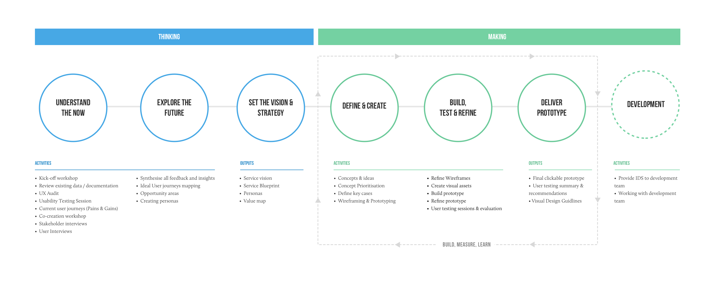
The following schemes outline a user-centred design approach to shape the Delivery Health service, and to capture value-adding opportunities. We worked together collaboratively, putting user research at the heart of the process.
Stage 1. Thinking
Research Methods
- UX Audit
- Usability testing session
- Customer journey mapping
- Customer interviews
- Review existing data & documentation
Usability Testing Session
The purpose of this round of usability testing was to identify identify areas highlighted by respondents when monitoring the health status of delivery projects using the Health Monitor application.
Strengts
- The only tool which provides delivery status
- Consolidates all project statuses in one place
- Common format of delivery status
- Visible throughout all levels of the organisation
Current Problems
- DHM is frequently unstable
- Supervision levels are not taken into account
- Everyone can change status
- Impossible to track project status changes
- Learning curve is too long
Kick-off Workshop
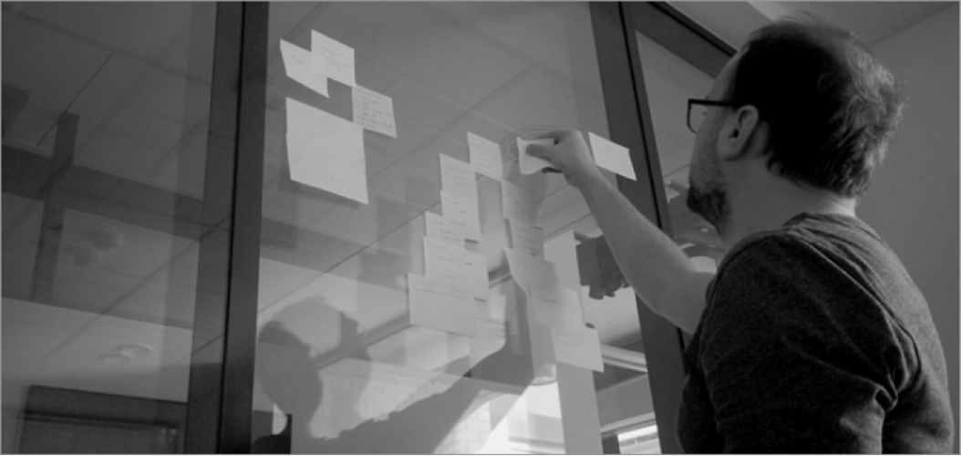
We hold kick-off workshops when a new project starts. Thinking together with the client plays a key role in a good kick-off. Kick-off workshops can help acquire domain knowledge, get the stakeholders and the design team on the same page, explain the UX process and challenges, create a detailed project plan and build trust.
This workshop helped us understand the main process participants and their levels of communication. Immersing ourselves into the process has enabled us to identify the current gaps in DHM service, and create 5 proto-personas.
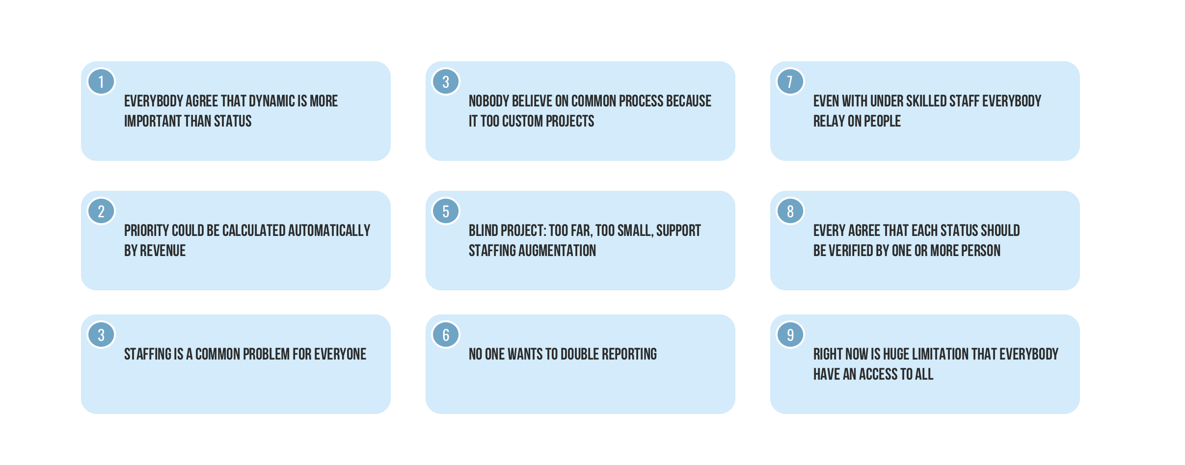
Top-Level Observations
User Interviews
Shouldn’t we invest at least as much time in understanding our customers, their needs and pain points, and how to deliver solutions to them? User interviews are a key activity for understanding the pain points, mindsets, tasks, and motivations of the user group. Our job is to help our team see the world through the eyes of the customer and make the necessary changes to stay focused and avoid wasted effort.
Preparation for user interviews began with recruitment, we wanted to ensure that we recruit a representative sample of users for our interviews. Next step was designing questions for the interview and creating a script.
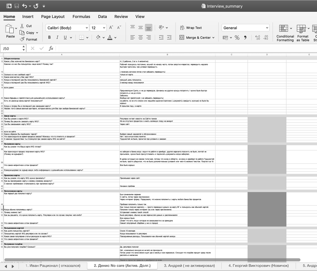
During this research process, I conducted and deeply interviewed over 35 people across all parts of EPAM.
Key Insights
Personas
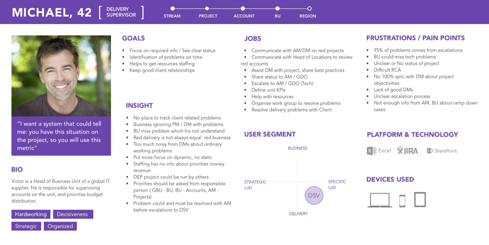
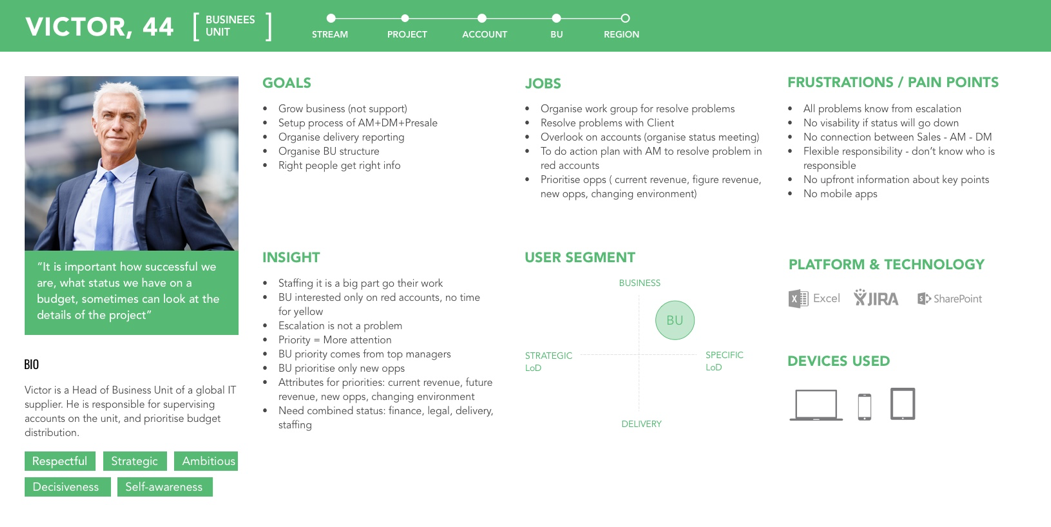
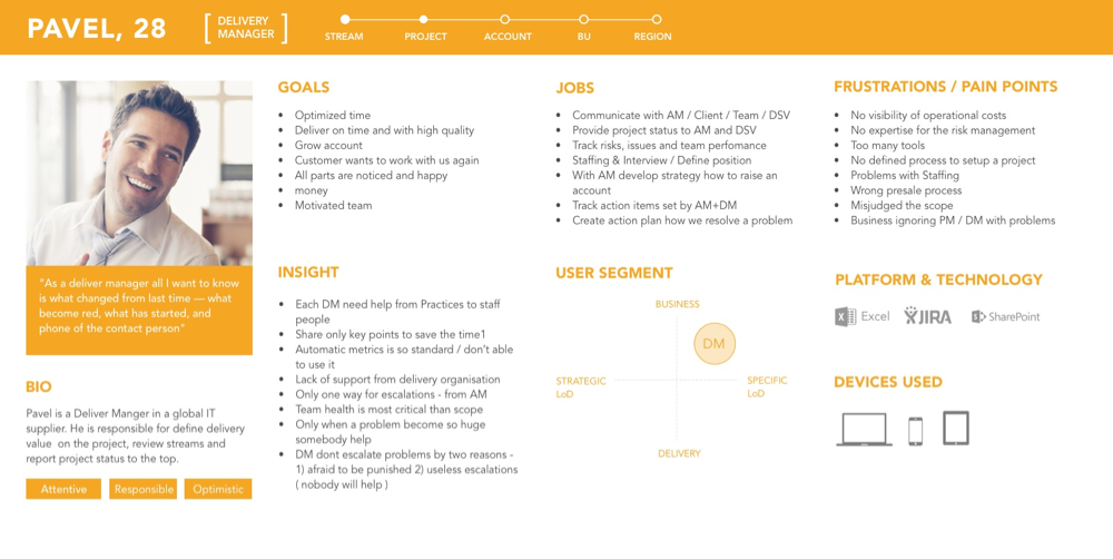
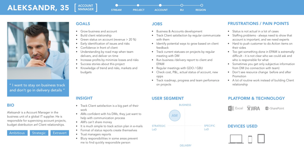
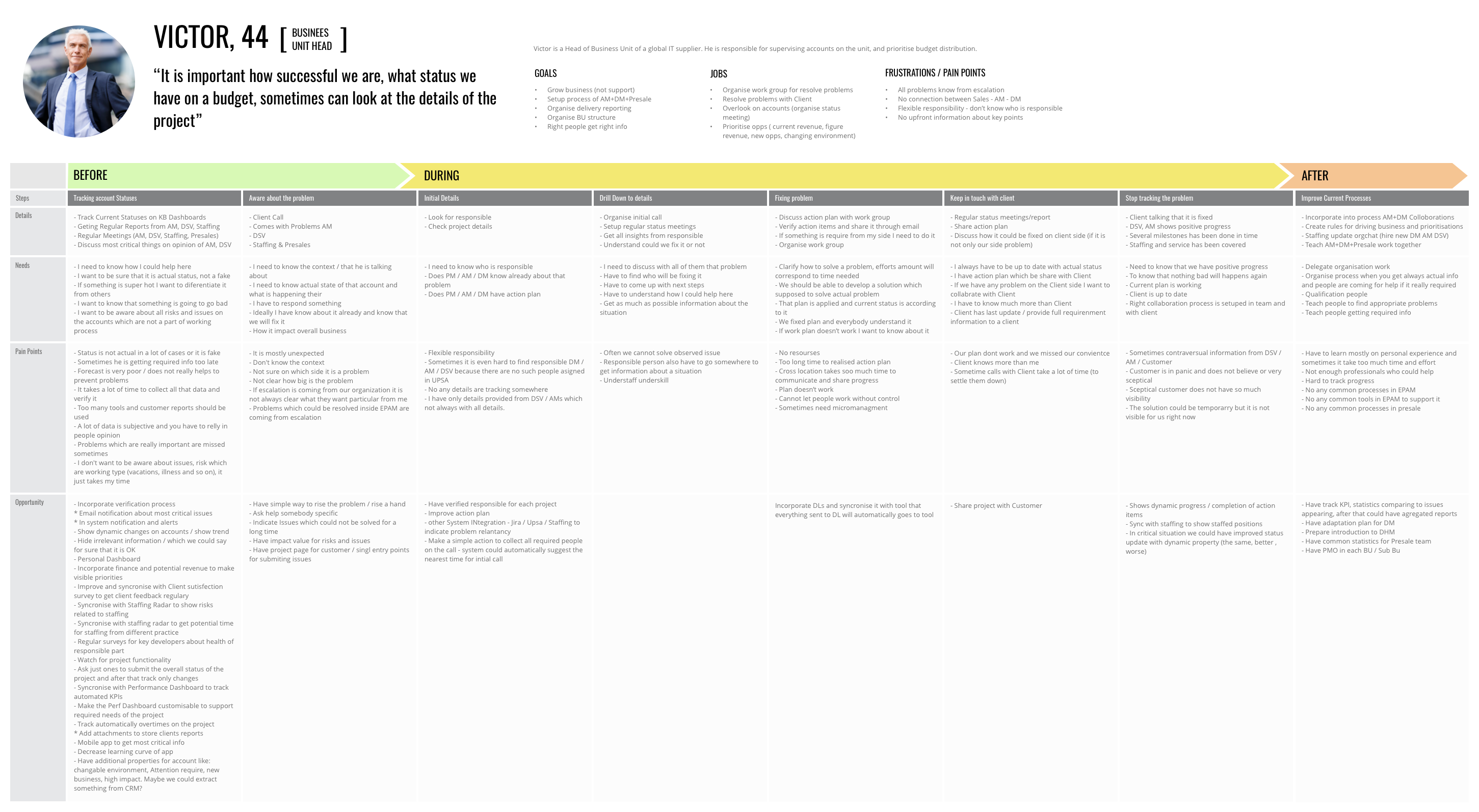
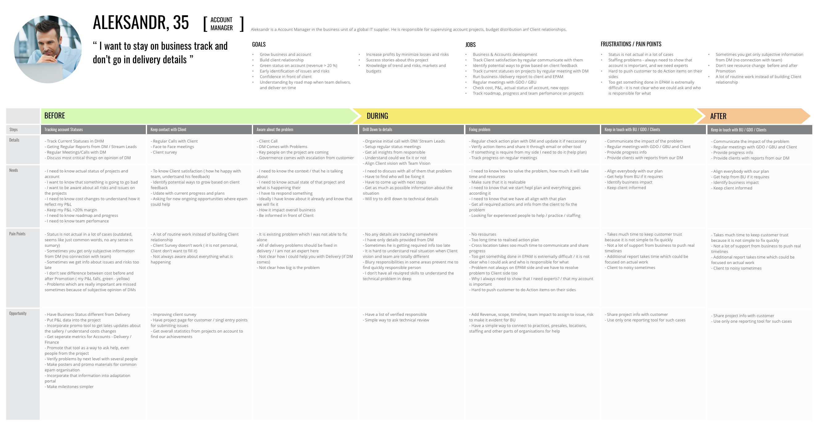
We took a closer look at our data gathered in the Discovery Phase, especially User Interviews. Synthesising our customer research and tagging our most important insights, mainly problems, we were defined 4 key personas.
Customer Insights
“It is important how successful we are, what status we have on a budget, sometimes can look at the details of the projec” - Victor, 44
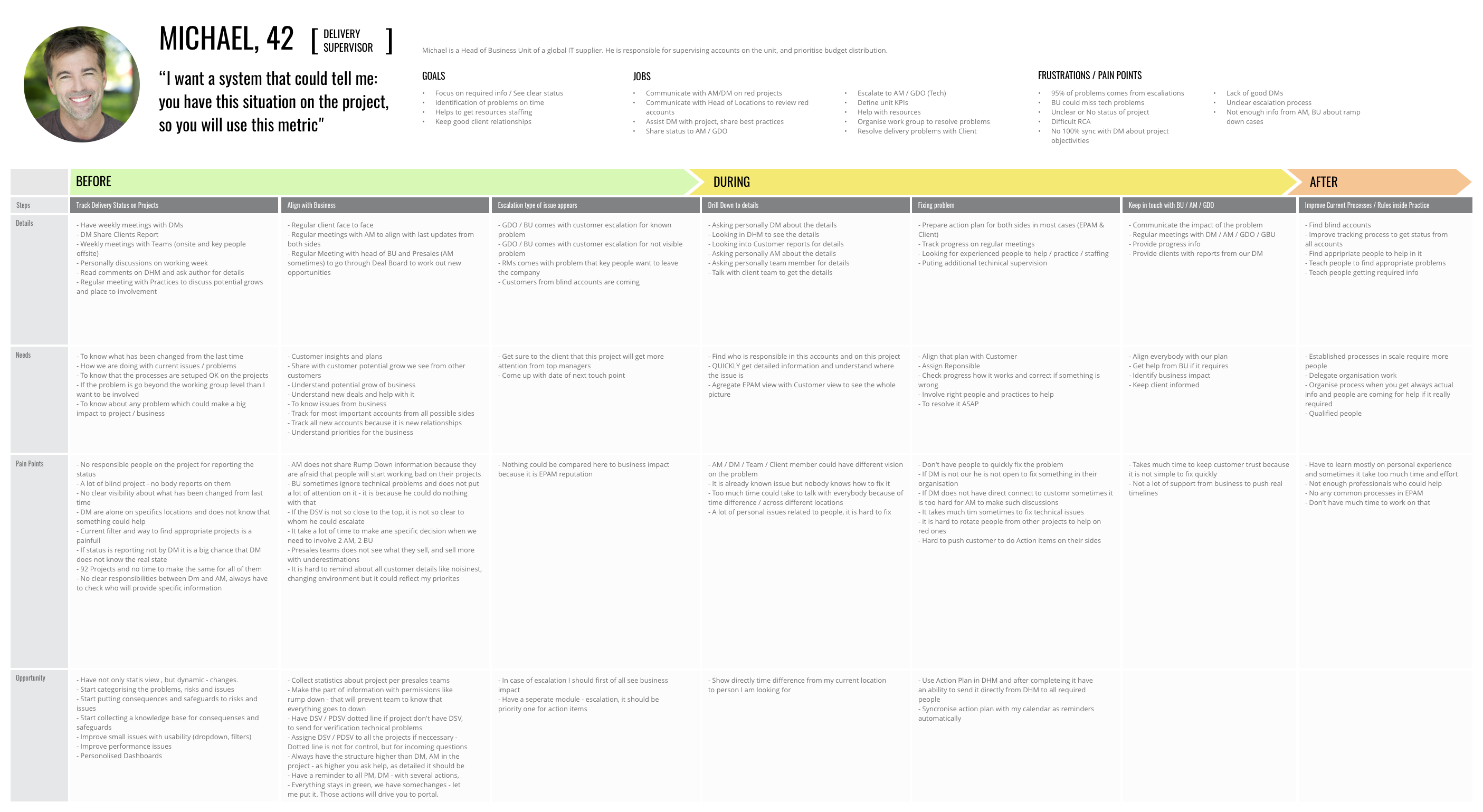
I want a system that could tell me: you have this situation on the project, so you will use this metric" - Michael, 42
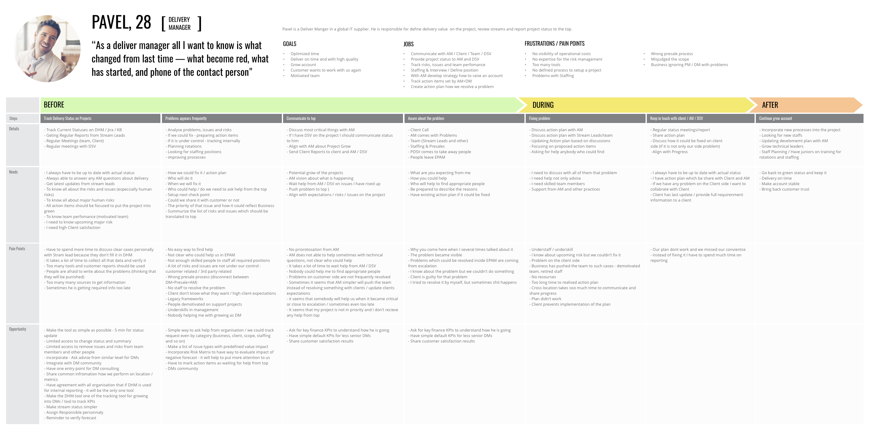
“As a delivery manager, all I want to know is what changed from the last time — what became red, what has started, and the telephone number of the contact person" - Pavel, 28
“I want to stay on the business track and not go in delivery details” - Aleksandr, 35
Customer Journey Maps
Mapping is one of the best ways to identify the changing contexts of a customer’s interactions with the company over time. Based on the main findings from user research, we have built 4 journey maps (according to each persona) to show how users identify and resolve ongoing issues and escalation.
Co-creation workshop
Activities:
- Present our learning and insights on the business today and relevant trends
- Icebreaker: thinking outside the box
- Collaborative ideation session based on identified delivery service gaps
- Playback of group opportunities
- Prioritise opportunities through validation exercises
The aim of co-creation workshops is the creation of new approaches for products, services and business models for your business. We focused on the creation of immediate and future opportunities.
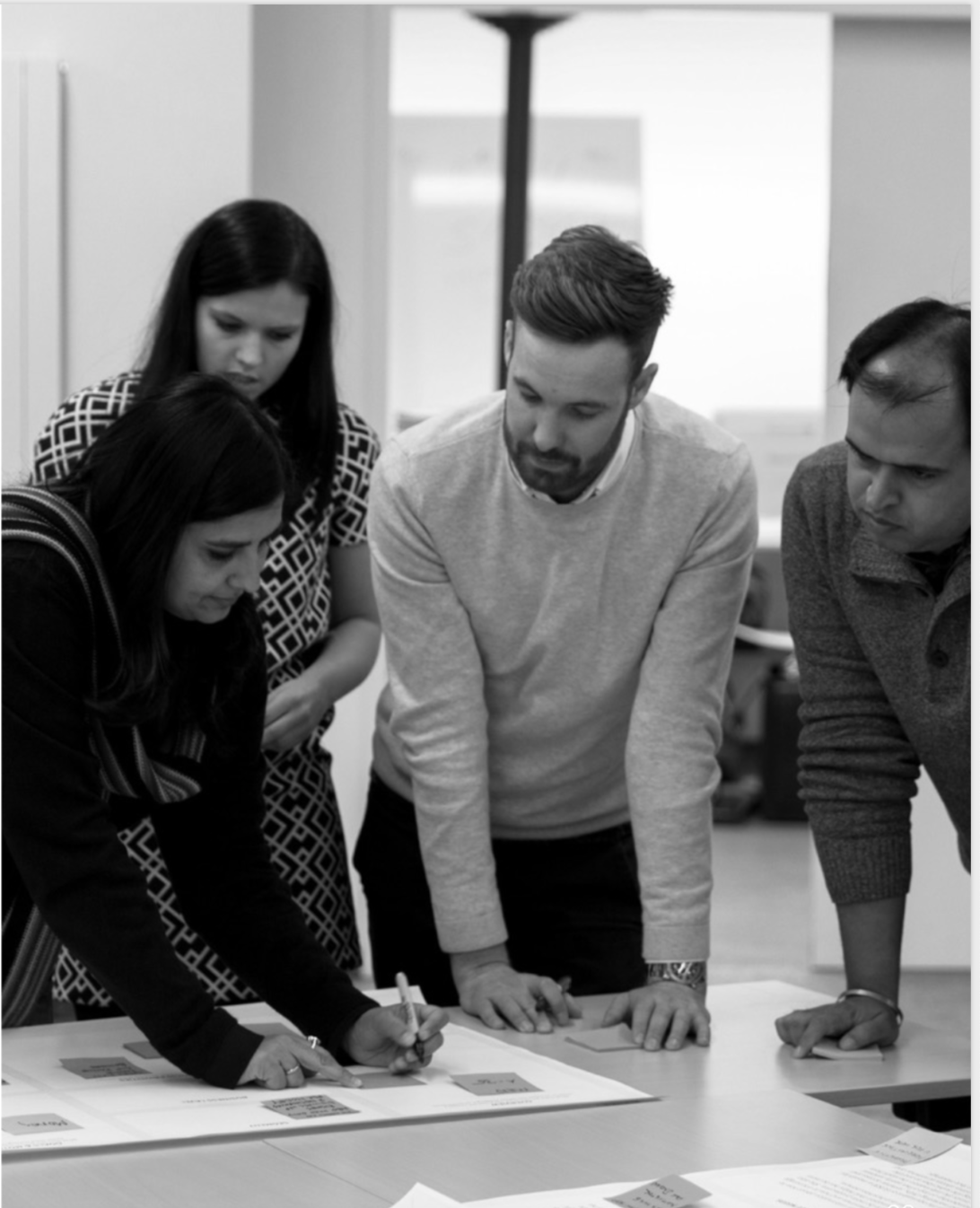
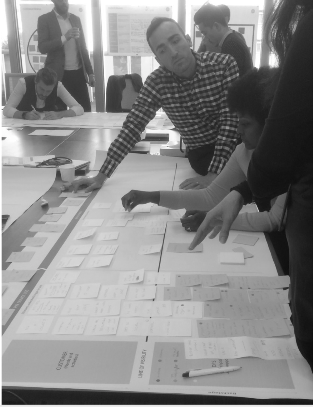
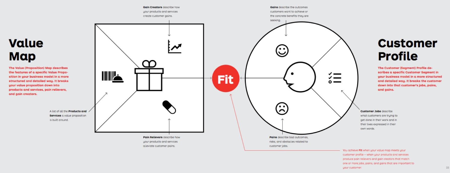
We've used a Value Proposition Canvas to create Value Map based on customer's needs and pain points.
Opportunities Captured
- Integration with internal systems
- Forecasting
- Risk / issues automation
- Project budget
- Aggregation of statuses for higher level
- Reporting module
- History tracking
- Communication processes and standards
- Mobile app
- Account / project prioritization
- Alerts system
- Smart help / process driven hints and notes
- Dashboards for all roles
- Custom goals / KPIs
- Personal metrics
- Milestones and roadmap tracker
2. MAKING
Design Principles
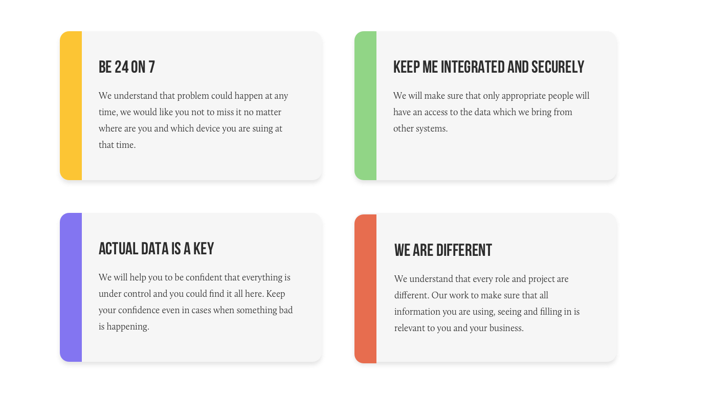
To create a better, more consistent experience for our users we created design principles to support the Delivery Health Monitor. Below are the full set of experience principles.
Prioritised Concepts
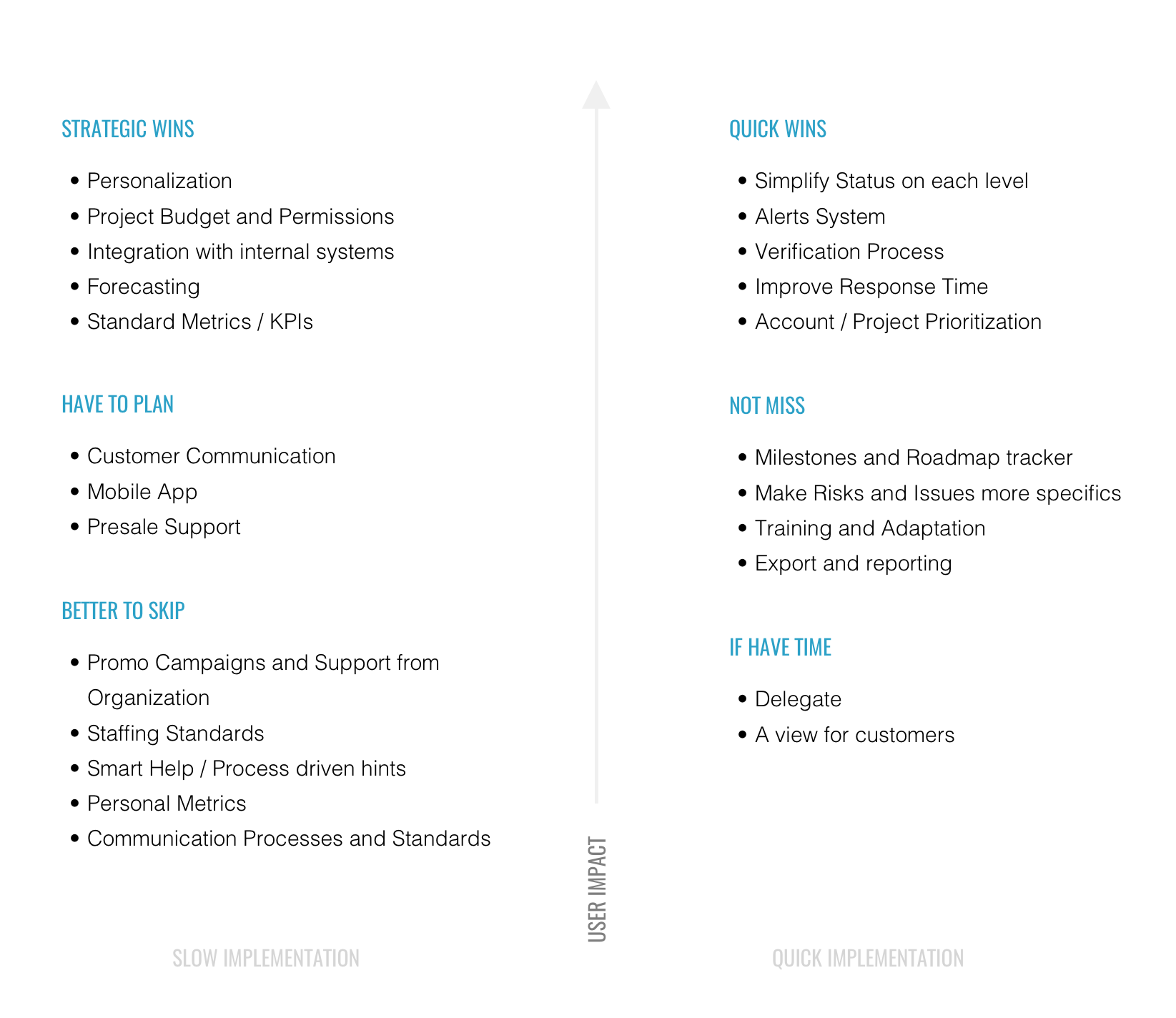
Based on the benefits they potentially provide to users and the potential effort for implementation, we identified the primary concepts. This creates focus on the most important aspects but doesn’t mean we won’t be considering all of these ideas during conceptual phases.
User Scenarios
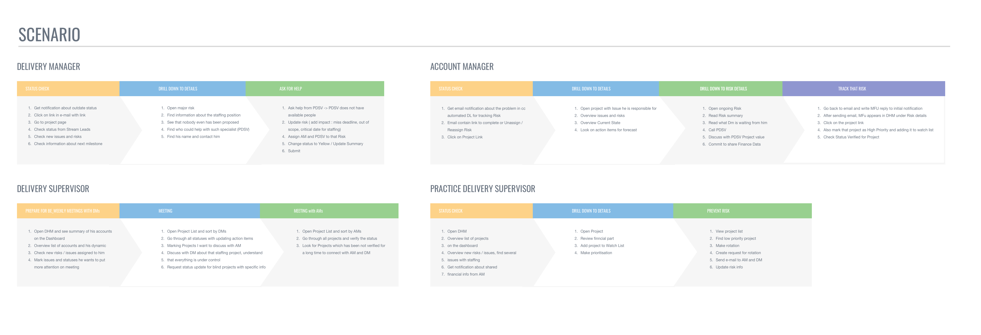
User scenarios are a great way of communicating the key tasks that a user will perform within a system. They can also help define the usability testing regime when a project has finished. In addition, they enable testers to focus on the key tasks within a system.
Define key cases
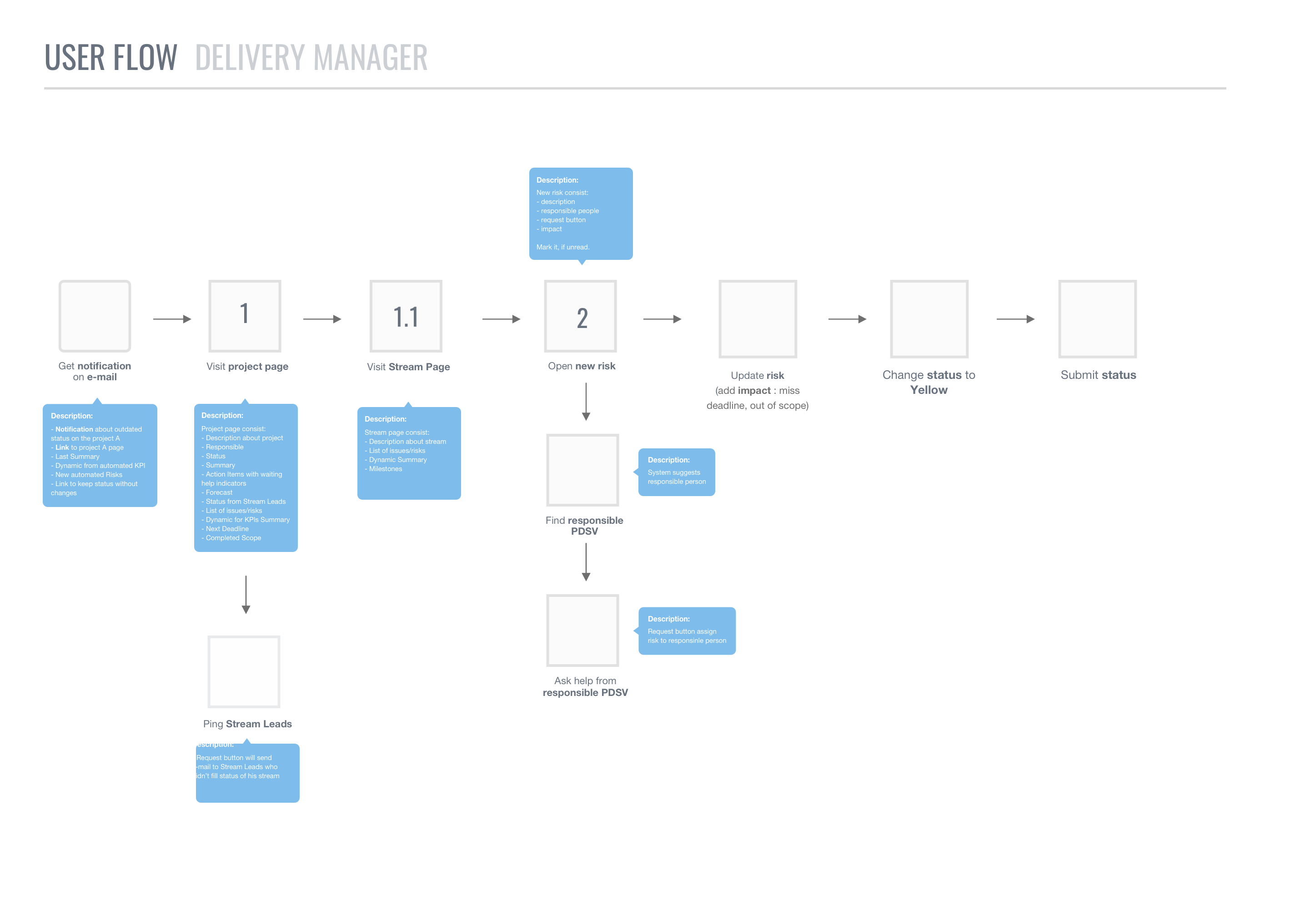
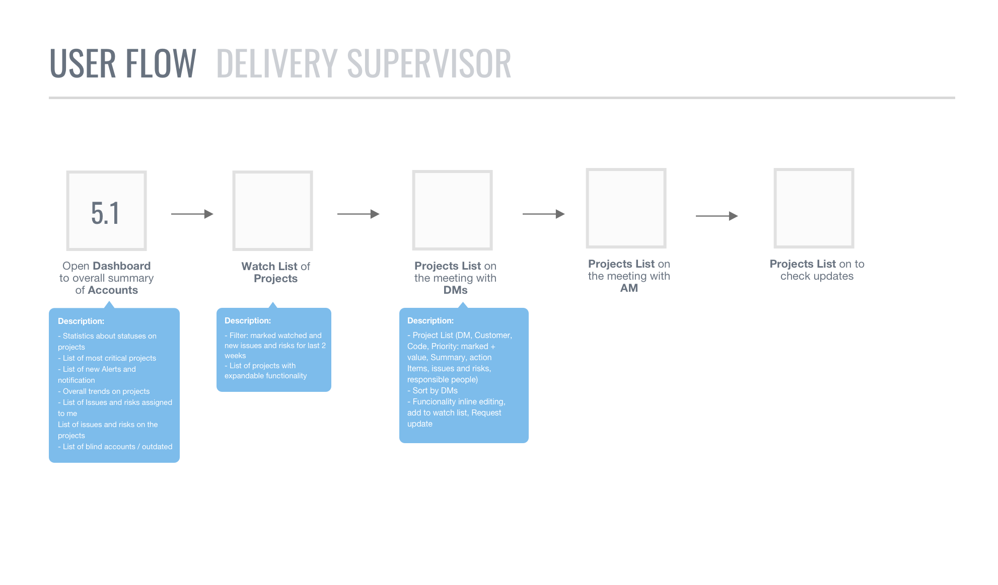
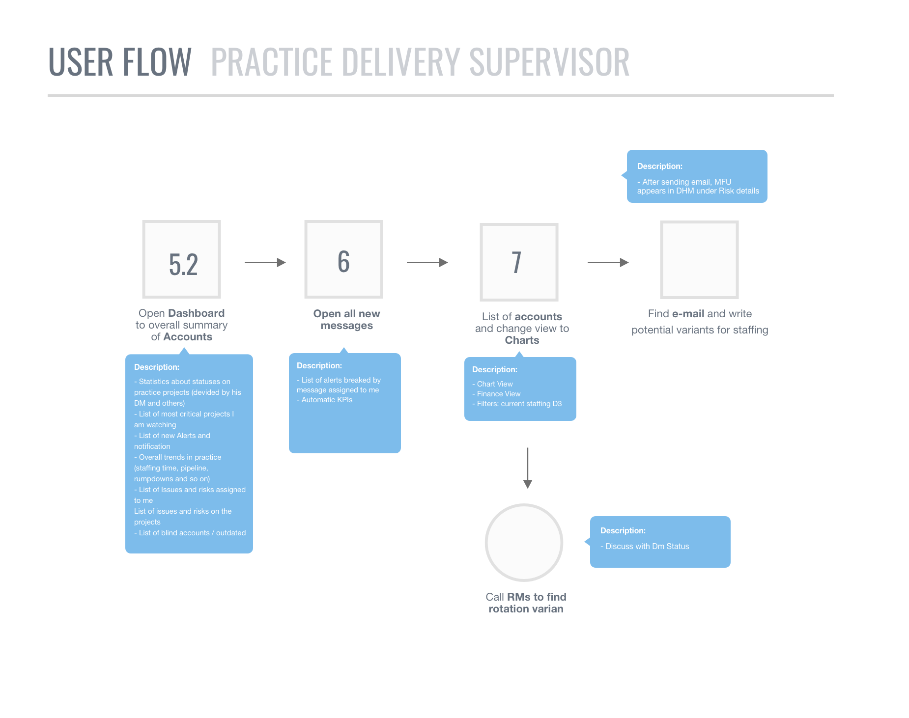
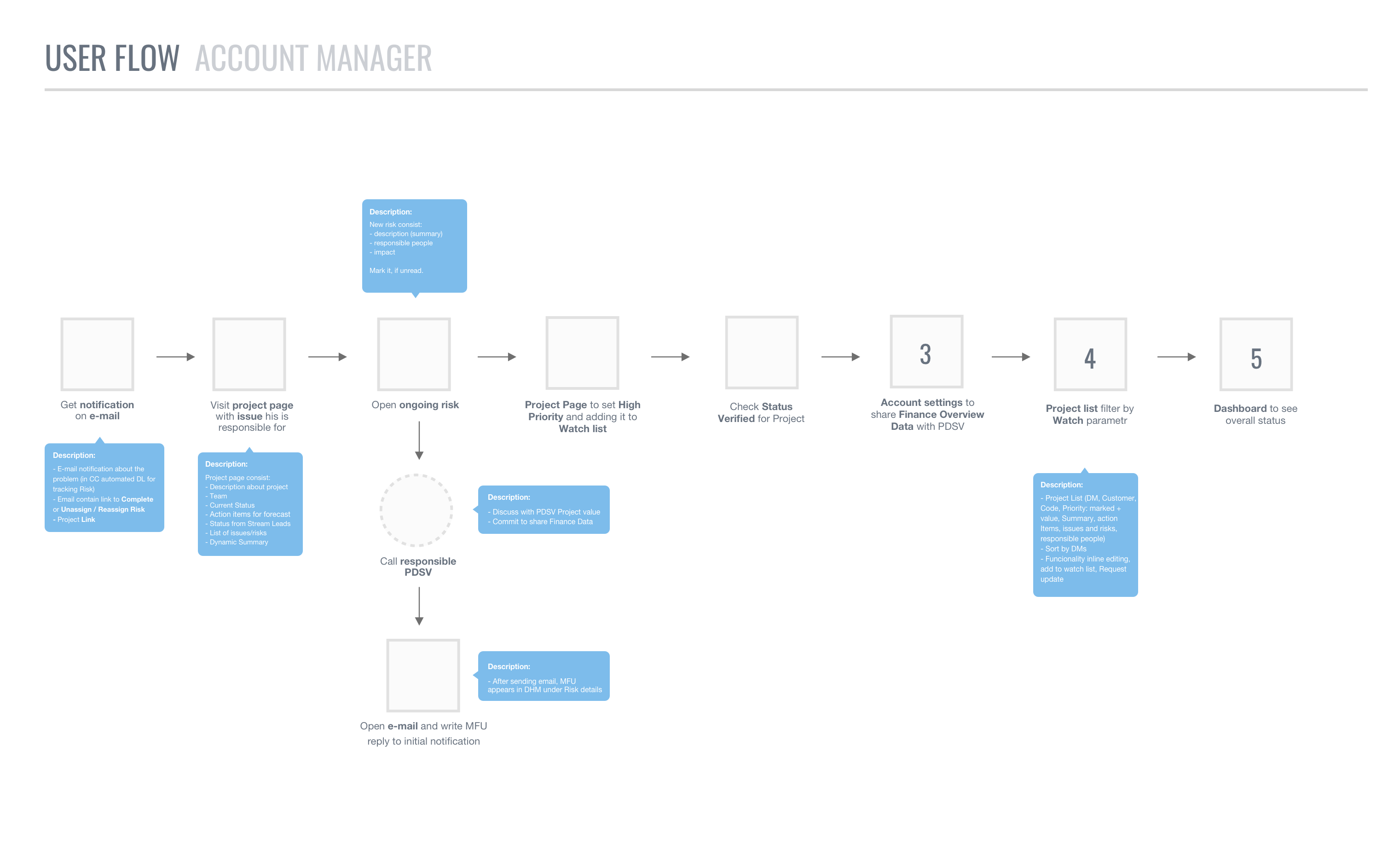
Based on the prioritised concepts, we identified key cases and developed user flow for each person. Each use case is represented as a sequence of simple steps, beginning with a user's goal and ending when that goal is fulfilled.
Deliver prototype
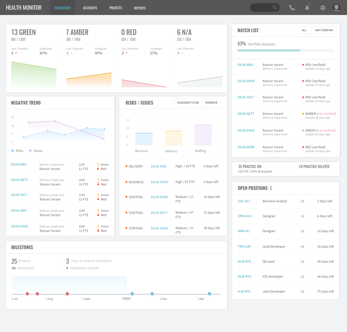
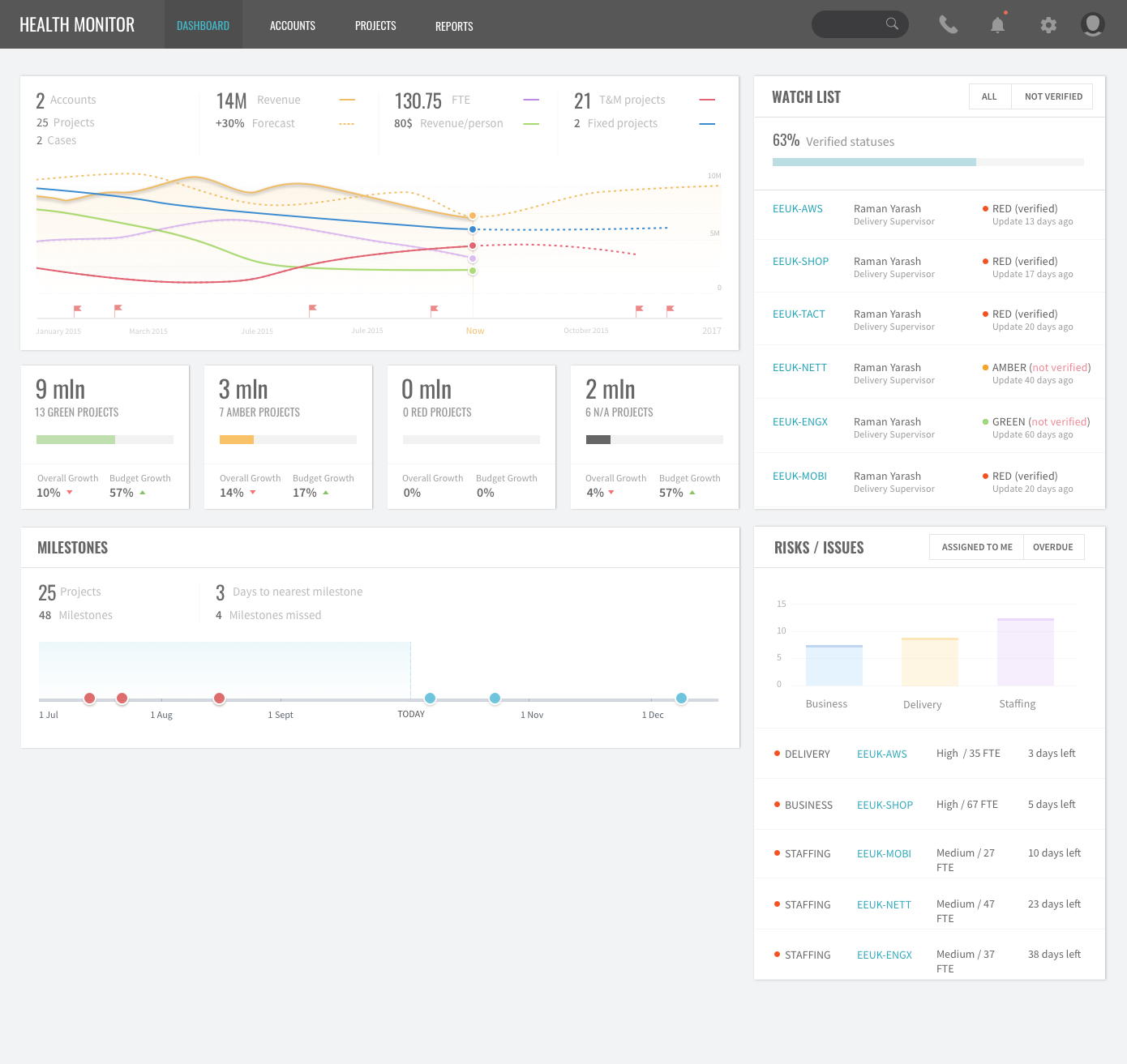
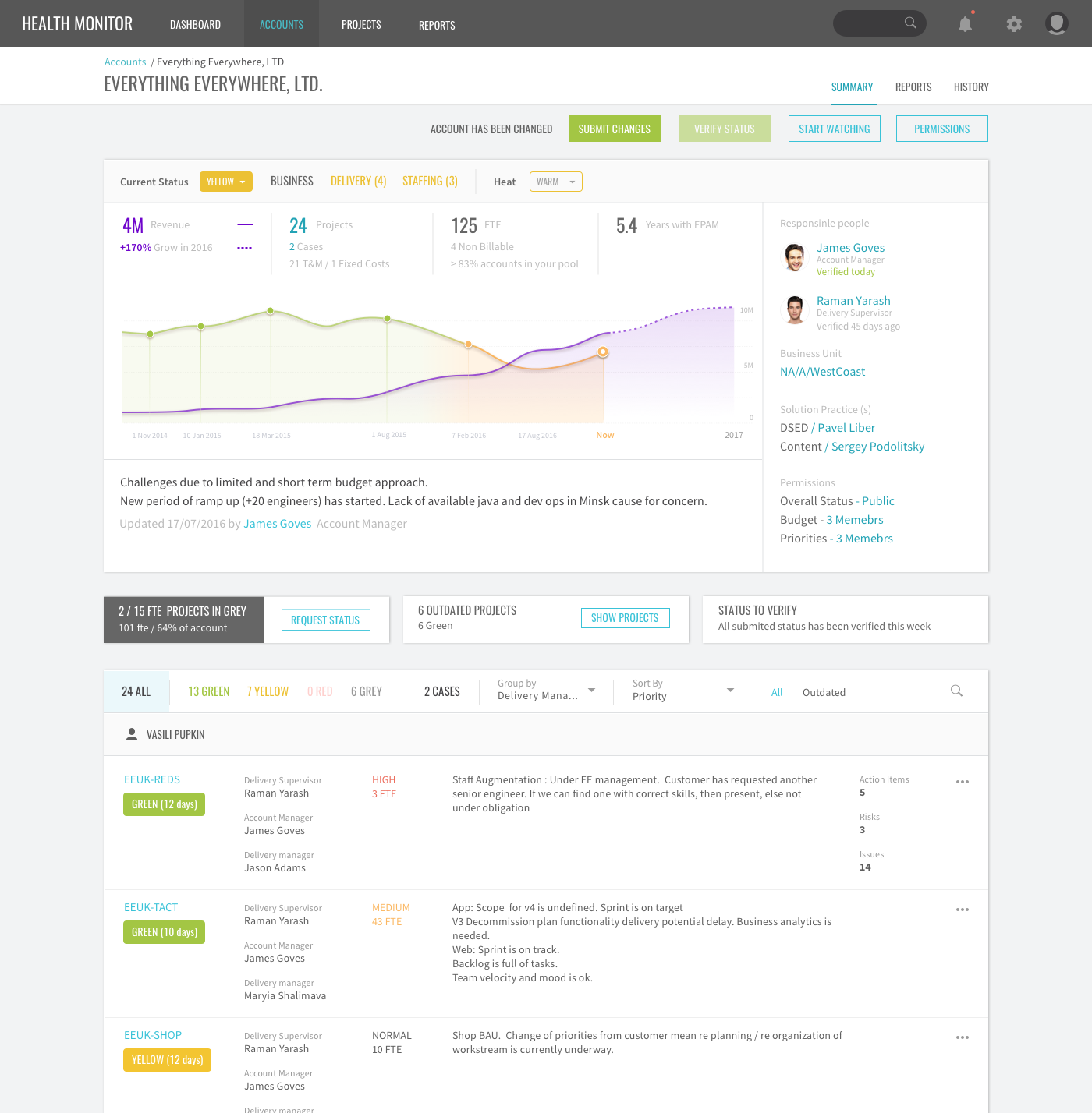
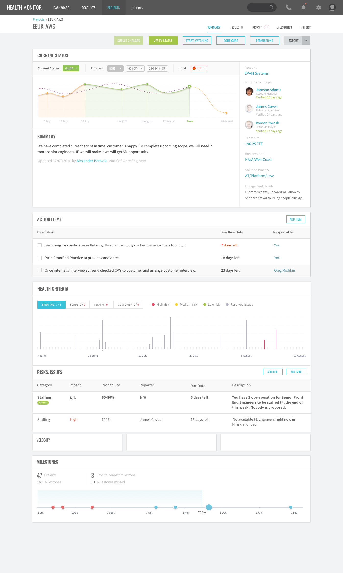
The biggest improvements in user experience come from gathering usability data as early as possible. It’s cheaper to make changes before any code has been written than to wait until after the implementation is complete. Prototyping offers designers the opportunity to bring their ideas to life, the practicability of the current design, and to potentially investigate how a sample of users think and feel about a product.
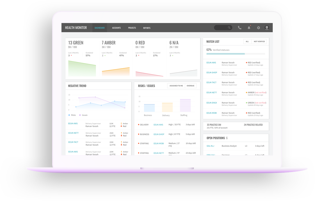
During the phase Build, Test, Refine we were working on wireframes prototypes and as a result we delivered the final interactive prototype.
The outcomes and results
After 4 months of working on this project, we fully redesigned an existing solution, found hidden user pain points, and created a new value proposition for the Delivery Health Monitor.
- The number of grey projects decreased by 22%
- The number of escalation cases related to delivery decreased by 20%
- The time of resolving issues decreased by 30%
The redesign of the Delivery Health Monitor has had a positive impact on the delivery experience, at the time of writing (3 months since launch). The escalation rate has been decreased, which means that communication and coordination were improved across all company levels.
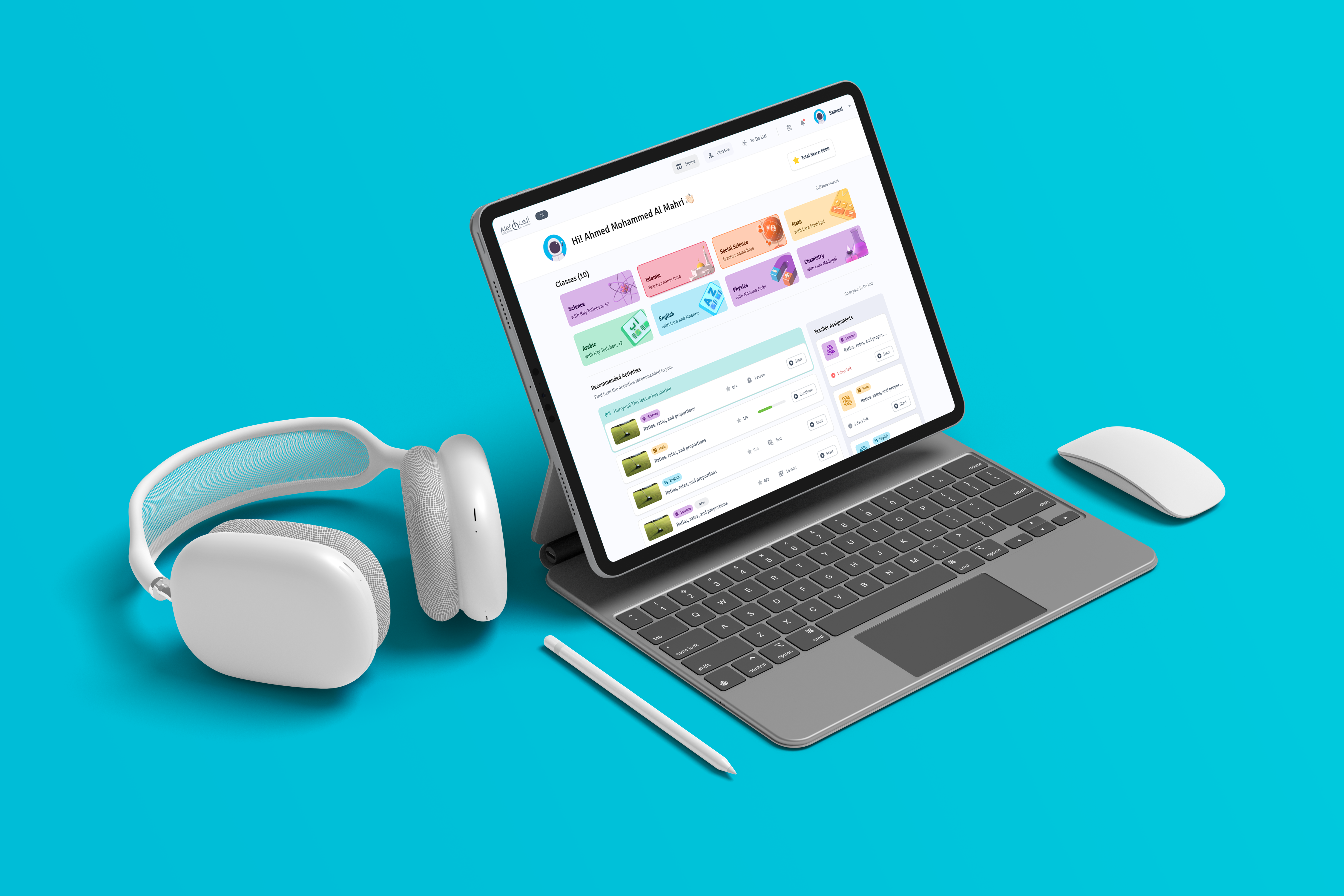
Alef EducationProduct Design | UX Research
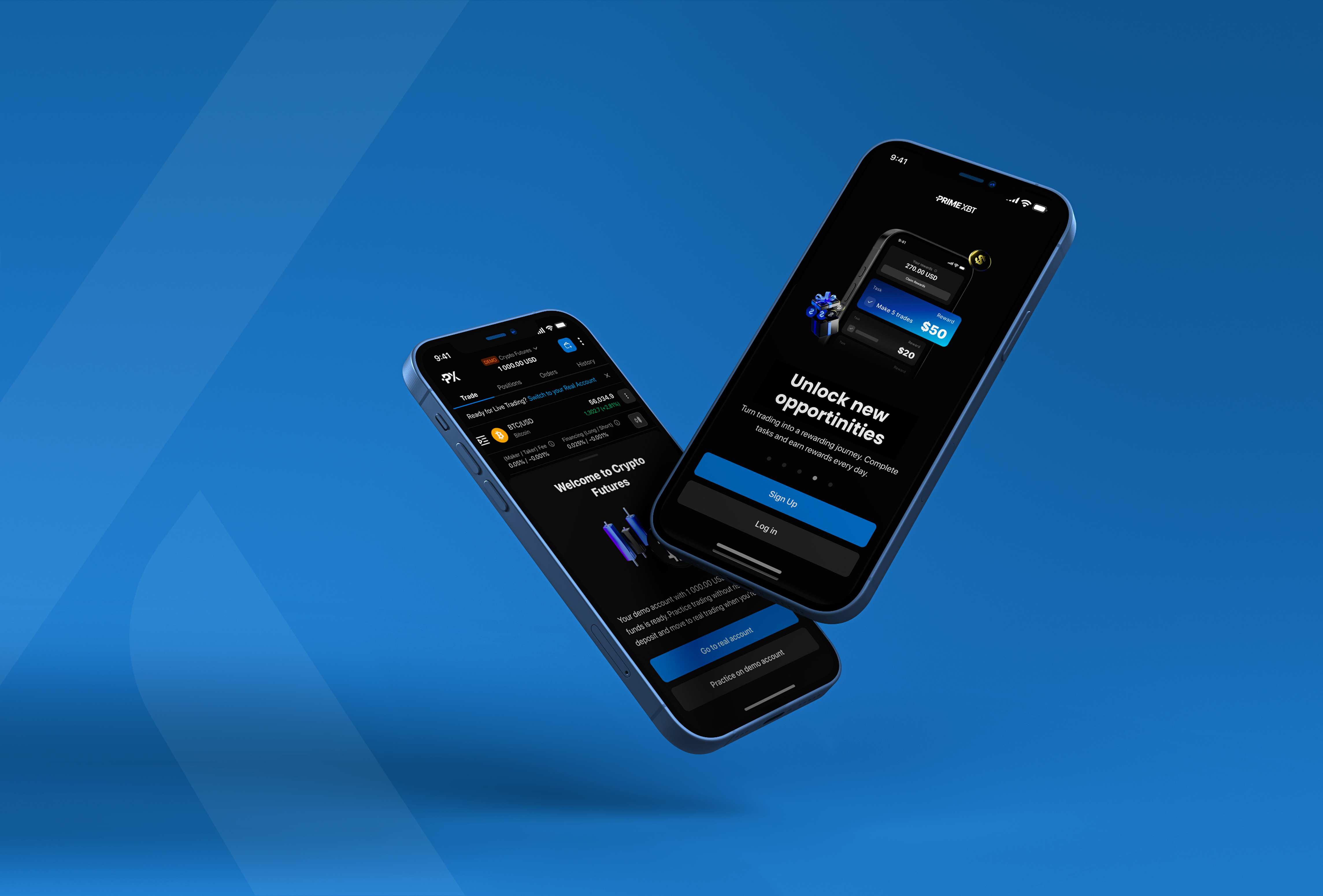
Prime XBTProduct Design | UX Strategy
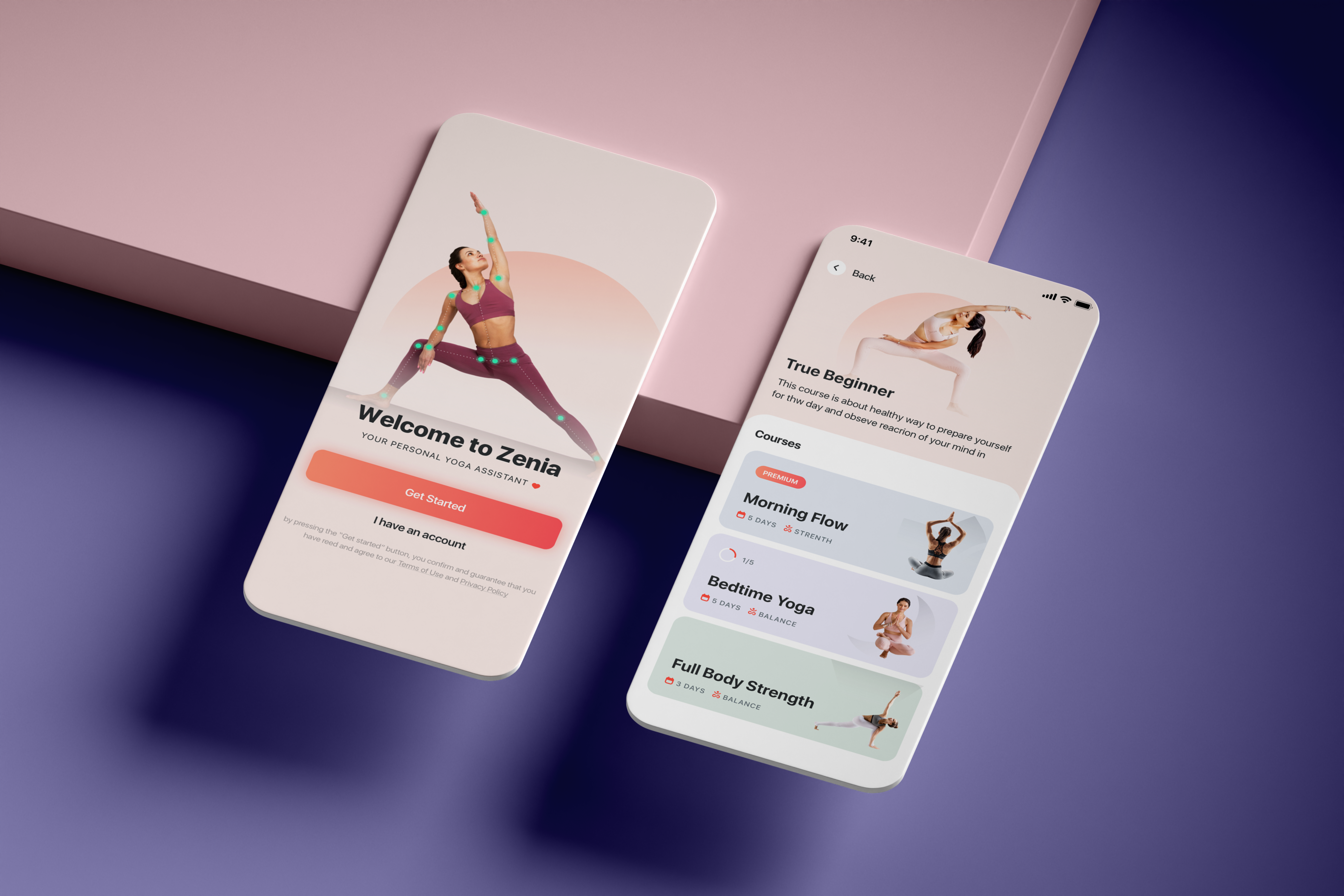
Zenia AIProduct Design | UX Research
WARGAMING CARDUX Research | Product Design